SWEET MOON
Graphic Design | Branding | Packaging
Sweet Moon is a Vietnamese mooncake company that offers an assortment of three earthy-flavored mooncakes in travel-friendly, compact packaging. Its branding focuses on representing cultural roots of Southeast Asian history through a delicate pastry known as a relic of its own time. Sweet Moon invites people of all ages and cultures to experience a taste of fresh Vietnamese mooncakes.
TIMELNE
Apr 2020 - Jun 2020
TOOLS
Illustrator, Photoshop
EATING WITH JOY.
Connecting the simple pleasures of Southeast Asian history, familial tradition, and tasty flavors.
BACKGROUND RESEARCH
We wrote a case study brief to learn more about the lore of mooncakes to understand our branding and product direction better.
History
In Vietnamese culture, the Mid-Autumn Festival is traditionally seen as an opportunity for parents to spend time with their children after the harvest season, representing the fullness and prosperity of life. To honor the celebration, people often eat moon cakes and traditional snacks, feast with their families, craft paper lanterns, and worship the God of Earth.
Properties
The mooncake’s circular shape represents families gathering and celebrating together after the harvest. Traditional mooncakes have floral, symbolic, and Chinese lettering imprints, while many modern mooncakes today have cuter imprints, such as animals and small flowers.
Applications
Our brand utilizes the round and organic shape of the mooncake to encapsulate the idea of togetherness. Sweet Moon’s design direction encompasses minimal linework in traditional embellishments and intensely pigmented hues within the primary color scheme spectrum, all reminiscent of classical mooncake imprints.
DESIGN PROCESS
Our mood boards harmoniously overlapped, dictating the visual aesthetic we mutually adored. Inspired by the generational history embedded into the mooncake, we focused on the traditional beauty of deep, rich color schemes and intricate embellishments of Southeast Asian heritage.
Mapping the Mood Board
Our mood boards harmoniously overlapped, dictating the visual aesthetic we mutually adored. Inspired by the generational history embedded into the mooncake, we focused on the traditional beauty of deep, rich color schemes and intricate embellishments of Southeast Asian heritage.
Logo design by Annie Ly
The Logo
Noticing the curvatures of the moon cake shape, we simplified the dessert’s adornment and organic form to create the silhouette Sweet Moon. The main color scheme is a mix of light and deep colors: cream, gold, and red, popularly known as symbols of happiness, love, fortune, and celebration in Southeast Asian culture.

Expanding the Brand: Flavor Labels
The pastry brand introduces three flavors of Southeast Asian sweet cuisine: red bean, mung bean, and taro, color-coded into labels that are associated with the main ingredients of the mooncakes. Inspired by Southeast Asian ornamentation within art, clothing, and food, we reworked our own linework by turning the mooncake and lantern into symbols to decorate the label in reference to the Mid-Autumn Festival, a holiday that celebrates with sharing treats with loved ones, including yummy mooncakes.
-
The signature flavor of Sweet Moon. Grown from the finest adzuki bean vines, Sweet Moon harvests its red beans to make sure that they have a sweet, nutty flavor and smooth paste-like texture.
-
Sweet Moon’s fresh taro mooncakes use organic taro roots as its core ingredient. Handpicked and healthily grow n, the taro mooncake is baked to enhance the earthiness with each bite you take.
-
Mung beans are popularized in a many famous Vietnamese desserts. Sweet Moon includes high-quality mung bean sprouts into its mooncakes, delicately grown to have a subtle sweet taste.

Style Guide
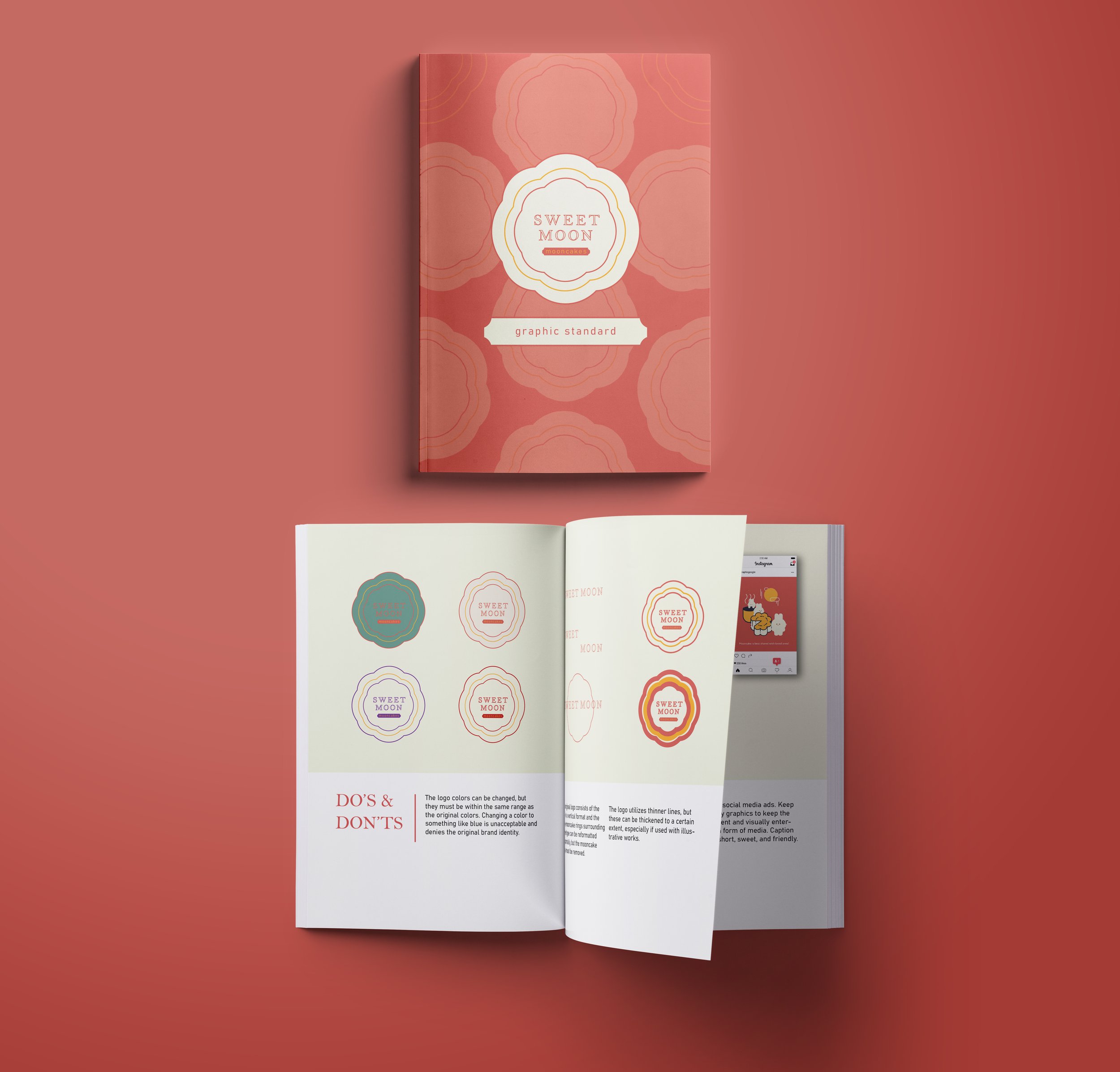
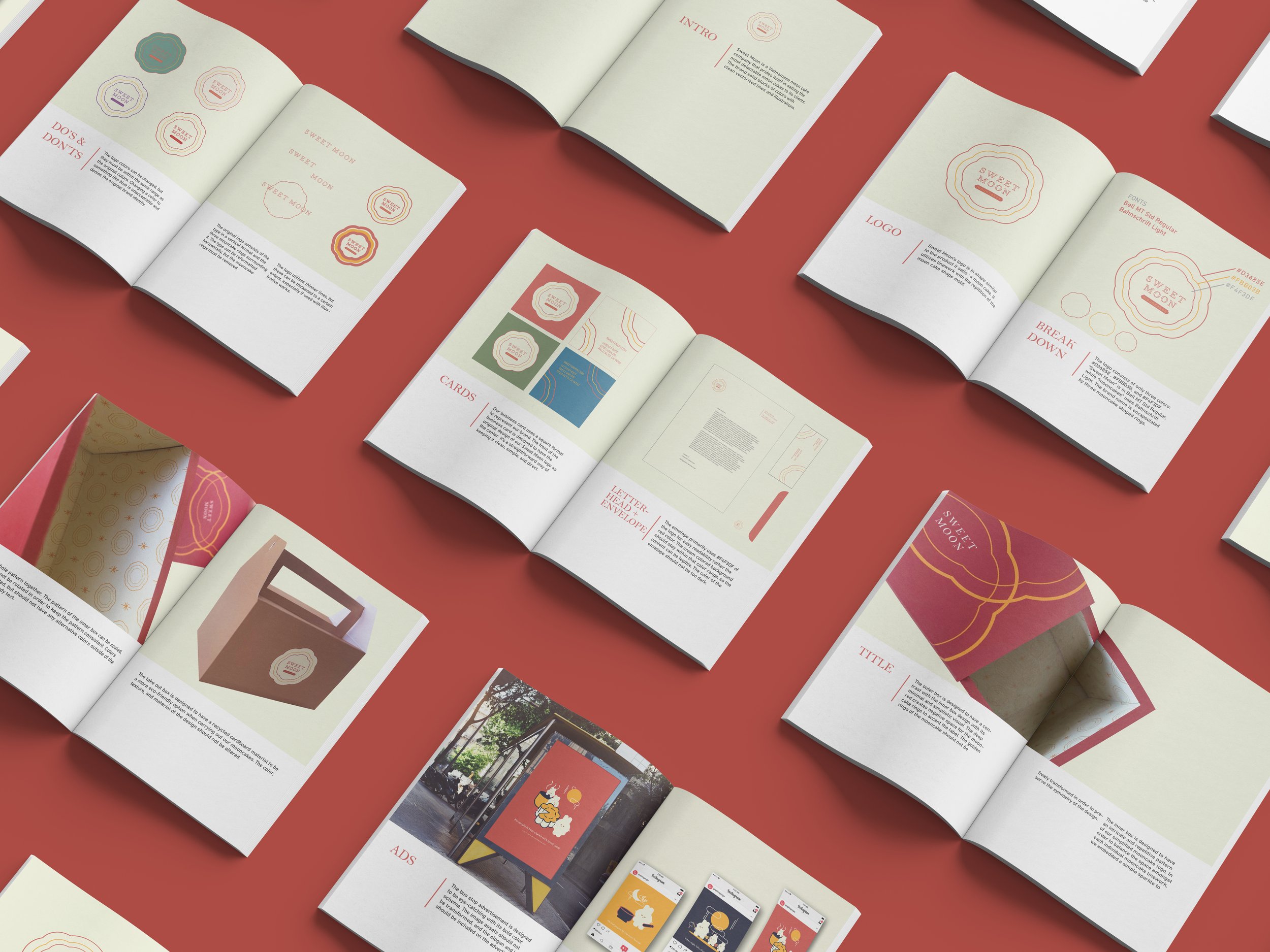
Sweet Moon’s style guide demonstrates the do’s and don’ts to protect its brand integrity. Our branding focuses on classic, muted, and warm colors paired with thin, round, and organic graphic works. We hope to emphasize minimalism, playfulness, and professionalism into our packaging, visual grapichs, and overall branding.


Marketing Collateral
Sweet Moon’s branding uses deep hues of red to pair with an off-white cream color to tie boldness and daintiness together. We composed our visual graphics by using the round linework of the logo as accents on the informative side of the business card to illustrate parts of the brand all around.


Packaging Box
Our goal was to provide convenience to the customers ordering mooncakes on the go. We devised a take-out box that could carry multiple mooncakes at once, ensuring that the customer had the option to take it by the handle and collapse the foldable edges if needed.
For our design decisions, we ultimately stylized the packaging with our classic red and cream combination— a bold red painted on the exterior to capture one’s attention and a delicate mooncake pattern to adorn the box’s interior for a charming impression.


Website & Interface
The Mid-Autumn Moon Festival is associated with interconnecting folklore, guiding our story-focused branding. Our homepage narrates a story with cute, bubbly graphics that teaches about the origins of the mooncake festival.
We purposefully designed the Sweet Moon website to focus on the informational aspect of its product rather than a take-out ordering system. Sweet Moon creates intuitiveness by embedding minimal information, clean UI elements, and fun graphics. Images and information are processed in a slideshow format guided by arrows and simple tabs in the menu navigation so that customers can be encouraged to learn about our product and ingredients.
Social Media Campaign and Public Installation
Our mascot, Moon Bunny, is a curious character inspired by the Moon Rabbit's folklore legend in different Asian cultures. The three separate promotional graphic visuals are based on the Mid-Autumn Festival and centered around the following values:
Work hard
Honor one’s traditions
Celebrate by enjoying a mooncake with one’s loved ones
For public advertisement, the narrative storytelling images are seen on social networking platforms, such as Instagram, and within public spaces, including billboards, posters, and bus stops.


TAKEAWAY
Sweet Moon was created to represent Vietnamese culture with our community of a diverse range of customers through the power of dessert. Throughout the process, I felt that we had a strong grasp on how to move forward with our branding direction, but not enough substance to reference. I’ve compiled a couple of reflections that I would change, noted below:
-
I felt that we could have delved into more information on our competitors specializing in Asian pastries, specifically moon cakes. We conducted thorough research about origin lore, however, from a business standpoint, it would have been helpful to understand how other brands carry out their culture, branding, and products.
-
I believe showcasing a tangible, functioning prototype with additional website screens would have been a great extra for this project. I would be interested in delving into the UI portion of the design more intricately, such as using certain animation effects and transitions to carry out our execution.
-
Our most ambitious task of the project was to execute a take-out box as the mooncake’s packaging. Having the opportunity to physically measure, print, and fold the box appropriately was challenging, but it drove me to consider design within other angles in a 3-dimensional sense. If I were to redo this part of our branding, I would have wanted to challenge myself by creating an inner take-out box with complementary flavor labels for the moon cakes.
Conclusively, Sweet Moon was a great branding project that dived into multiple areas of branding design, and it helped me understand the different logistics to account for when designing the medium.


