Original Product: Winter Solstice Advent Calendar 2022
Graphic Design | Branding | Illustration | Original Product
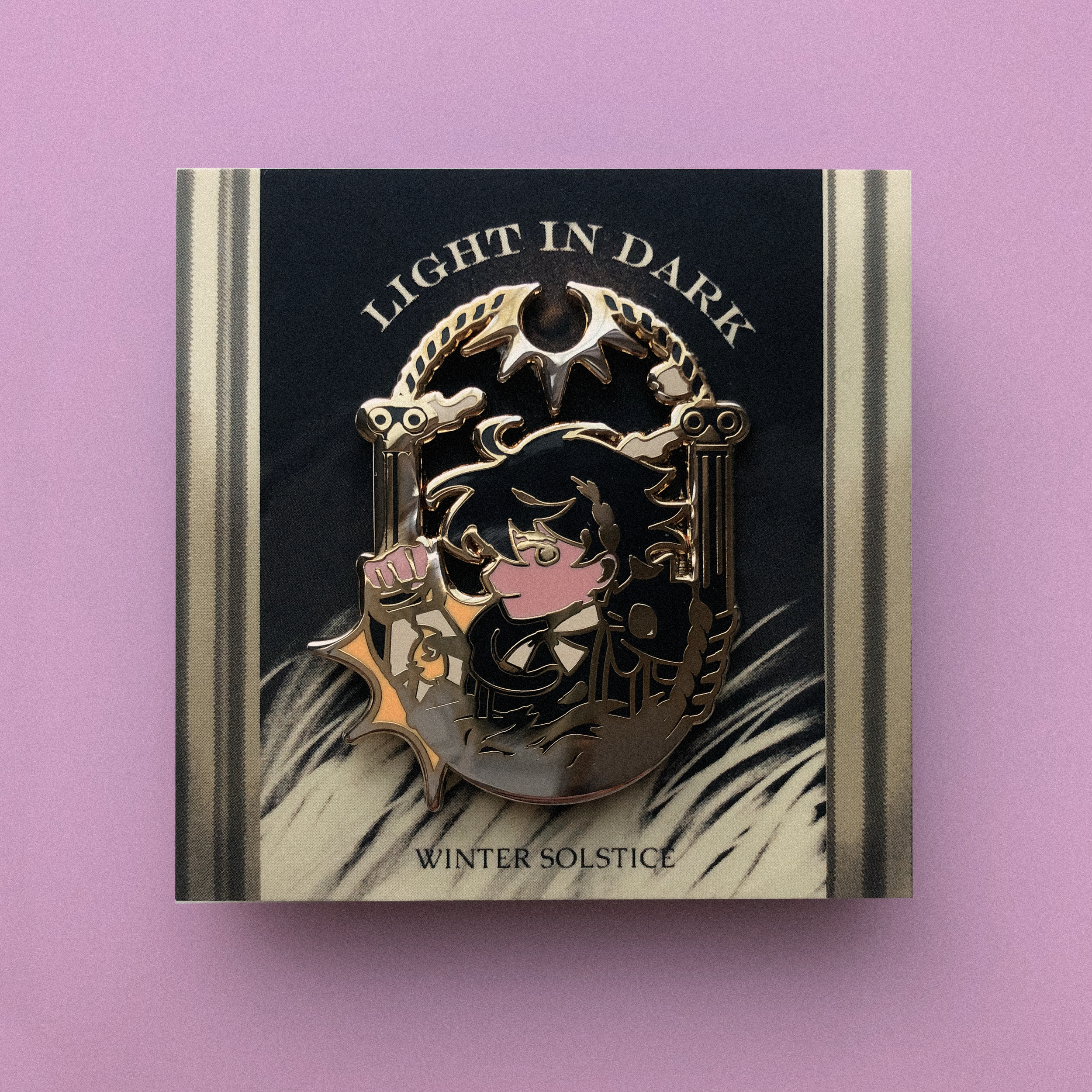
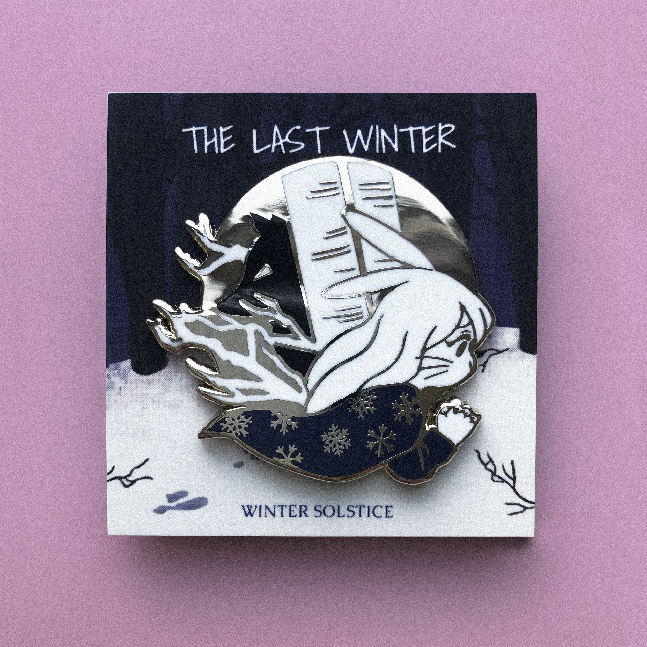
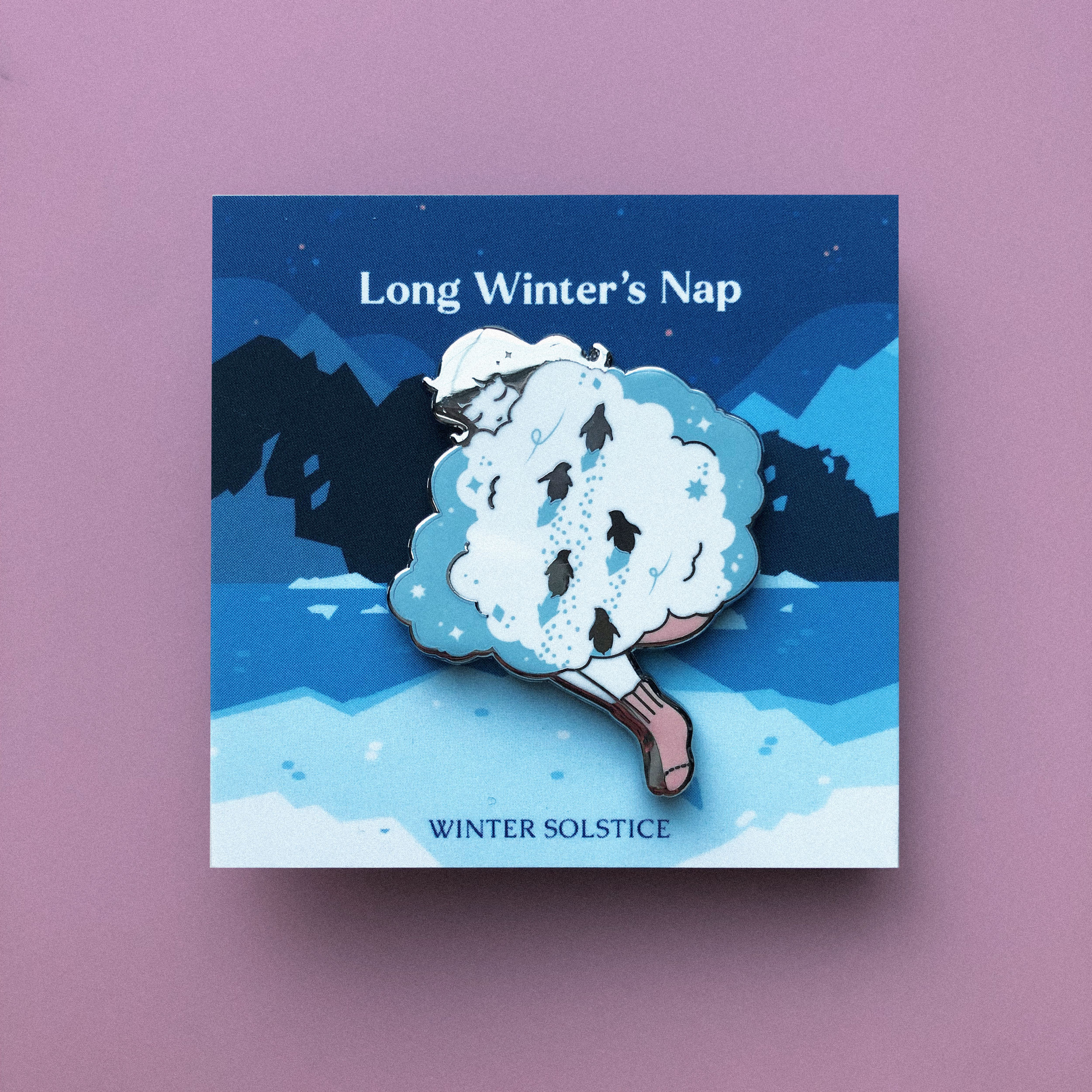
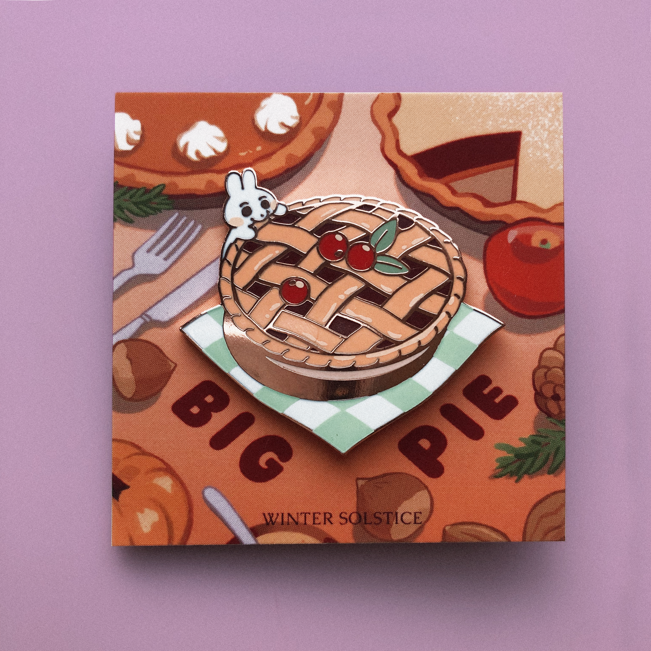
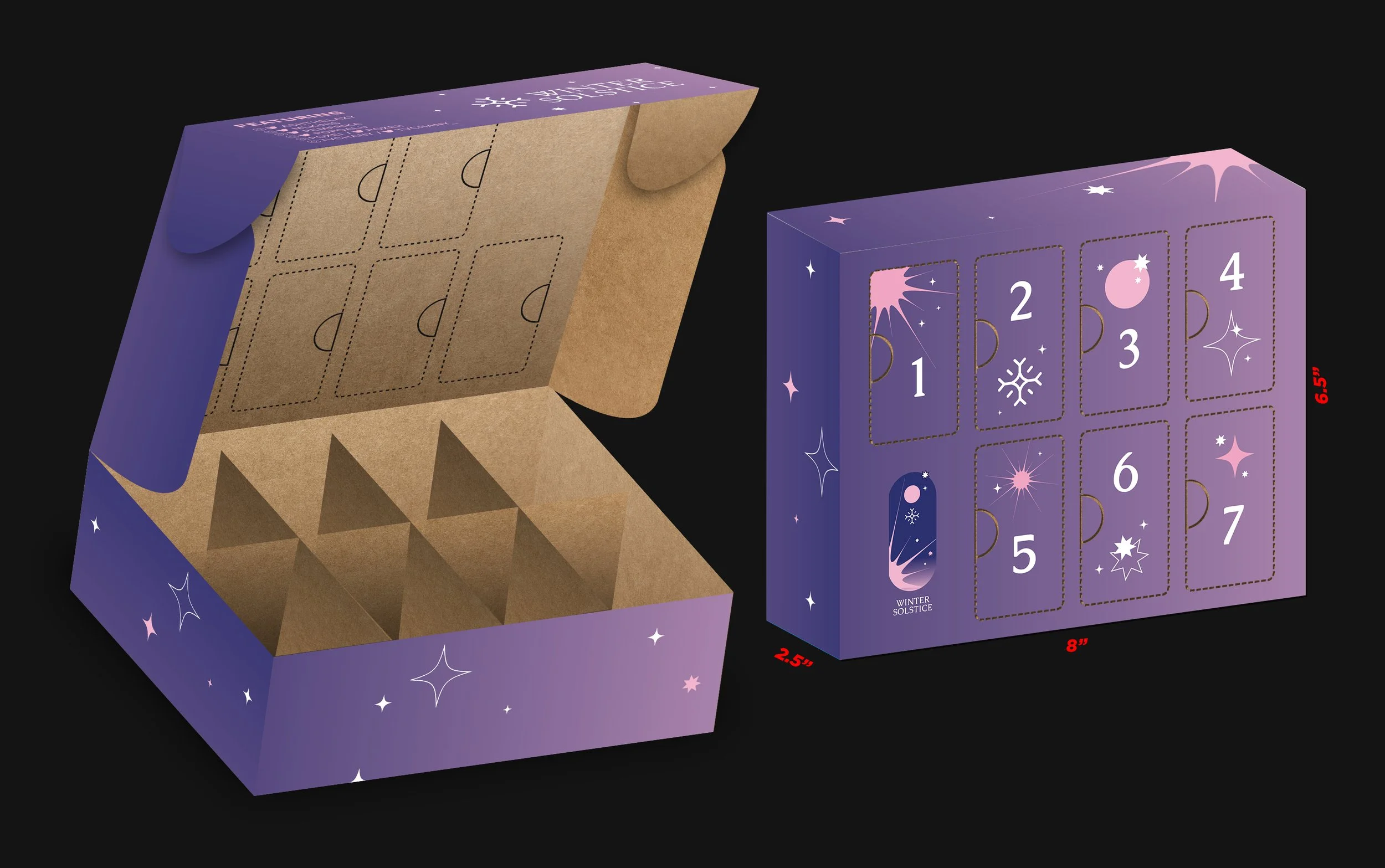
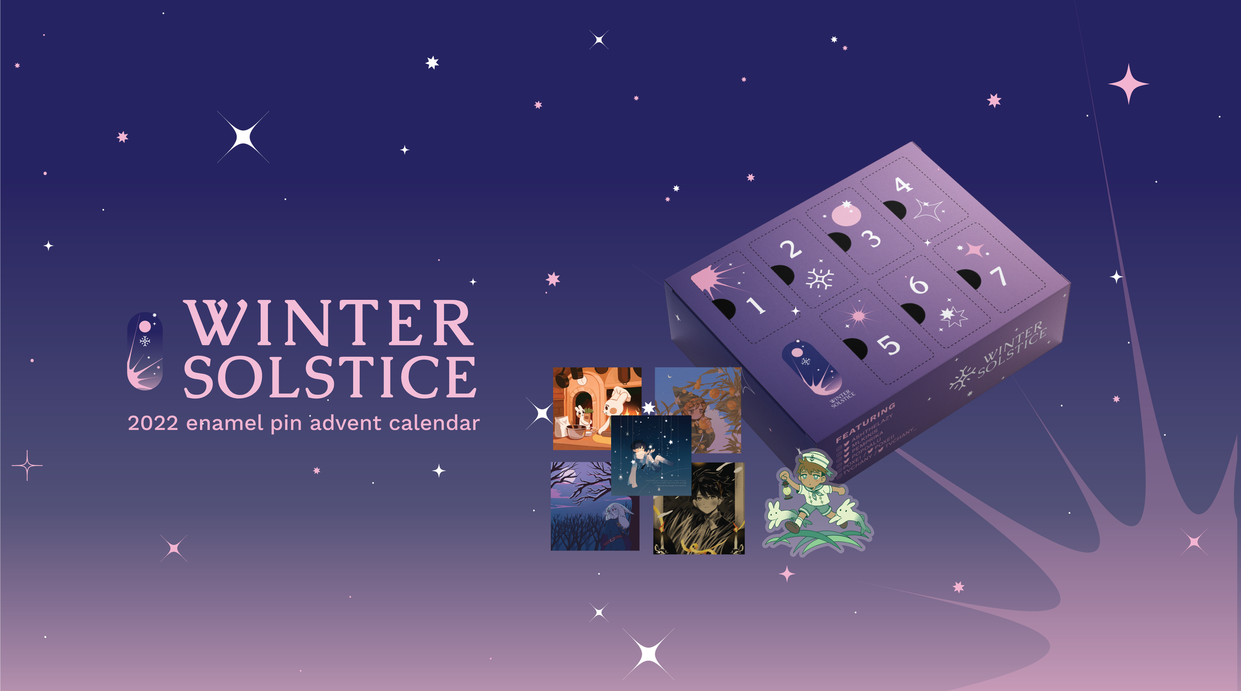
Winter Solstice was a collaborative seasonal product, which promoted an original enamel pin advent calendar gift box featuring seven unique artists and was designed to count down the days from December until Christmas Eve.
The recipient is intended to unwrap seven different “surprise” enamel pins, which are placed in seven slots of a gift box that represent the days of the week, starting from December 18th to December 24th, 2022.
To keep the advent calendar a surprise until the day it's opened, the enamel pin designs are meant to be kept a secret until opened by the corresponding day!
TIMELNE
August 2022 ~ January 2023
ROLE
Co-Graphic Designer, Illustrator, Branding Strategist, Co-Productions Manager
Co-Collaborators: Annie Ly, Ashley Pascua, Katherine Liu
TOOLS
Illustrator, Photoshop, Procreate

SCOPE
Our project was aimed to launch by December 2022, which we planned out meticulously from concept to execution.
-
The subjects of the enamel pin products were crafted as a collective of original concepts, varying from all ideas ranging from characters, animals, and objects related to imagery that represent the Winter Solstice.
-
The target audience gears to all ages who enjoy collecting original enamel pins and want to celebrate a festive time with a fun little gift.
-
The branding revolved around having a winter holiday theme that was universally inclusive. While the concept of an advent calendar is originally shared as a western religious activity, we imagined that the gift idea can be enjoyable to many others of different backgrounds.
To generalize the theme, we aimed to give our customers and supporters the freedom of interpretation through our designs.
RESEARCH
Winter Solstice is an occurrence celebrated by various cultures. We took the liberty to dive into global perspectives on what Winter Solstice meant to different ethnic groups, and how we could incorporate the historical origins and stylistic fundamentals to create a holistic branding approach.
-
The advent calendar theme, “Winter Solstice” was inspired by the earthly tradition amongst many cultures. The Winter Solstice signifies an occurrence of when the earth tilts the furthest away from the Sun, resulting in the shortest day and the longest night of the year.
-
The subjects of the enamel pin products were crafted as a collective of original concepts, varying from all ideas ranging from characters, animals, and objects related to imagery that represent the Winter Solstice.
-
The target audience gears to all ages who enjoy collecting original enamel pins and want to celebrate a festive time with a fun little gift.
-
The branding revolved around having a winter holiday theme that was universally inclusive. While the concept of an advent calendar is originally shared as a western religious activity, we imagined that the gift idea can be enjoyable to many others of different backgrounds.
To generalize the theme, we aimed to give our customers and supporters the freedom of interpretation through our designs.
Gauging Interest
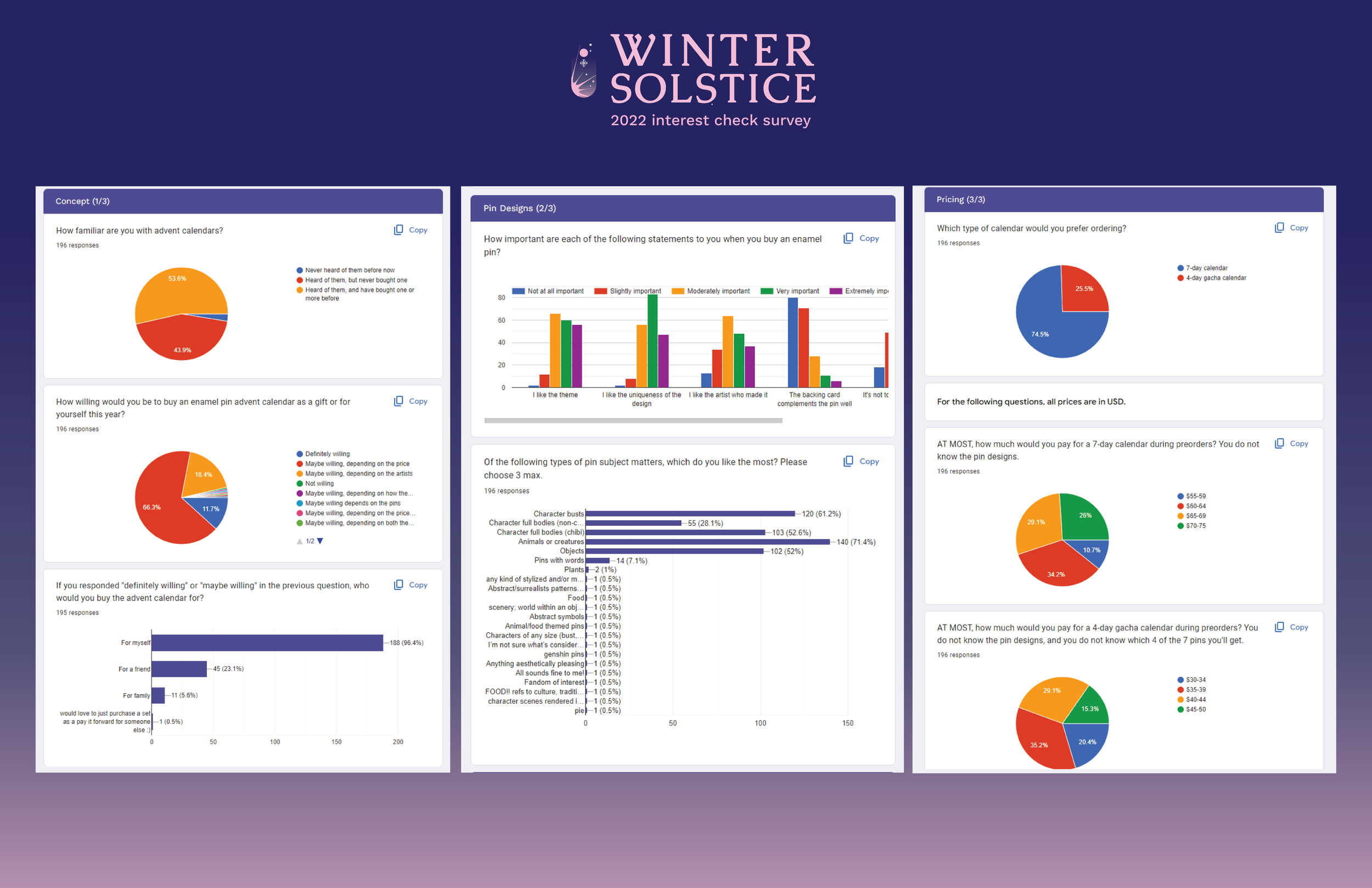
Since advent calendars are not a common product within our main market, so we decided to spark interest by releasing a public Google form to our audience.
We estimated pricing buckets, offered bonus merchandise ideas, gauged demographic details, and pitched the overall concept to understand our level of interest and profit margin.
By the end of the survey period, we estimated over 200+ responses to our interest form, extracting and analyzing the data we received to assess the scope of our project.
BRANDING
The branding revolved around having a winter holiday theme that was universally inclusive. While the concept of an advent calendar is originally shared as a Western religious activity, we imagined that the gift idea can be enjoyable to many others of different backgrounds.
We aimed to give our customers and supporters the freedom of interpretation through our designs.
The Mood Board
We agreed to have the Winter Solstice branding highlight minimalism with a hint of youthful modernity to reflect an elegant winter theme. Winter Solstice signifies a balance of darkness and light, represented by the sun and night.
To embed those qualities of a beautiful winter concept, I collected inspirational imagery that focused on organic, clean lines, muted palette tones, and broad, wintry elements, including six-pointed stars, arches, orbital movement, and light rays.
The Logo Design
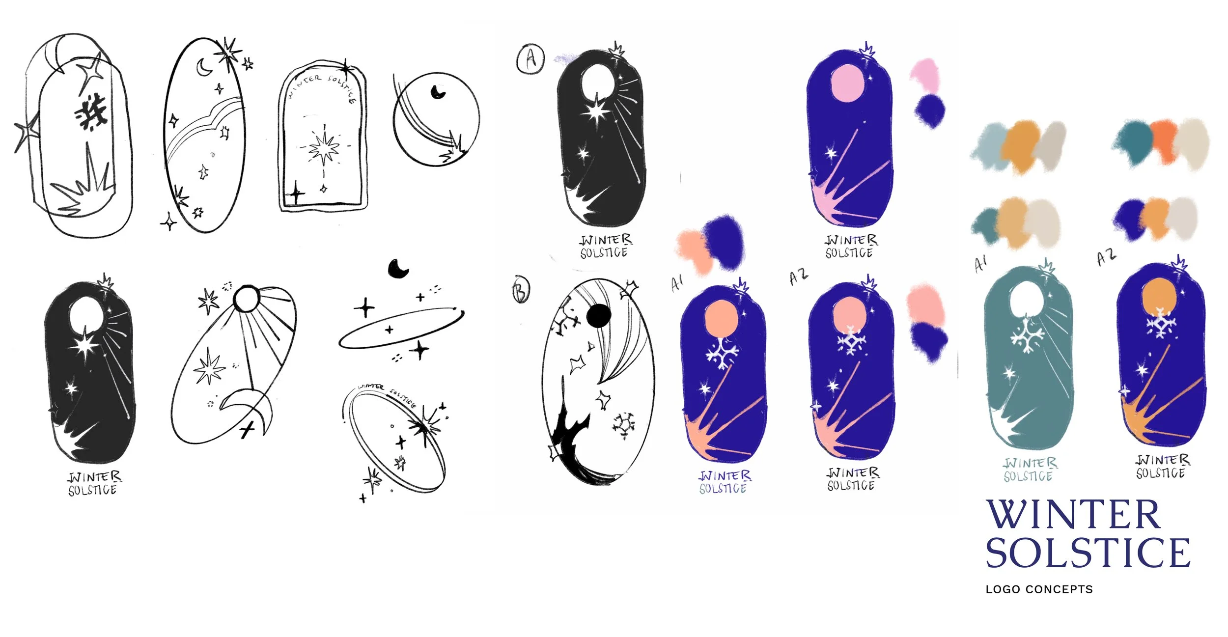
When collecting inspiration on themes, elements, and concepts, I found myself enamored by the symbolism of circular and organic shapes and drew some concepts on how to embed those celestial qualities in our logo design.
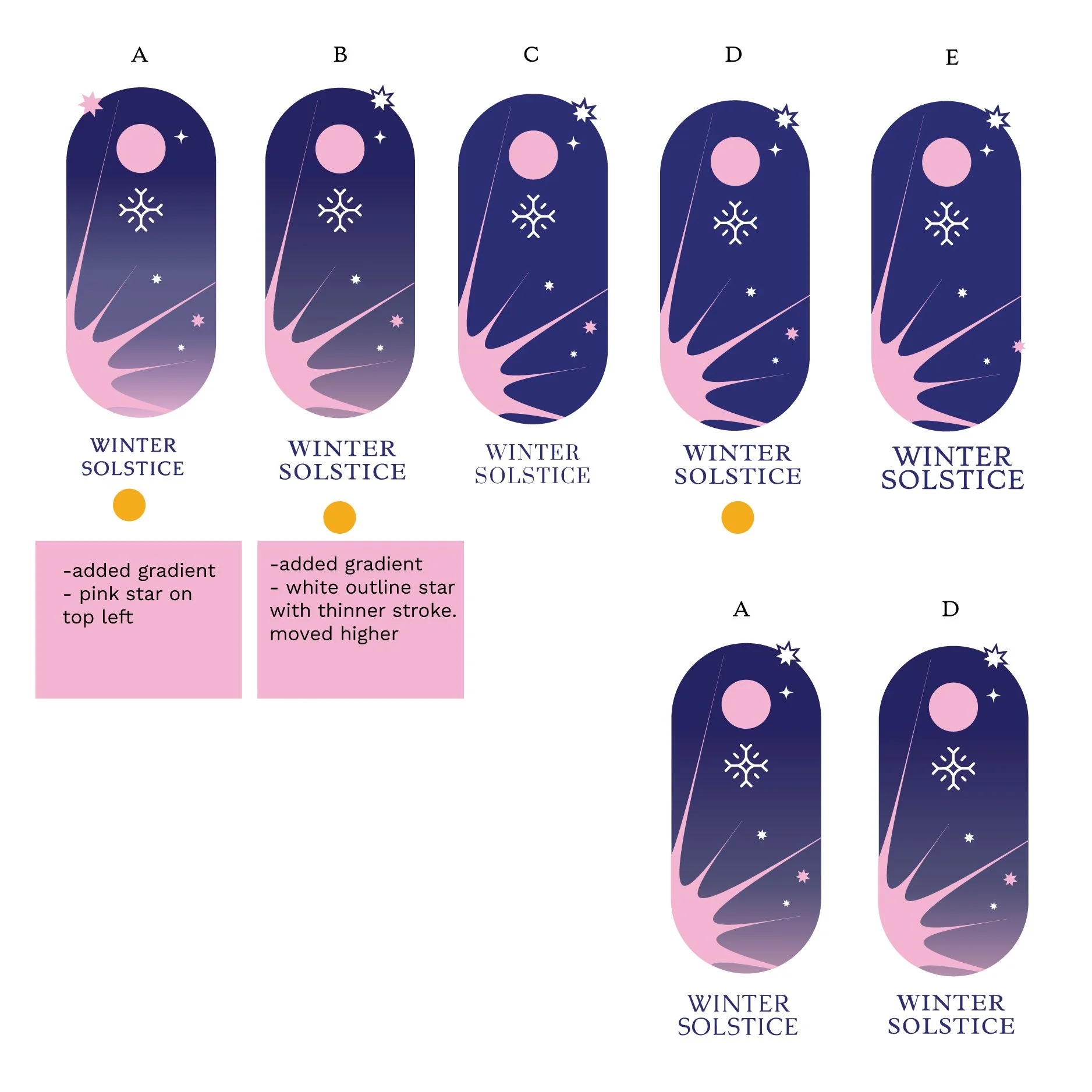
Ultimately, we used a pill-like oval shape as the prominent silhouette and combined the star, sun, and moon to represent the meaning of winter solstice. Using a violet and pink color scheme with a gradient captured the modernity and simplicity we hoped to convey in our branding.
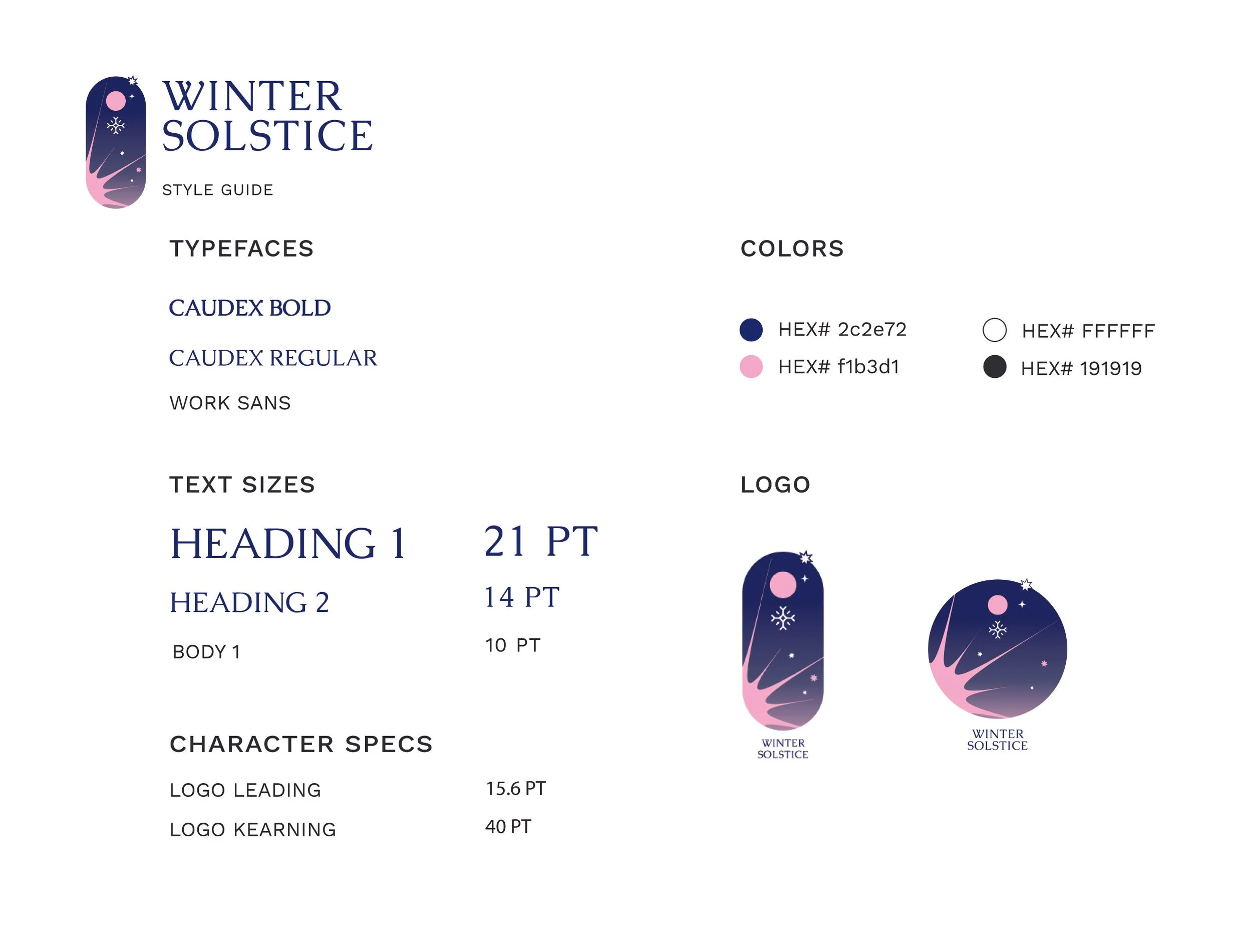
Branding Guide
My main inspiration was drawn from the minimalism of Musely’s brand. While browsing its website and looking into its photography, I noticed that the company geared towards simplicity, pastel palettes, and non-texturized graphics. While still warm and eye-catching, Musely keeps its branding professional and soft with its colors and compositions.
DESIGN PHASE
The branding revolved around having a winter holiday theme that was universally inclusive. While the concept of an advent calendar was initially shared as a Western religious activity, we imagined the gift idea could be enjoyable to many others of different backgrounds. We aimed to give our customers and supporters the freedom of interpretation through our designs.
PROCESS
The theme, “End of Summer”, expresses an introduction to Autumn. At first, I experimented with more yellow and orange hues with accents of teal to highlight natural skin tones and to embrace the welcoming of a cool, brisk season.
Although I tried to stay within Musely’s branding, the typography and colors were not synchronized with the image enough.

PRODUCTION LOGISTICS
The branding revolved around having a winter holiday theme that was universally inclusive. While the concept of an advent calendar is originally shared as a Western religious activity, we imagined that the gift idea can be enjoyable to many others of different backgrounds.
We aimed to give our customers and supporters the freedom of interpretation through our designs.
Giftbox concept design and mockup by Katherine Liu and Ashley Pascua
MARKETING CAMPAIGN
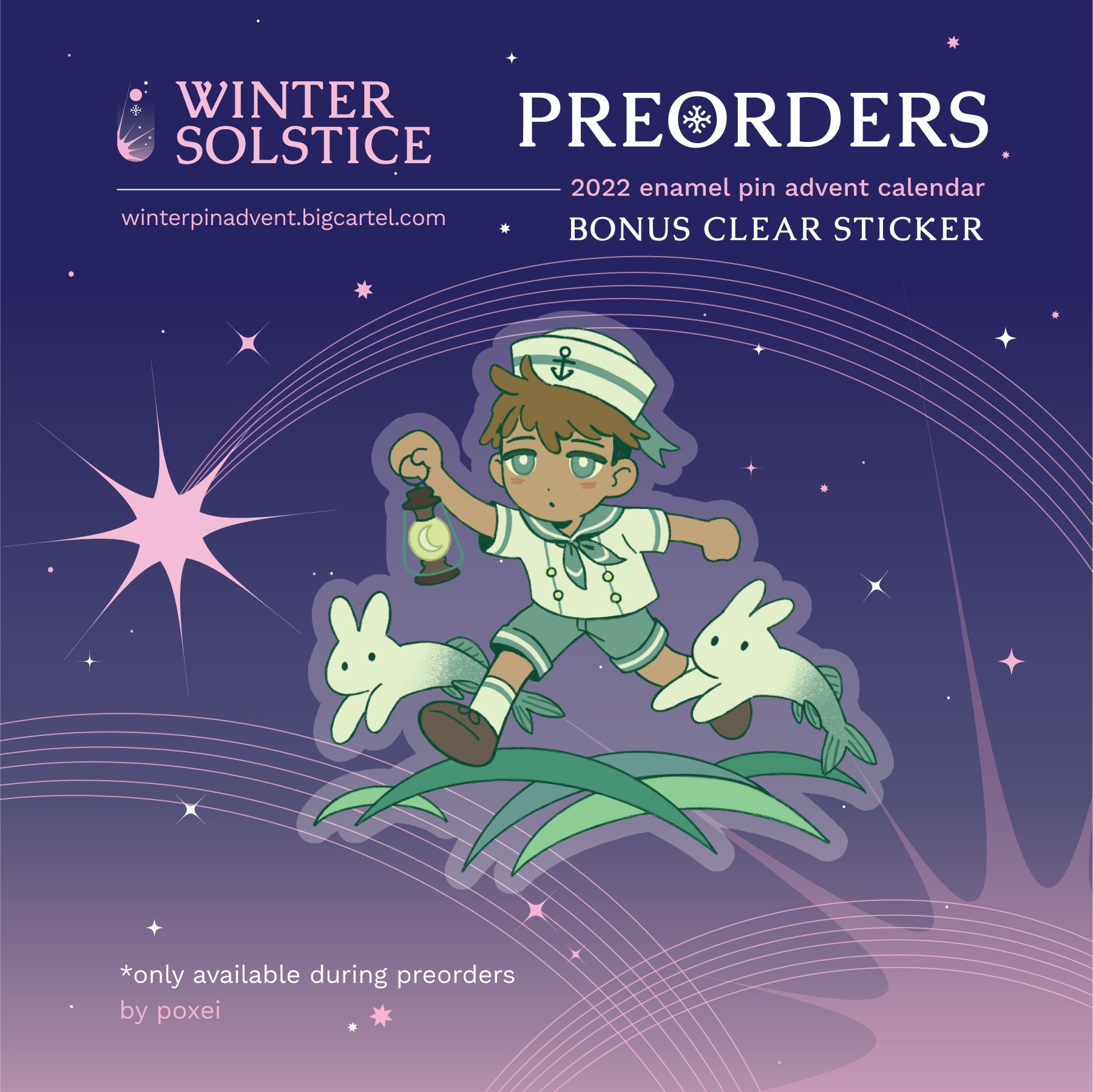
One of our main concerns about the project was initiating enough marketing momentum to reach the right audience. To fan out our reach, we set up a calendar for the moderators and participating artists to share at their own time. I designed several varied graphics that focused on different perks and inclusive products of our limited product.



The Countdown Campaign
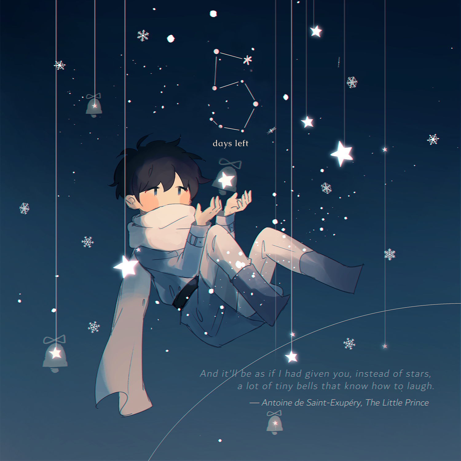
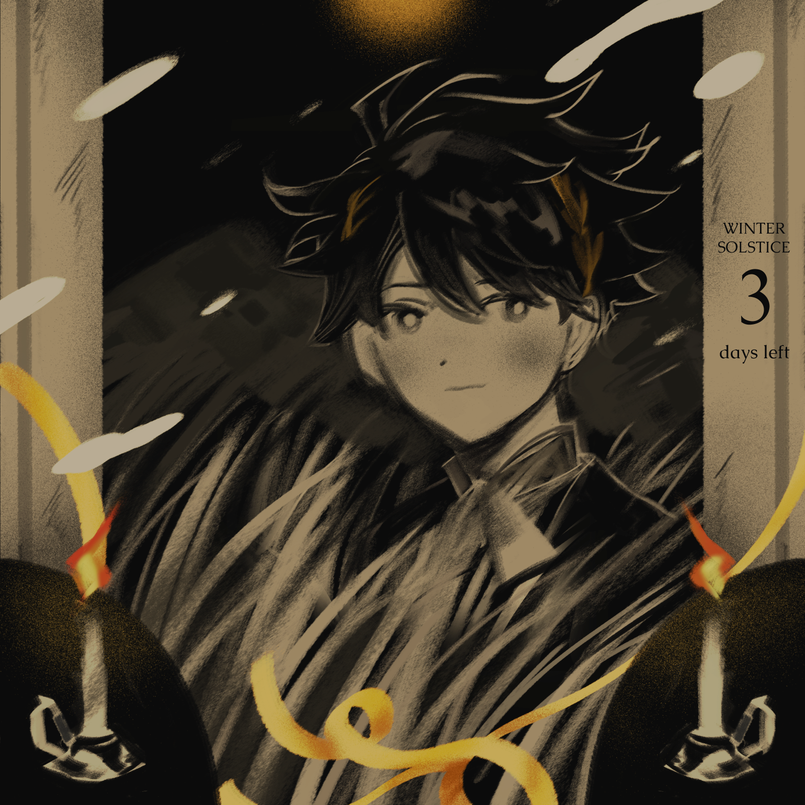
We wanted to gain a wave of excitement and enthusiasm for our product, so we set up a week-long campaign that showcased a theme artwork of some of our pins. Each artwork displayed the amount of days left under the preorders open, letting our customers know when the launch would open.



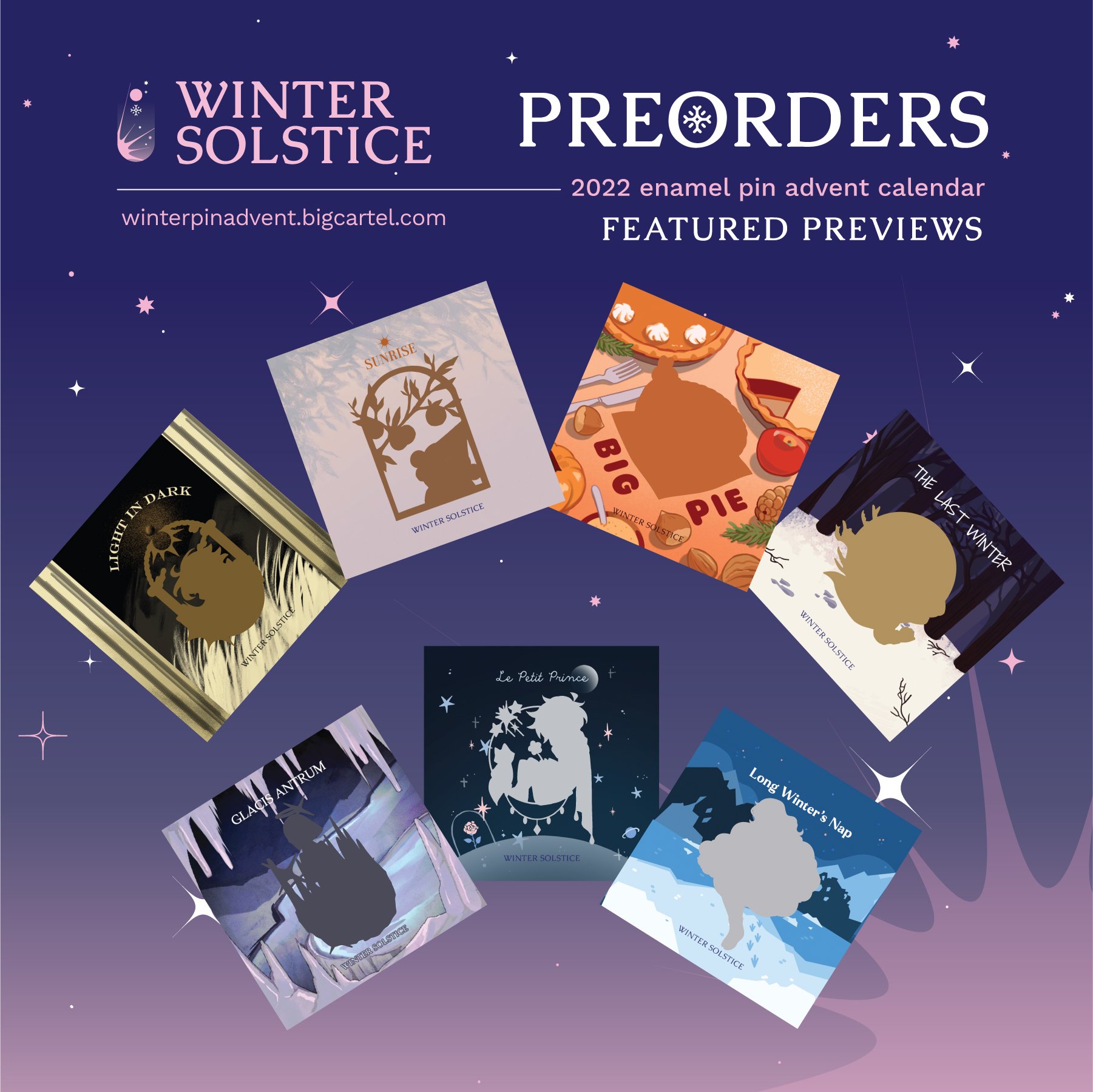
Sneak Peak Campaign
During the preorder phase, we initiated another campaign, where my co-designer created gifs of our artwork previews. Our goal was to keep the designs a secret until the customers received their own boxes by the holiday season, so we purposefully hid the surface design, so that the viewer could see only the silhouette.
TAKEAWAY
Despite its rewarding success and fun, there are a handful of issues that I felt could’ve been addressed differently.
Learning Points
Communicating with your team to assess equal work distribution is important. Defining the roles of every member will create a more efficient workflow process for meeting timeline deadlines.
Pulling your weight in full effort will show. The morale and success of the project depend on everyone’s willingness to contribute and put in the extra milestone to create something meaningful.
Timing in production and preorder timeline must be accounted for early on before the start of the project. Projected deadlines should include buffer time in case of production or shipping delays.
It is essential to have a backup plan in case there is a mishap in delivering the correct products or supplies. Our team did not foresee our supplier accidentally leaving out a set bundle of inset dividers for our boxes, and therefore, had to accommodate by scheduling extra time to package our products.


