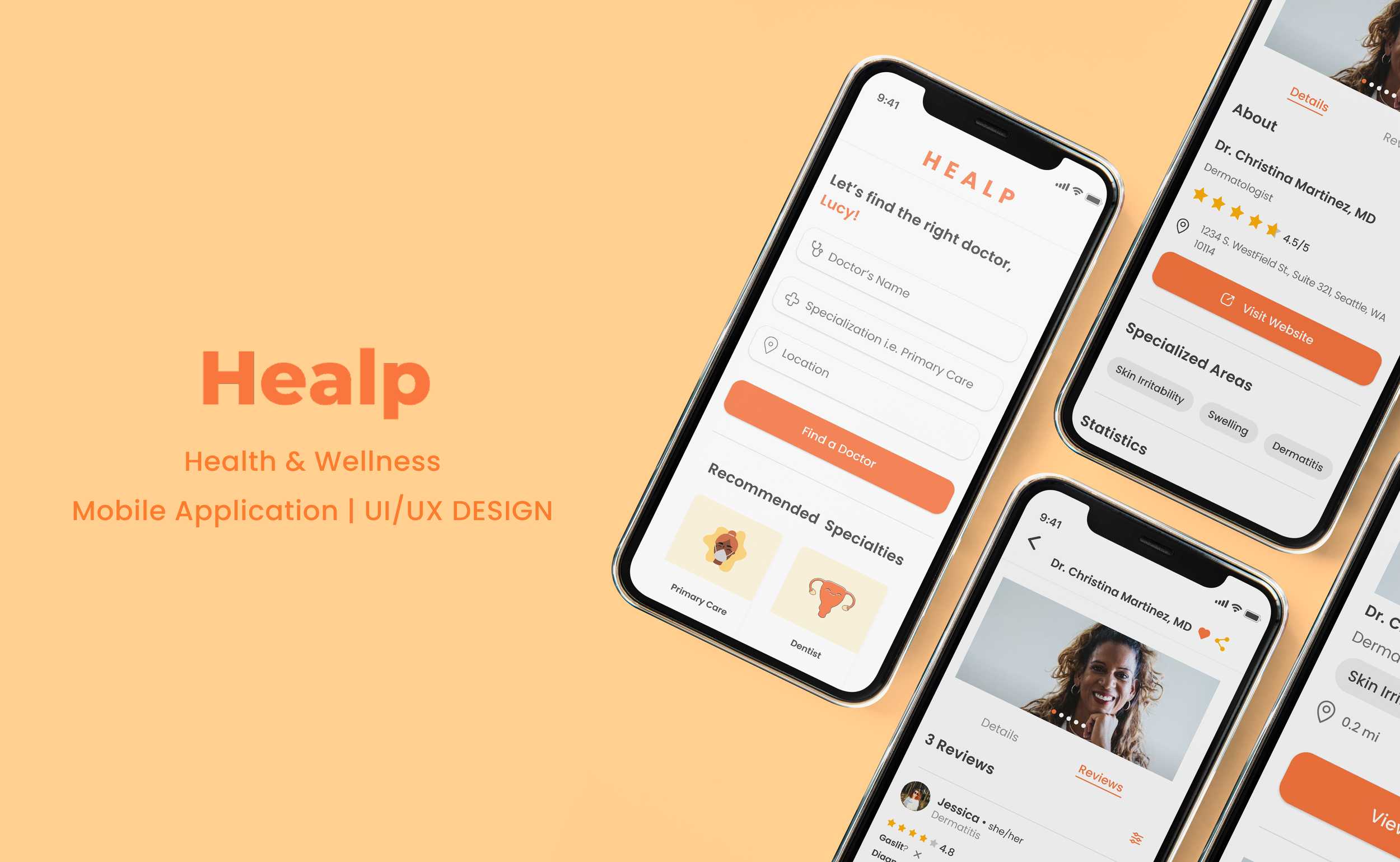
Healp: Mobile Application
UI/UX Design | Mobile Application
**Project under NDA (certain parts are omitted due to privacy reasons)
Healp is a health service platform that uses AI and crowdsourcing to help patients with chronic conditions find reliable treatment by delving into the emotional side of diagnosis and alleviating uncertainty through the community and big data.
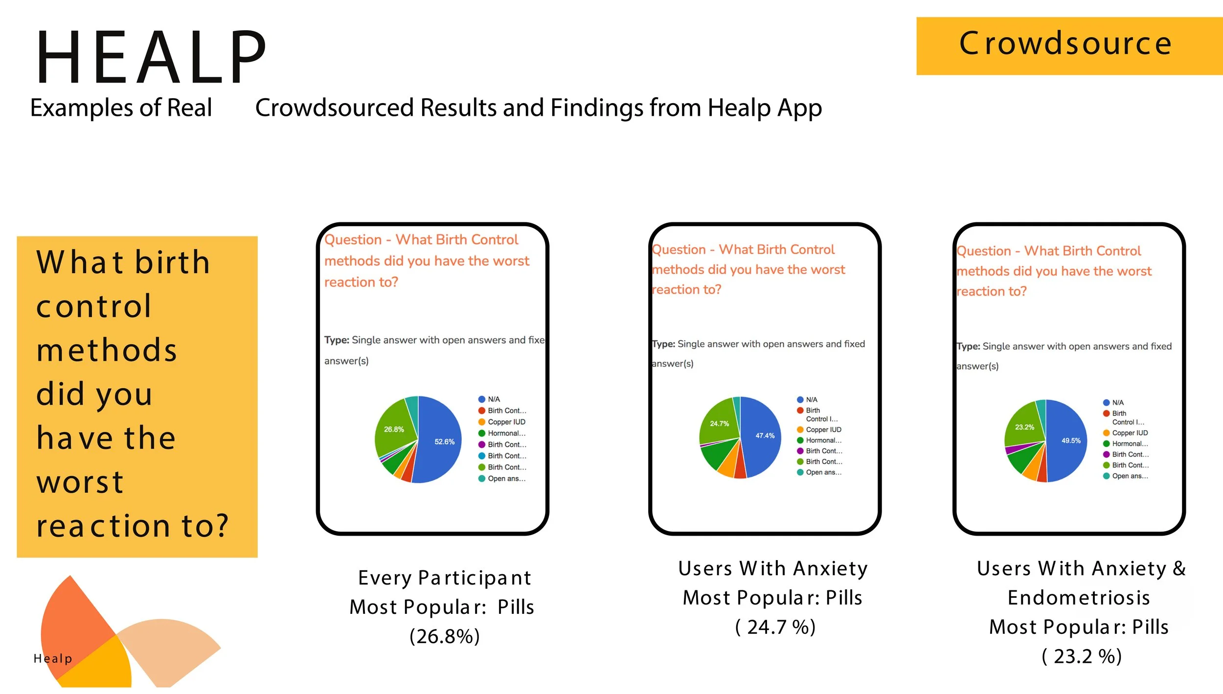
According to Healp’s data analysis, 85% of its survey takers concluded that they experience gaslighting situations when seeing their doctor. In response, the app introduced two new initiatives: the Doctor Recommendation Form and the Find a Doctor search functions, aimed to guide users in searching for doctors with effective results.
TIMELINE
January 2023 - Current
ROLE
UX/UI Designer
TOOLS
Figma, Google Suites, Photoshop
PROBLEM
— Patients with chronic illnesses have a hard time finding the right doctor fit for their needs.
Today, healthcare is challengingly inaccessible, making it difficult for people with chronic diseases to find reliable treatment. While only ~40% of chronic conditions have extensive research and treatment, there is still an alarming lack of resources for many who suffer from untreatable illnesses.
SOLUTION
According to Healp’s feedback forum, users have consistently requested an implementation to intuitively find a helpful doctor who will help treat their illnesses without gaslighting their condition.
Our solution is to tie the community closer by sharing support and suggestions from others who experience similar conditions and embedding a dependable search system to aid in their search for a positive health professional who can reliably address their medical needs.
01 — RECOMMEND A DOCTOR
Share credible doctor recommendations for the community
View helpful reviews by users with personal experience with their provider
Find a suitable health professional that fits your needs and preferences
02 — SEARCH FOR A DOCTOR
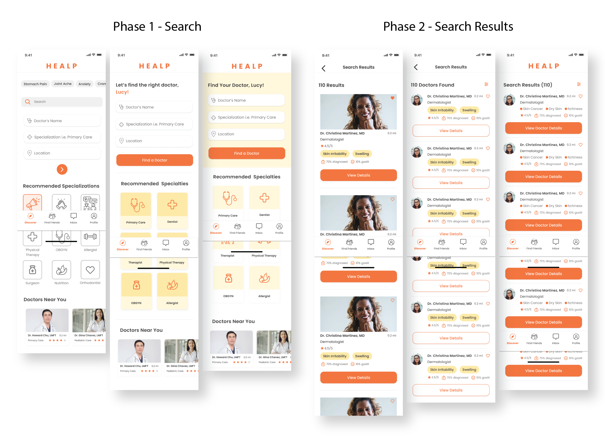
Quickly search for doctor listings based on filtered preferences
Browse and sort through an abundance of doctor options
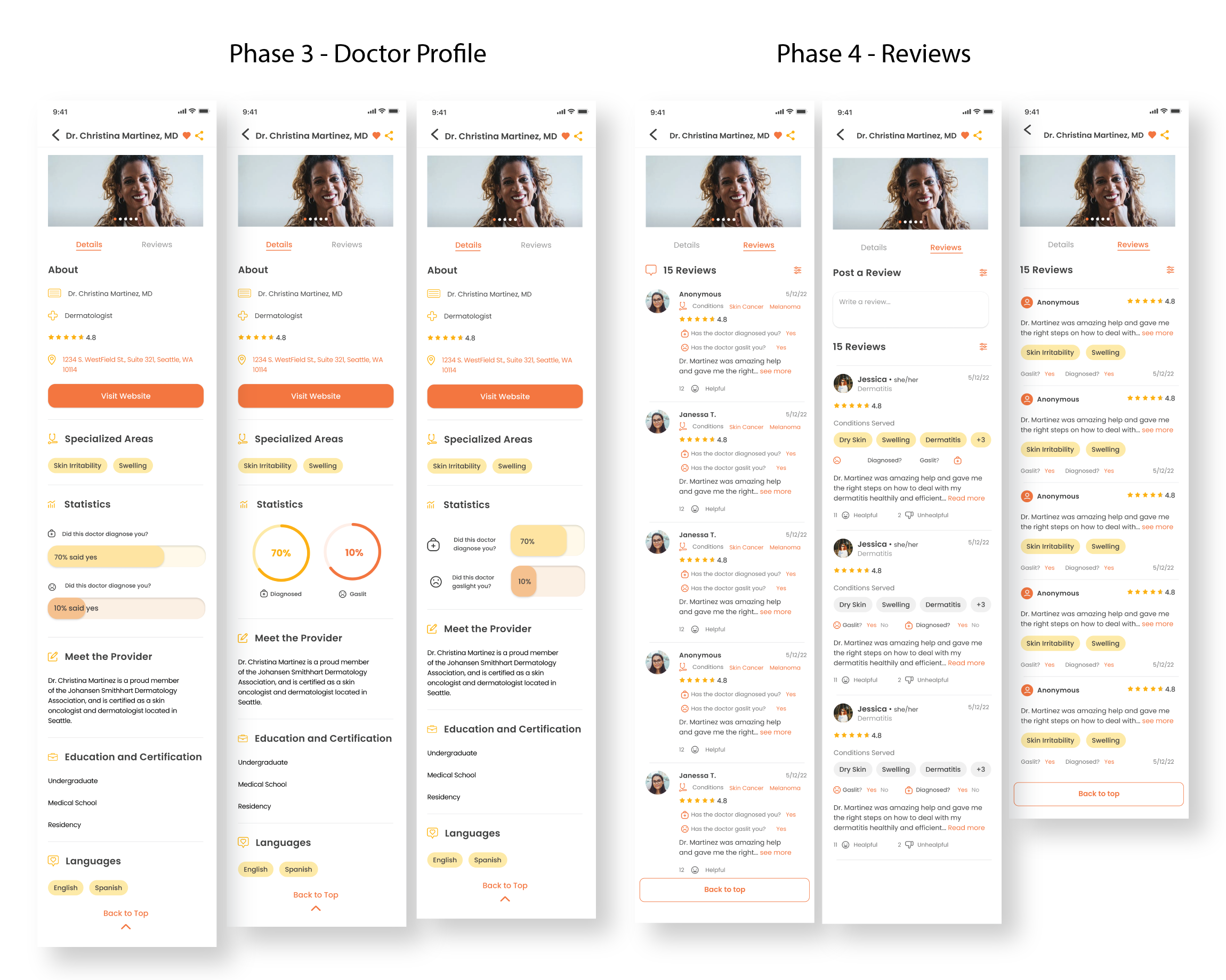
Access a profile summary of the selected doctor
Submit and engage with personal reviews by the community
Healp our users find the right doctor…
Healp strives to facilitate communication and resourcefulness amongst the community by allowing users to recommend their favorite doctors to aid other users in their search.
DISCOVERY PHASE
Assessing the Data Responses
Healp conducted several Q&A workshops to gather helpful information on how to improve the app. The most popular method of finding a doctor is through friend referrals since there’s already an established level of trust. However, not everyone has the same conditions and bodily mechanisms, so it still makes it difficult for chronically ill patients to get the right referrals.
Interestingly, users are inclined to travel farther when they receive proper treatments from a great medical professional. They tend to care about other qualities, including:
Their helpfulness in listening to their health issues
The effectiveness of their treatment and remedies
Consideration of the patient’s time and energy
Understanding the user’s needs
A majority of patients feel hopeless about finding an optimistic doctor, constantly facing struggles in misdiagnosis, receiving the wrong treatment, or being dismissed entirely. According to the Par80 survey, approximately 78% of physicians consider patient referrals a crucial part of healthcare practice, as multiple levels of trust are already established. However, many patients do not experience the same illnesses or symptoms, so chronically ill patients have a hard time getting reliable referrals.
The health community is bonded by mutual health struggles, which empowers users to openly share their positive experiences and insight for others in need.
To help facilitate the communication between users who are looking for resources and users who want to provide help, I proposed a list of questions based on the patients’ experiences to address the problems commonly reported when seeking out a doctor so that the suggestions can be tailored to qualities the user is looking for.
Understanding the Content
-
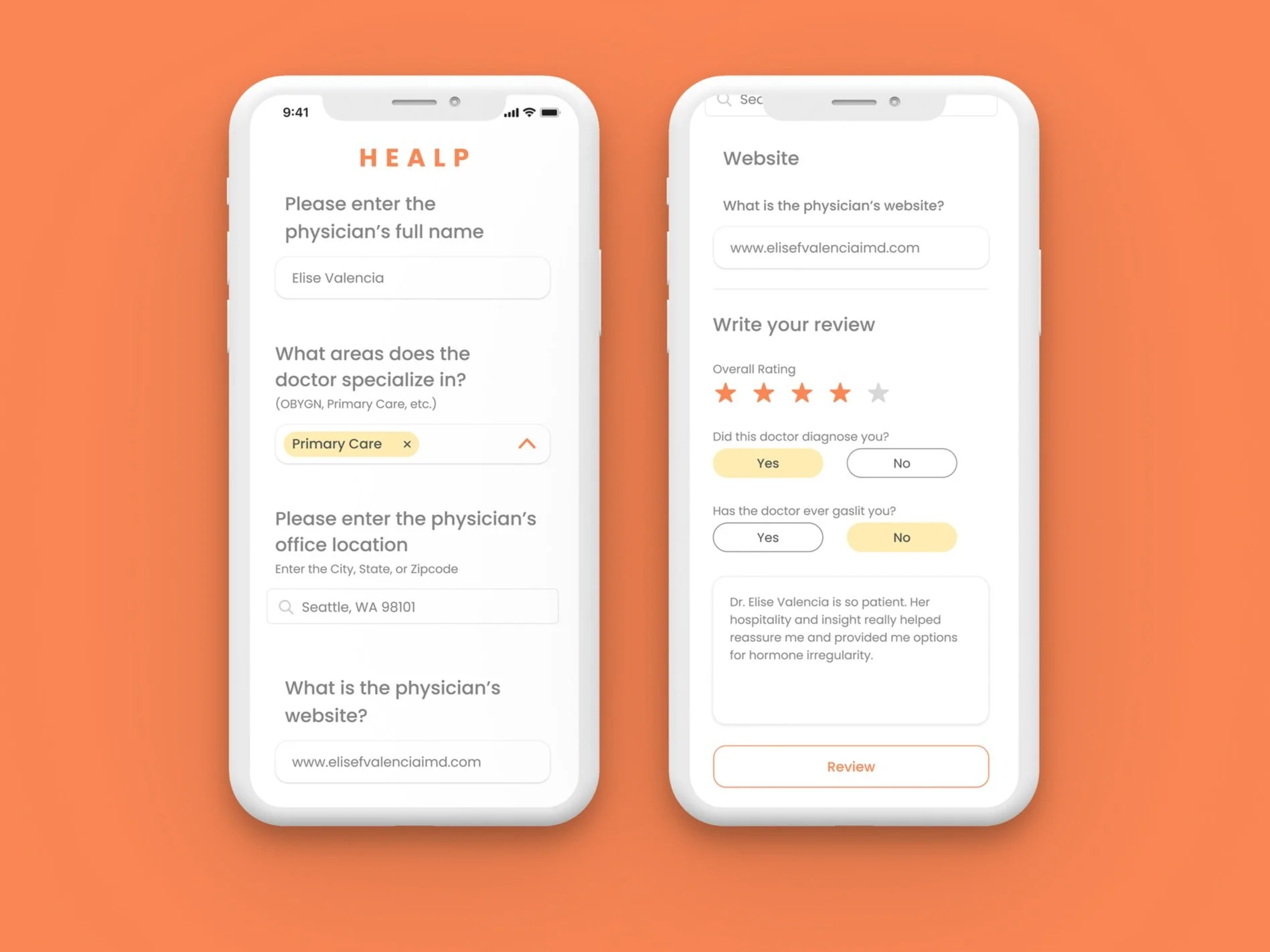
For this question, users must input the first and last name of the doctor to populate the results and identify the corresponding person.
-
To make the results relevant to the users, we agreed that including the areas of specialization to help filter the results would give users a quicker time sifting through the archive.
-
Indicating where the doctor is located will give the users an idea of how accessible the option is.
-
Writing a review will help enforce the credibility of the recommendation. Those seeking results may want to know specific qualities of what made the experience positive to the user recommending the professional.
A few popular factors that users may look for would include, the overall helpfulness, bedside manner, wait time, and hospitality.
FEATURE 01: RECOMMEND A DOCTOR FORM
FEATURE 02: SEARCH FOR A DOCTOR
-
To make the search filtering system efficient and effective, we focused on summarizing the details by asking users to identify:
Special conditions
Location preference
Availability accommodation
-
Once results are filtered, the users need a visually digestible way to view the important information quickly.
We focused on emphasizing the profile image, rating, specialized areas, location, and a scale of how helpful the doctor is.
-
Providing all the needed details while maintaining beautiful flow was important to Healp’s navigation. Our initial deduction based on past research findings helped us prioritize the following sections:
Doctor’s name
Role
Rating
Location
Specialized conditions
-
Displaying commentary based on real users’ experiences can make a large impact on decision-making.
To help users in their research, I designed the review system to highlight the poster’s profile details, along with their review post.
RESEARCH ANALYSIS
Competitive Analysis
For this development phase, we aimed to create a simple and intuitive process for filling out a form by using beautiful UI visuals and keeping the verbiage clean and easy to read.
FEATURE 01: RECOMMEND A DOCTOR FORM
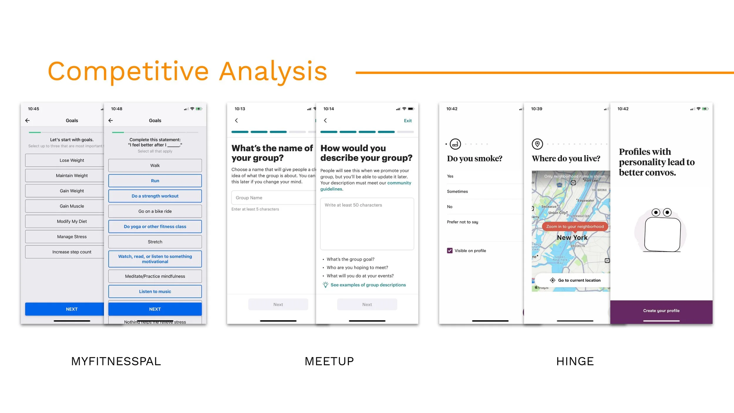
Learning Highlights from Our Competitors
-
Pain Points:
Set up requires tons of detailing, which lengthens the time to complete the process
Gain Points:
Each section had its own screen and transition, which made it easier to digest, but made the process longer
Varying UI elements keeps the process engaging and differentiates (i.e. progress bar) category separation
Overall, not overwhelming and easy to read
-
Pain Points
Content in multiple choice selections is too wordy, bulky
Lack of UI element variation and visuals makes it difficult to detect interactivity and engagement.
Gain Points:
Explaining their options to help guide the user in making choices
Including transitions screens to include advice and explanations of user’s responses
Overall, exhibits a positive atmosphere with tone and wording
-
Pain Points
Overcoming a paywall - users are unable to post unless committing to the subscription at the end of the process
Gain Points
Summarizes briefly, which makes it easy to follow along with
Varying UI elements creates an engaging process
Last screen prompts a call to action, making it purposeful and helpful
FEATURE 02: SEARCH FOR A DOCTOR
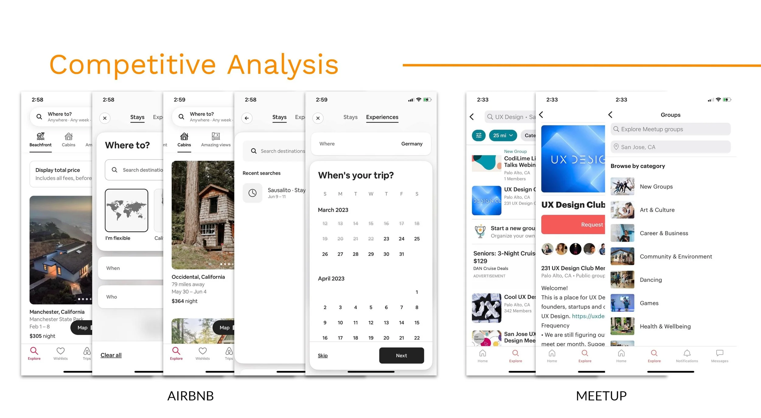
Learning Highlights from Our Competitors
-
Pain Points:
Although buttons are clear, the wording for the call to actions in the results page is not as clear.
Gain Points:
The homepage has a clean and straightforward way in displaying the search engine, which includes the Near Me location, availability, and insurance compatibility.
The results page highlights important doctor details, including the name, role, rating, reviews, location, distance, and availability.
Customizable filters related to the scheduling calendar is accessible at the top of the results page.
Overall, the flow in finding a doctor shows convenience and accessibility very well. The interface is fluid, simple, and modern, ensuring reliability and credibility.
-
Pain Points
The “Stays” and “Experiences” wording is vague and unclear
Requires exploration time to differentiate what the two tabs, “Stays” and “Experiences” entail.
Listing preview does not have clarity with the call to action button.
Gain Points:
The search and filter feature modernly presents its search engine well by guiding the user with three easy steps in defining their preference for area vicinity, projected vacation dates, and number of guests.
Call to action buttons are easy to detect.
Using varying elements, such as horizontal sliders, toggles, gallery photos, and map visuals keep the process engaging.
The listing preview has large imagery quality, and includes all the needed information that the user may want to know.
Overall, the app exhumes cleanliness and modernity. The interface is smooth and easy to navigate through.
-
Pain Points
Unnecessary details and clutter in search process, including the integrated map system, which takes up half of the screen upon entering the screen.
Gain Points
Includes multiple imagery for the user to digest all at once.
Call to action buttons are defined obviously and familiarly to the user.
Reliable search engine provides a great amount of options for the user to skim through.
-
Pain Points
Visually, the format is not as engaging with the lack of larger imagery.
Gain Points
There’s enough filtering details included with the search function, including distance and category of interests.
Using bolder, brighter colors for the call to action buttons make it clearer for the user to choose the option.
Trends in Competitors
After assessing notes on a handful of competitors, I found similar cases with more robust, more impactful form layouts and summarized my findings to consider them in my design process.
Solution: Emphasizing visual elements and using less text copy makes the user experience intuitive, allowing the user to proceed with the task with ease and curiosity.
Opportunities for Growth
Embedding a progress bar or slider dot indicator can create a sense of control and set expectations for the user
Including search bars, results, and suggestions to guide the user in their decision-making
Diversifying UI elements would make the experience more interactive, engaging, and interesting to ensure the user completes the task from start to finish
More prominent visuals with easy access encourages engagement and traction. Visuals help break the text into parts for users, making reading and digesting the information easier.
DESIGN PROCESS
Reinforcing Healp’s Branding
Healp’s branding foundation streamlined the design process efficiently. When coming on board, I found that its interface is largely themed around organic lines, colors, and visuals tied together through minimalism and professionalism.
Restructuring Content Hierarchy and Interface
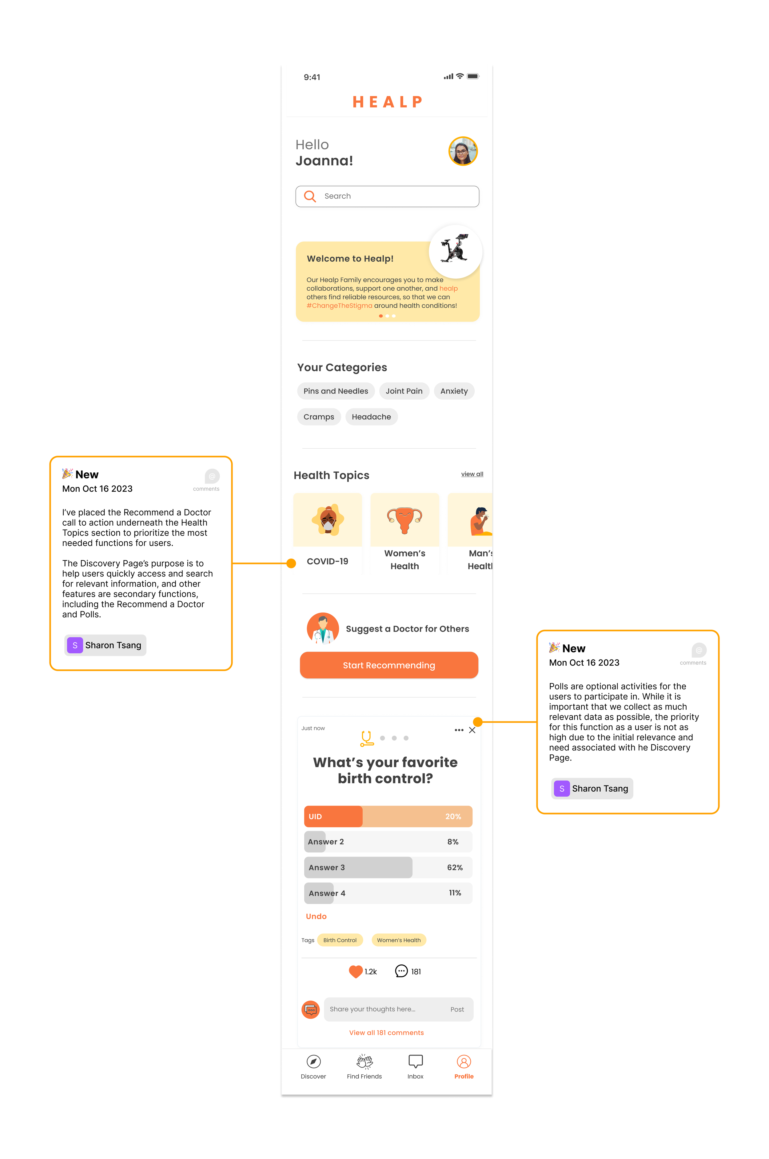
The Discovery Page houses all the community features, including where the Recommend a Doctor function lives. Introducing a new function may be hard to notice or use due to unfamiliarity, so I considered prioritizing the users’ needs and how the users use the Discovery Page based on how they perceived the function.
I’ve iterated five different versions experimenting with the placement of the Recommend a Doctor section by using different colors, artworks, layout formats, and buttons to see which captured more attention while maintaining the flow of the page.
Reinforcing Healp’s Branding
My finalized iteration of the Discovery Page uses minimal colored elements, excluding the call to action button to draw attention to the function. I chose to use white as the background to limit distracting qualities that would clash with the button’s presence. Additionally, I added an icon at the top of the subheading title to keep the user engaged and attentive to the new information they’re digesting.
Collecting Mood Board Concepts
My focus was establishing the hierarchy of information. In search of inspiration, I found beautiful visual features that followed a minimalist style formatting that reinforced legibility and intuitiveness. With the insights we know and understand, we concluded that the recommendation form should encapsulate modernity and simplicity with straightforward elements.
Defining the Design into Mid-Fidelity
I integrated Healp’s UI kit, along with its existing assets to maintain branding consistency while I drafted multiple iterations of both features. Per feature, I made sure to iterate at least 2-3 sets of drafts to open a discussion on what might work best.
Feature 01: Recommend a Doctor Form
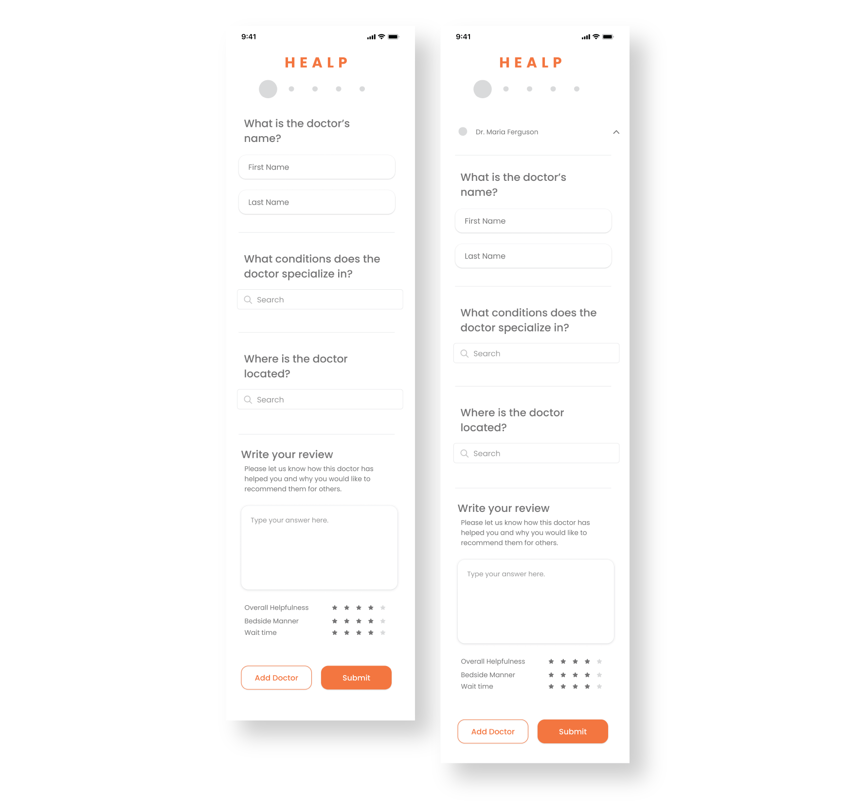
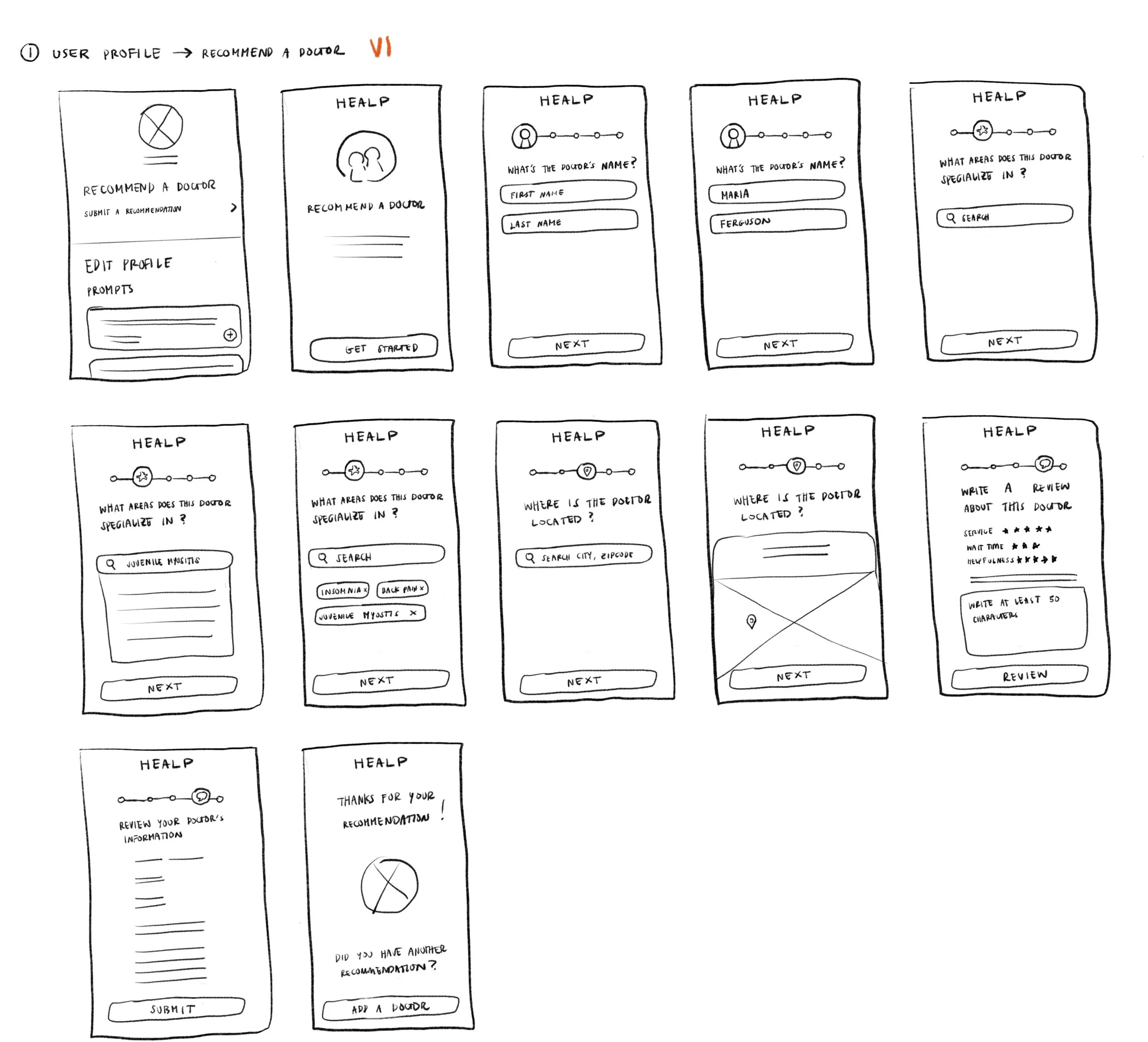
I envisioned the recommendation form in a different layout method, where the user would work through the questions on multiple pages paired with a timeline preview element. As I drafted it, I figured breaking down the content into pages would be less overwhelming in information overload; however, after discussing it with my team, we realized this process could be too tedious and lengthy for the user.
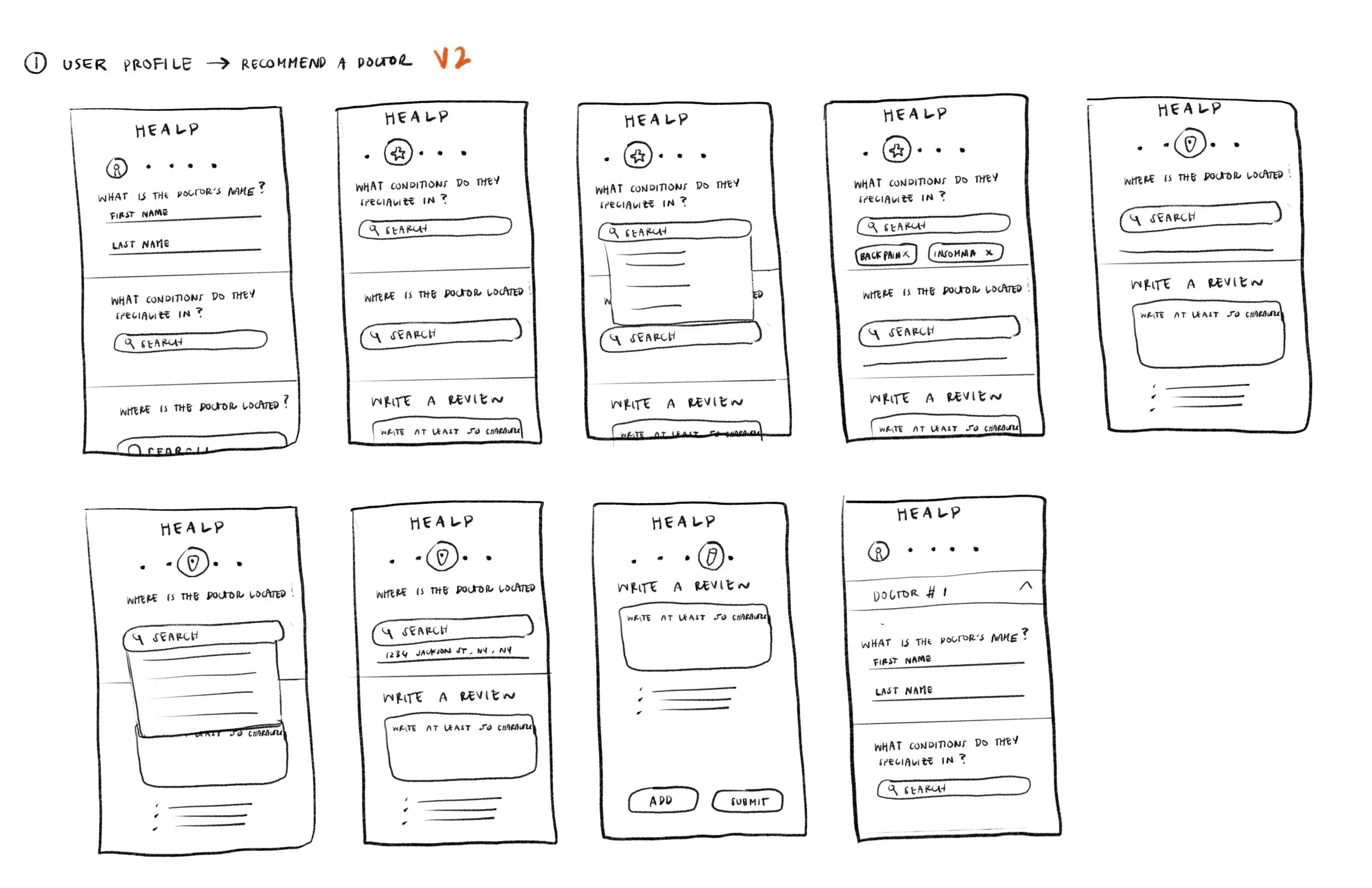
I iterated a second version, depicted on the right, where the form is consolidated into one single page and sectioned by dividers to make the categories more accessible to read.
Feature 02: Search for a Doctor
To streamline the workflow, we broke down Feature 2 into four phases. I designed multiple variations in each stage to test the best solution's possibilities by varying color palettes, buttons, layouts, and visual elements.
To narrow our decisions, we ultimately agreed that layouts emphasizing the large imagery while maintaining the simplified details would work the best. With so much information already established in the health industry, users need more visual engagement to stay focused and interested.
Early Concepts in the Works
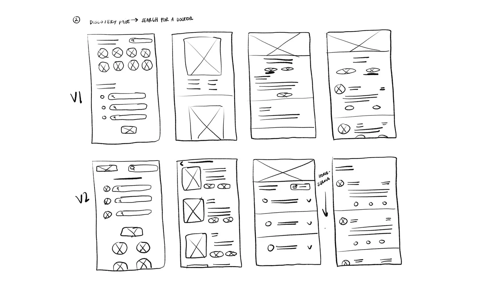
For both features, I sketched out two different versions that tests out different UI elements, so I can see what might work best with the nature of the user flow.
Feature 1’s Sketches…
The Recommend a Doctor Form is aimed to guide users through a form. For people who have less time or patience, I wanted to focus on making it as quick and easy to digest as possible, so, I highlighted the key features:
Adding a progress bar to indicate which section the user is working on. This gives the user an idea of how much time needed to spend to the form.
Dropdown menus and tag bubbles can help the user recall their response more efficiently.
Vertical scroll ended up as our main contender for formatting layout as it feels less tedious than clicking a “Next” button repeatedly. Most frequently used review structures and survey forms nowadays, i.e. Google Forms, uses a vertical scroll.
Feature 2’s Sketches…
The Search for a Doctor function becomes an informative directory for users who need a reliable search system. Users using this feature will need details condensed practically to find the information they need. Some key points that I noted when brainstorming the sketches include:
Adding a progress bar to indicate which section the user is working on. This gives the user an idea of how much time is needed to spend on the form.
Including dropdown menus and tag bubbles can help the user recall their response more efficiently.
Using a vertical scroll as the main layout can help avoid tedious clicking through the “Next” button on each page. The most frequently used review structures and survey forms nowadays, i.e., Google Forms, use a vertical scroll.
Usability Testing for Validation
Given the issues with scheduling and the need for more time for team-oriented meetings, our design team took the reigns to conduct usability tests using our current high-fidelity prototypes. We planned video call sessions to collect feedback on each project’s designs to improve the new functions.
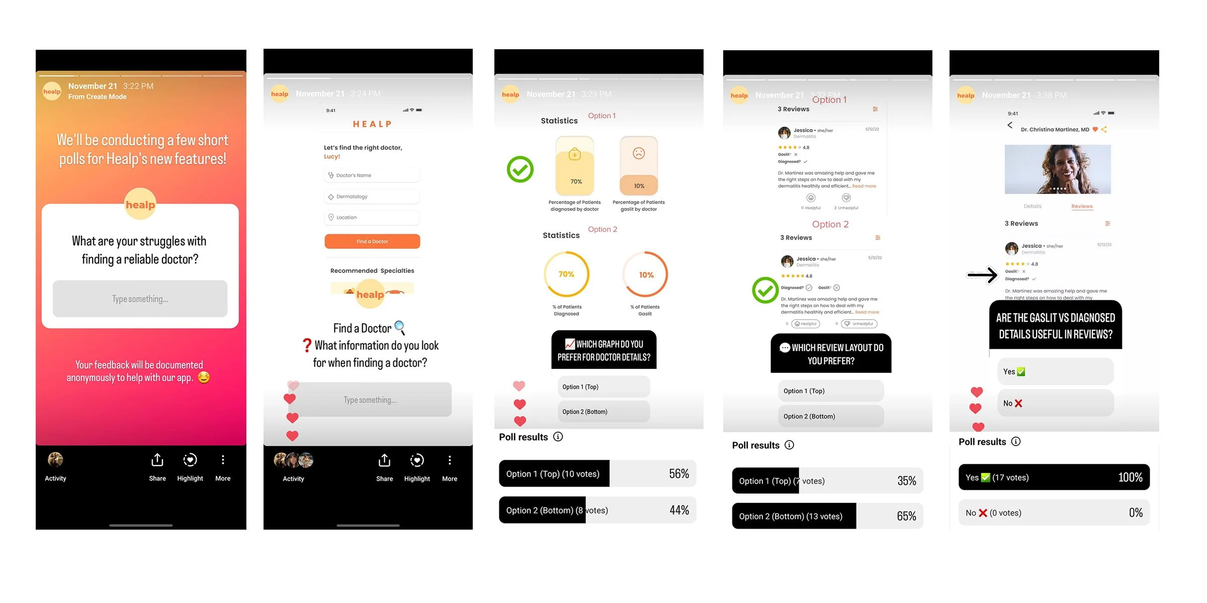
We also took advantage of our social media presence by scheduling a series of different poll surveys on our Instagram stories, letting our users vote on their preferred layouts and functionalities.
Usability Testing for Validation
Before collecting feedback, I mapped out broad questions to ensure the context would be general enough to funnel our sought answers.
What are your struggles with finding a reliable doctor?
Are there any details on this Doctor recommendation form that must be included?
Finalizing the Hi-Fidelity Wireframes
Based on the usability test, we found components lacking in the Recommend a Doctor Form. While the design was straight to the point, less is always more.
FEATURE 01: Recommend a Doctor Form
Some issues that were addressed during the prototype assessment:
Visual indication to guide the user
I eliminated any remaining introductory text to allow the functionality of the design to do most of the “talking.” In turn, I added more visual elements and heading titles to help guide the user through filling out the form, including a progress bar with subtle slider dots.
Hierarchy of information with rating placement
My tester noted that she expected the rating portion to appear first when proceeding with the review section. With the current trend shifts in many popular search directory apps, like Google or Yelp, we’ve grown accustomed to viewing a typical step-by-step process for review systems, such as leaving commentary for last or optional.
I shifted the order by moving the rating stars to the top of the review section and placing the commentary section below for any optional notes about the recommended doctor.
Call to action clarity
Upon completing the form, the user is prompted with two paths for the call to action. The tester was confused with the verbiage of the buttons. There must be a more precise indication that the form is complete using different phrasing, such as “Add Another Recommendation.”
Additionally, the back button could be placed at the top of the page so the user can quickly access the previous page or edit their response.
Heading title clarity
Categorizing the sections by labeling each one with clear heading titles can help organize the user’s train of thought more vividly, rather than having them read through walls of text.
FEATURE 02: Search for a Doctor
Understanding the users’ needs and funneling the information they want to see was a hurdle for this phase’s function and design.
Visual graphics for stats
We concluded that accentuating the numbers using vibrant branding colors and increasing the font size would be more eye-catching. Most of the votes in our poll survey indicated that most users preferred seeing the bar graph, as it remains a standard style for statistical visuals and seems to register to the public eye more intuitively.
Informational Hierarchy
I rearranged the content structure within the Doctor Profile so that the “Meet Your Provider” lives near the top, where its information is relevant to the rest of the background details.
Comments and review section layout
The horizontal engagement/reaction layout was much preferred for the Review Section. The horizontally formatted elements also take up less space and, therefore, feel shorter and quicker to read.
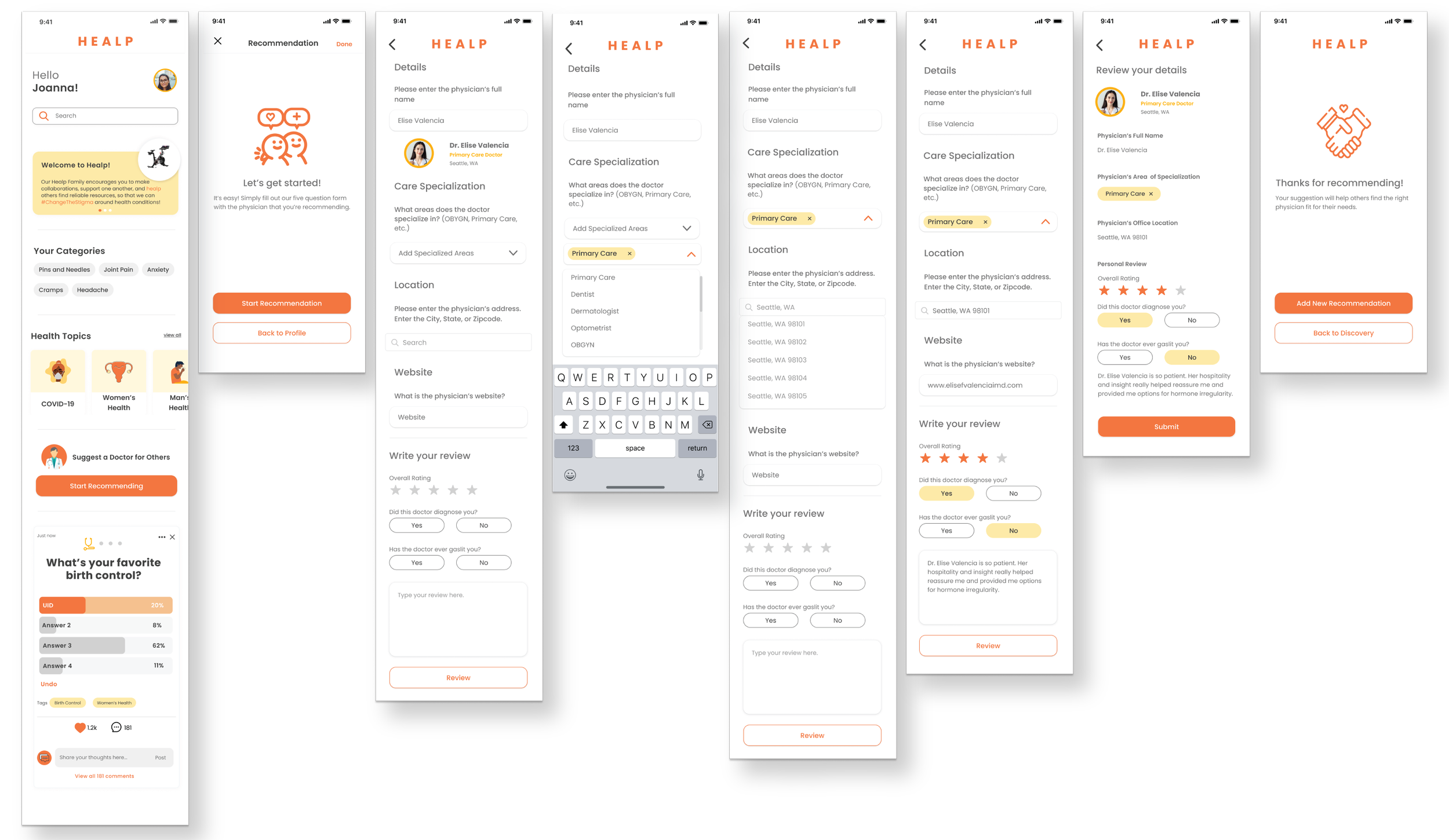
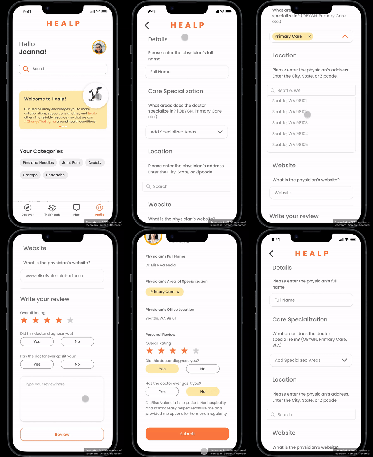
Recommend a Doctor Form
Feature 01
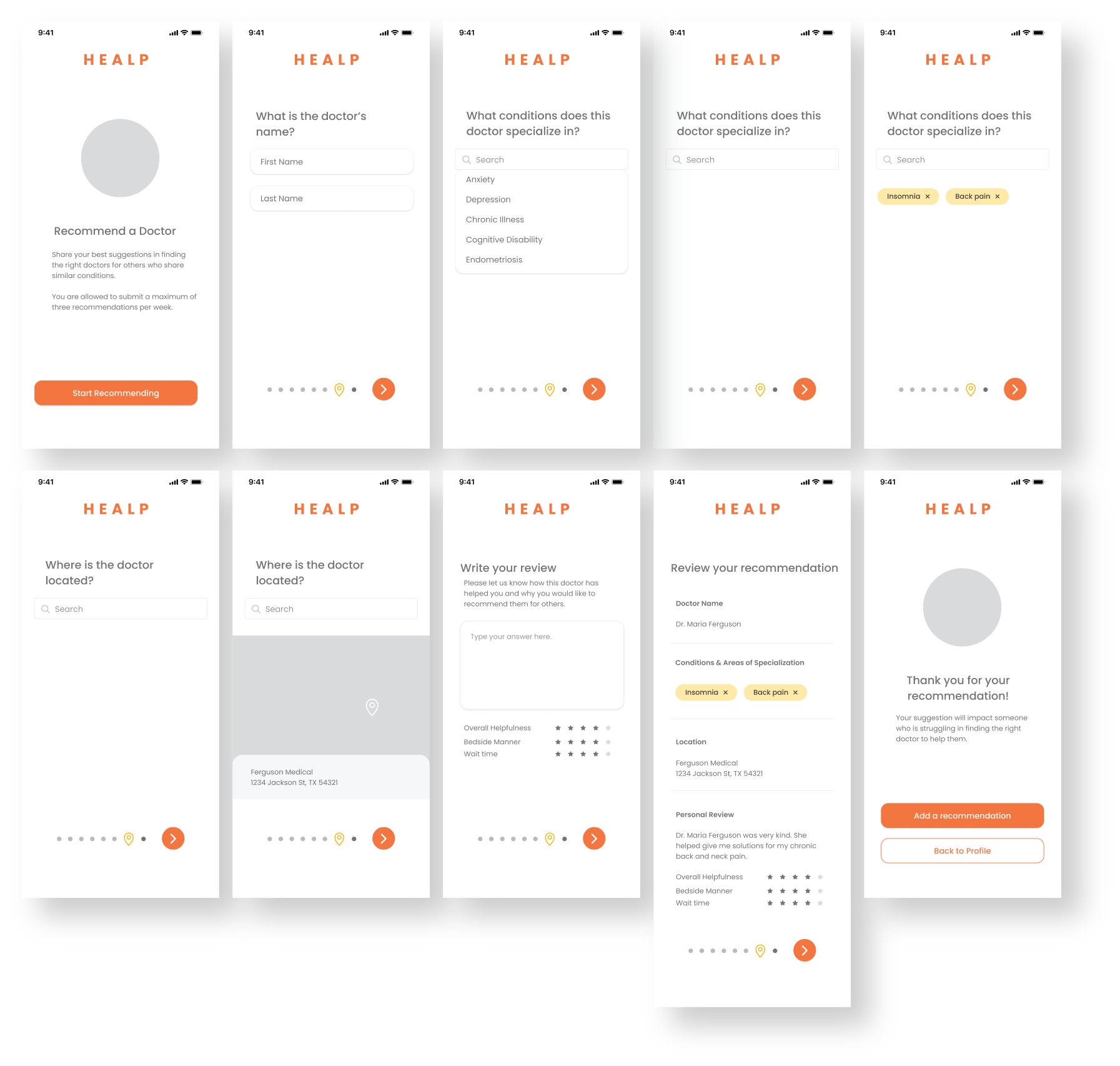
Healp strives to weave the community together by giving users a streamlined way to recommend and receive reliable doctor suggestions who can help treat their medical conditions.
The sense of empowerment will offer positivity and hope as they seek out more resources for credible professional help.

Discovery Page

Introduction
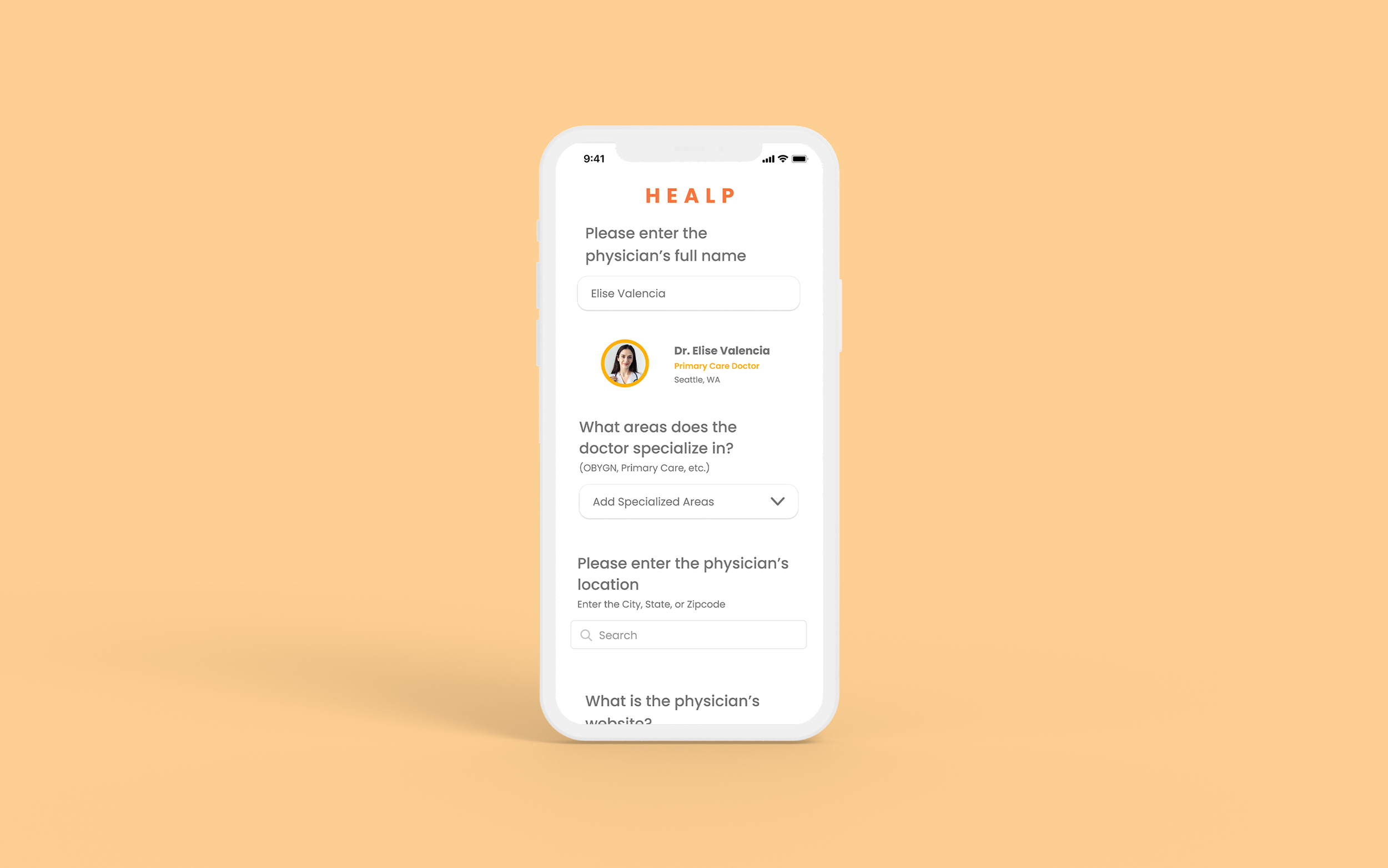
Enter Doctor Details
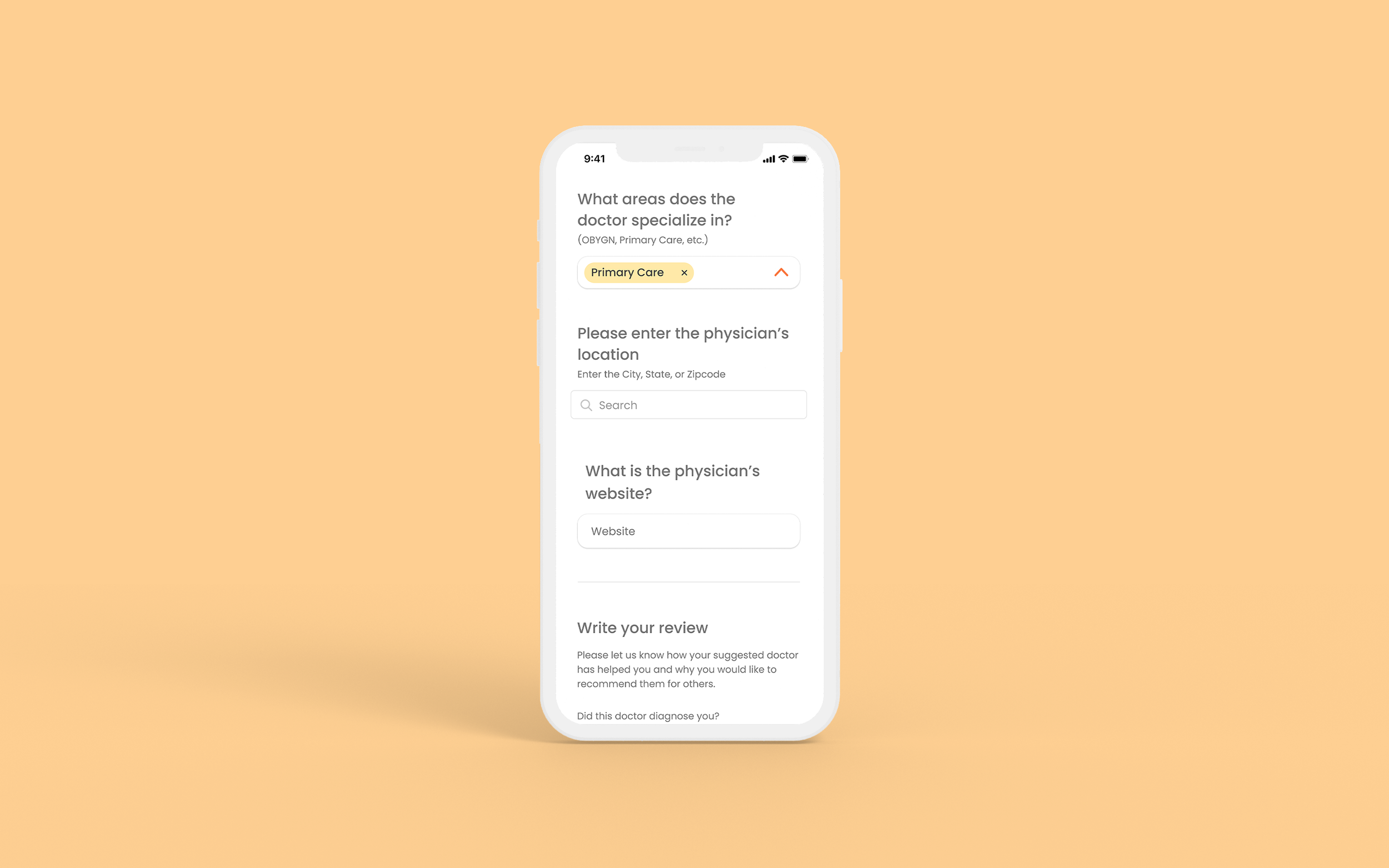
Enter Doctor Details
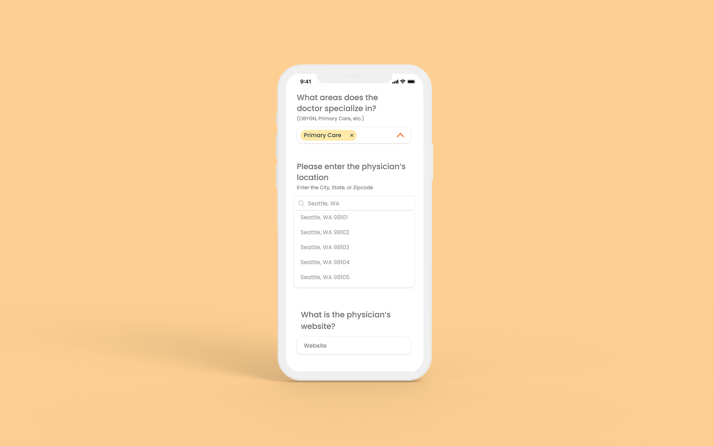
Enter Doctor Details

Write a review

Review Submission
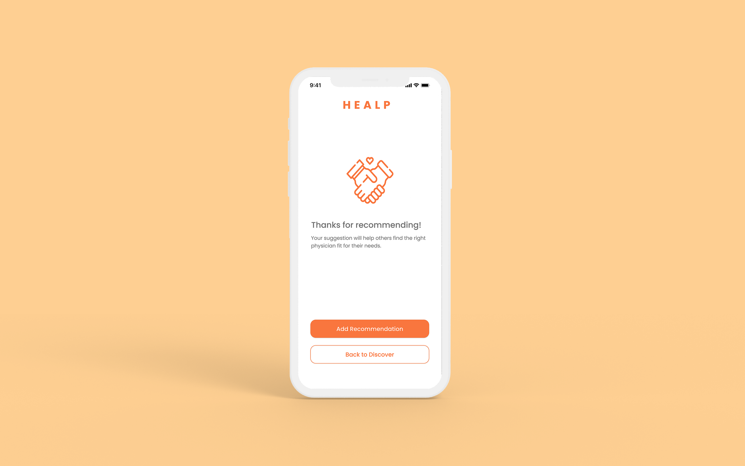
Recommendation Submission End
Search Directory for Doctors
Feature 02
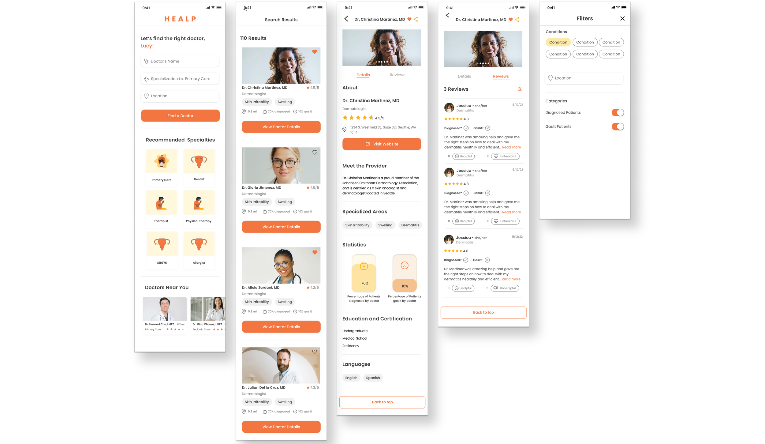
Today, search directories provide users with a more effective research process for finding sources.
Healp’s vision is to provide users with a convenient method of finding information through an integrated search function that channels filtered results and unifies the necessary details of healthcare professionals’ backgrounds.
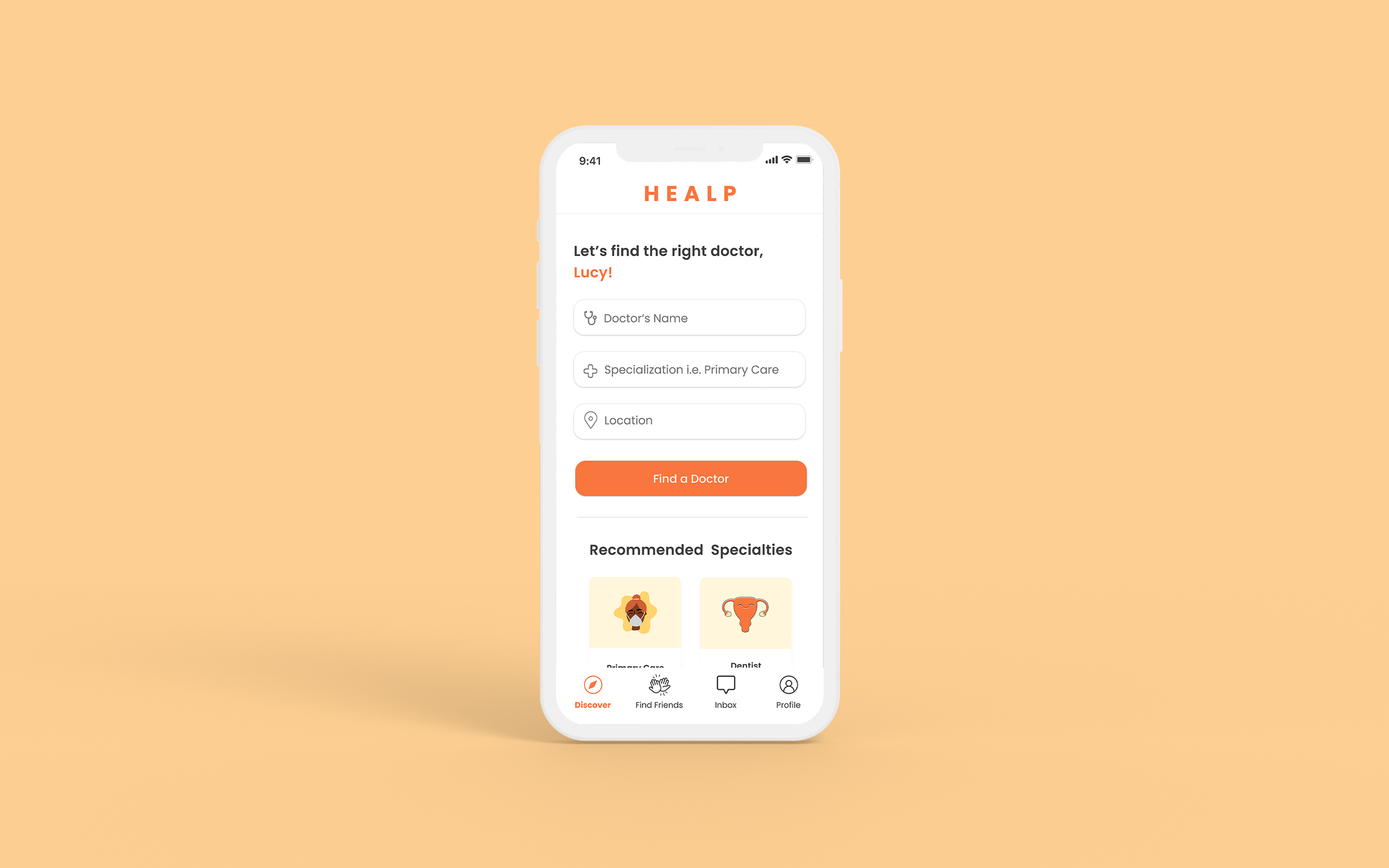
01 - Search Directory Home

02 - Search Results

03 - Doctor Details

04 - Doctor Details (continued)

05 - Reviews
The Final Design and Results
Ultimately, the recent development in the health market impacted Healp’s decisions to delay the release of both the Doctor Recommendation Form and Search directory due to prioritization in monetization. Healp decided to pivot its market into improving patient needs within clinical trials so that noninvasive trials can be conducted for the suitable patients.
With its current market trends, the health industry is emphasizing a need for clinics to aid in patients finding doctors who can successfully help their patients. This issue affects not only patients but also their insurance companies, who need to cover copayment costs, which increases the need to expedite the process for doctors and patient needs.
While the priorities have shifted to improving clinical trials, Healp still aims to implement changes to its forum activity for higher user engagement opportunities, and the pipeline of the doctor recommendation and search features will be pushed out to quarters 2 or 3 in 2024. Our current feedback was helpful in further understanding what the users needed.
Recommend a Doctor
Search for a Doctor
THE ASSESSMENT
Throughout the first and second quarters of the year, we made decisions that helped impact the process for each phase.
Setting Goals
Initializing a timeline and set of expectations helped provide standards and structure to our team, fueling motivation as we chip away at our project advancements.
Utilizing Data and Resources
We used our past user database during peak COVID-19 years (2020-2022) and assessed responses based on their needs and desires. Understanding our audience gave us a unique perspective that helped align our design direction and business strategies.
Designing with Functionality and Appeal
The implemented features create a new outlet for the community to participate and engage with one another more closely. The interface designs emphasize cleanliness and legibility to encourage interactivity and facilitate optimal research guidance.
Eliminating unnecessary jargon and increasing visual elements, including vibrant branding colors and negative space, elevates the clarity in all the components needed to exercise the tasks. We chose to arrange the hierarchy of information about the users’ most frequently requested information, aiming to give the best user experience for our users when conducting their research.
TAKEAWAY
Learning Points
Facilitating transparent communication and diligently meeting goal deadlines will enforce efficient hand-offs to the Development team.
While iterating the drafts, simple nuances can confuse the user, especially when they might not be as used to seeing the element of function as often.
When phases are delayed or direction and leadership are missing, take ownership of the project and work with your teammates as needed. Optimizing time and efficiency will go a long way with productivity.
Communicating with a design team can stimulate great conversations that open new perspectives, ideas, and techniques.
Asking questions to clarify different design elements needed for decision-making encourages positive and effective discussions.
Be specific with user testing questions when asking for feedback; this will ensure that users’ responses will stay focused on the particular feature evaluation, rather than getting distracted by an irrelevant detail


