The Olive Branch of Hope: Website Redesign
UX Research | UX Design | Visual Design
The Olive Branch of Hope is a non-profit charitable organization that provides social, emotional, and holistic support for women diagnosed with breast cancer.
In 2021, the organization initiated a rebranding strategy to establish a stronger online presence. Our team is tasked to help rebuild Olive Branch of Hope’s branding foundation to make sure its services are conveyed effectively and actionably on their website.
TIMELINE
June 2023 - Current
TOOLS
Figma | FigJam | Notion | Photoshop
Problem
— The current website layout lacks a hierarchy of information, credibility, and content accuracy. It fails to meet accessibility standards, challenging the organization’s promotional efforts for its cause, thus decreasing growth opportunities in traffic and user acquisition.
As a team, we strategized to identify the most pressing issues on the platform, conduct backend research, and create design plans to address and enhance the functionalities efficiently.
Solution
We concluded that the Olive Branch of Hope’s website must be redesigned to improve the user’s experience in navigating, accessing, and engaging with resourceful, accurate information related to the organization’s initiatives, goals, and services.
Our team created branding personas, assessed UX audits, and designed multiple iterations of wireframes to change the website and branding strategy approach.
Scoping out the needs in our objectives
The organization is looking to expand its engagement on its social media and website so that it relates and appeals to supporters from ages 18-35 years old. The objective is to strengthen the cause by increasing event attendance, donations, and overall breast cancer awareness support.
BUILDING COMMUNITY
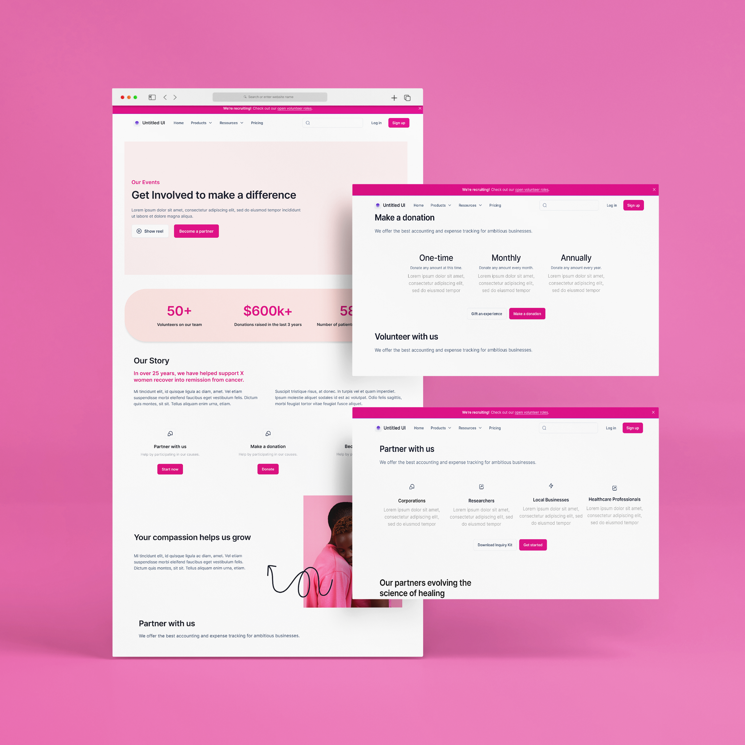
FEATURE 01 — GET INVOLVED
To encourage companies to contact our sales team and learn more about TOBOH’s mission to support women diagnosed with breast cancer.
Become a Partner
Showcases our current partners, the types of groups we want to work with, and how working together can make a difference in reinforcing credibility and trust.
Make a donation
Provides supporters with the option to offer monetary or tangible donations through packages and experiences.
Volunteer with us
Encourages users to participate and engage with our activities, resources, and events by offering role applications to specific areas where we are in need of help.
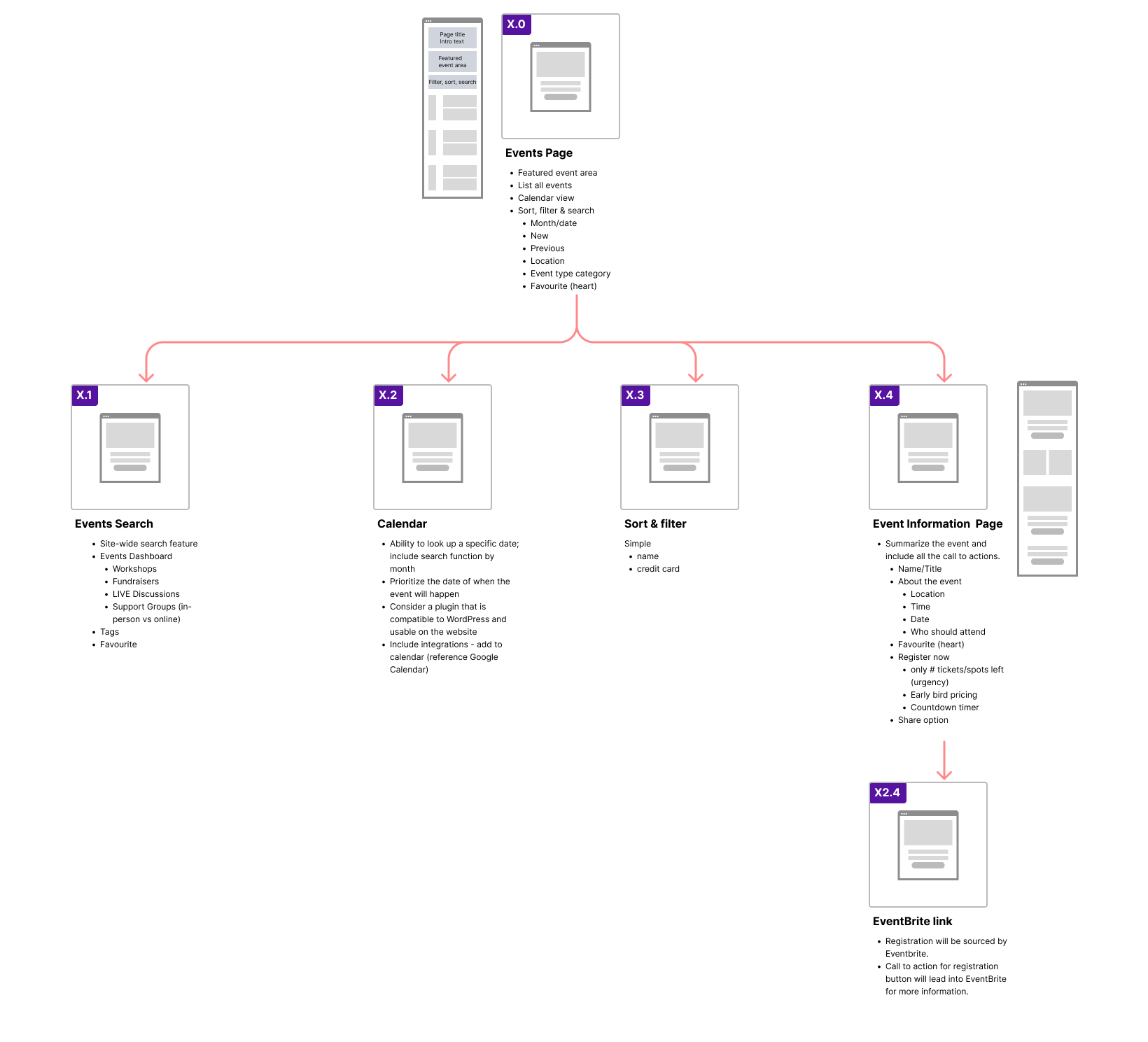
FEATURE 02 — EVENTS
To archive and share past, current, and upcoming events so that users can actively learn about and sign up to attend online or in person.
Workshops
Offers educational sessions on specific health topics for those who want to learn about scientific advancements, social issues, and health advice.
Fundraisers
Promotes charitable events that focus on spreading awareness and raising money to support diagnosed women through the obstacles of enduring breast cancer.
LIVE Discussions
Engages an audience in professional discussions with healthcare experts on different focus areas of health.
Support Groups
Allows users to receive resources and emotional communication through an empathetic network and community.
Actionable Experiences
The Olive Branch of Hope is integrating features to help support its cause and reflect on opportunity, involvement, and growth.
I volunteered to redesign the Involvement and Events pages because of the significant impact on the company’s goals and mission. I want to challenge my design thinking by aligning the needs of our users and the visual intuitiveness with the actions set by the organization.
DISCOVERY PHASE
With the lack of updates, many issues surfaced and remained unaddressed. We began investigating the current site to document how it currently functions for a practical assessment of design and functionality.
Light Bulb Questions
Can the user access the page alternatively using another starting point?
Which page connections make sense intuitively? Are there flows that can be restructured?
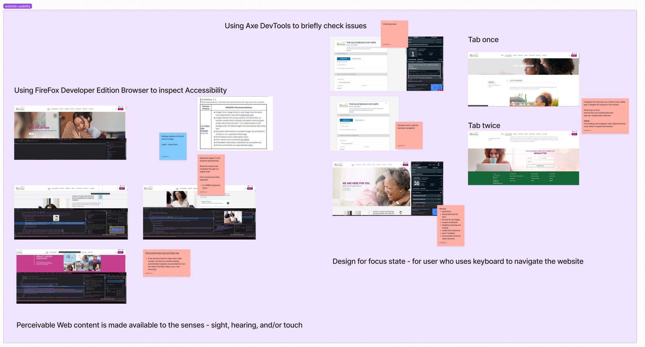
Using AxeDevTools to Check Issues
After using Firefox Developer Edition Browser to quality-check our accessibility standards, we were surprised to find several on-the-surface issues with the site, including:
Missing majority of Alt Text in images and selected elements
Keyboard support is not implemented properly
Lack of hierarchy and form with visual elements
Missing landmarks, unique ID attributes, heading hierarchy structure
Discernible text for links
Disabled zooming and scaling
Site Mapping and Checking Usability Issues
To kick off our UX audit, our design team screenshotted all the existing pages on our current website to visualize the user flow. A crude diagram of how the site is broken up would help us visualize how the user accesses certain pages.
Perceivable web content should accommodate the senses, including sight, hearing, and/or touch. This would ensure that all the cues are communicated to people thoroughly, whether or not they have a specific impairment.
Sitemap created by Kaman Au
UX Audit Analysis
Our UX design team found usability and accessibility issues on the organization’s website that had to be addressed immediately in order to fit the ADA compliance check and WCAG standards. We used colorful post-it notes to identify problems, opportunities, and idea recommendations for every section.
After analyzing the website, we conclusively recommended the Management team prioritize the immediate issues on the website while the design team redesign a new framework.
✕ Paint Points:
Accessibility Issues
Broken or missing buttons across different web pages
Error with specific browser access
Visual Contrast
Missing Alt text
Usability Issues
Poor content quality — Information and imagery are missing or are not up to date
Lack of hierarchy of information — Content is disorganized and overwhelming with clutter
Lack of credibility — No valuable credit sources in sponsorships, partners, and profile cases
✓ Recommendation Gain Points:
Quick and easy way to meet new people outside of your social network
Prompts allowed them to display their creativity in developing their profile
Having control of who they would like to meet (set preferences)




Prioritizing our Tasks
Naturally, the issues and changes that needed immediate implementation were jumbled and crazy disorganized. Our design team spent our next meeting organizing a Risk Matrix to make a follow-up proposal for our Project Manager.
We took the assessment findings from the UX Audit and turned them into post-it notes to group them into categories more easily. Each Post-it note contained a problem that needed addressing, and it was our call to determine which problem needed the most immediate prioritization.
High Value, Low Risk
While the homepage includes all the details you would expect, the amount of information is overwhelming with no sense of hierarchy, making it difficult to quickly find what the user is looking for.
High Value, High Risk
The knee-jerk reaction may be to use the quick-apply on the homepage. However, the current CTA button leads to an error page, which breaches accessibility standards. At this point, the user may be confused and frustrated about wasting more time searching for another way to access the volunteer page.
Low Value, Low Risk
After finding another way to access the Volunteer Page, the user would access a page full of opportunities to be more involved with events. Although navigating and accessing the page was tedious, the button is easily found once the user scrolls down.
Low Value, HIgh Risk
The form is quick and easy to fill out, and after submitting her application. However, the form doesn’t include any other options to share the details. Jocelyn may want to send the volunteer form to her friends in case others are interested in helping.
Insights
Our UX audit assessed that the current website fails to meet the WCAG Standards according to the ADA compliance checker, which can lead to serious legal issues if not appropriately addressed. The chart helps us determine which issues should be fixed before moving on to more time-consuming problems.
User Persona: Meet Jocelyn, the Proactive and Empathetic Volunteer
For our user personas, we filled in the gaps with what we already knew based on our current information from past observations and survey findings.
As a breast cancer survivor who understands how difficult it is to endure the journey to recovery, Jocelyn actively participates in any way she can. She’s constantly relying on the organization’s website to receive updates, apply to events, and make donations. Although she doesn’t call herself a tech-wiz, she still needs to access the site regularly, so having an intuitive and straightforward UI layout would be easiest for her to learn and use.
Customer Journey Map
Using the User Branding Personas created by our Senior Designer, our UX team focused on fleshing out branding personas to reflect our current users' potential behaviors and decision-making.
Each phase explores a different train of thought, action, and saying related to how the user interacts with the website. In my user persona, I’ve documented an analysis of how Jocelyn engages with the website to sign up to be a volunteer.
Phase 1: Homepage exploration
While the homepage includes all the details you would expect, the amount of information is overwhelming, with no sense of hierarchy, making it difficult to find what the user is looking for quickly.
Phase 2: Search for volunteering opportunities
The knee-jerk reaction may be to use the quick-apply on the homepage. However, the current CTA button leads to an error page, which breaches accessibility standards. At this point, the user may be confused and frustrated about wasting more time searching for another way to access the volunteer page.
Phase 3: Access the “Get Involved” tab on the top navigation bar
After finding another way to access the Volunteer Page, the user would access a page full of opportunities to be more involved with events. Although navigating and accessing the page was tedious, the button is easily found once the user scrolls down.
Phase 4: Completing the volunteer application
The form is quick and easy to fill out and after submitting her application. However, the form doesn’t include other options to share the details. Jocelyn may want to send the volunteer form to her friends if others are interested in helping.
Insights
Understanding our users’ goals and how they would instinctively behave when engaging with the current product will help put the issues into a more open perspective. Some issues found when exploring the user’s task flow in accessing the volunteer page include:
User had a difficult time locating an immediate way to volunteer
The volunteer button is located on the banner, but the transition is too fast and can be missed by the user
Fix the “No Results Found” issue with the banner’s volunteer button
Let users know what to expect post-submission and how they can actively share the volunteer form
Opportunities for Growth
Reduce text clutter across all pages for the user to read through will help the user digest the information and find what they’re looking for more intuitively
Address the minor bugs and error pages will waste less of the user’s time and decrease moments of frustration
Consider changing assets (i.e., carousel timing and banners) to facilitate more visual engagement and accessibility
Presenting Solutions Moving Forward
After analyzing our issues, we prepared a UX audit presentation and a series of questions for the involved stakeholders to fully digest the information needed to make the necessary improvements as soon as possible. Once we entirely presented the ongoing problems and our solutions to work around them, we consolidated a priority list for our project manager and development team to reference.
-
Resources in wellness, nutrition, and other programs motivate our users. However, usability deficiencies make it harder to maintain the traffic of the current user demographic.
-
We have community partners, but donors do not have enough recognition and credibility.
-
Defining our initiatives with a more precise and curated call to action will help stabilize our content.
-
We currently need more resources to have more involvement in testing.
-
The transition to performing CI/CD pipelines may be for a future initiative once the website is recreated to be more consistent.
The Strategy Breakdown
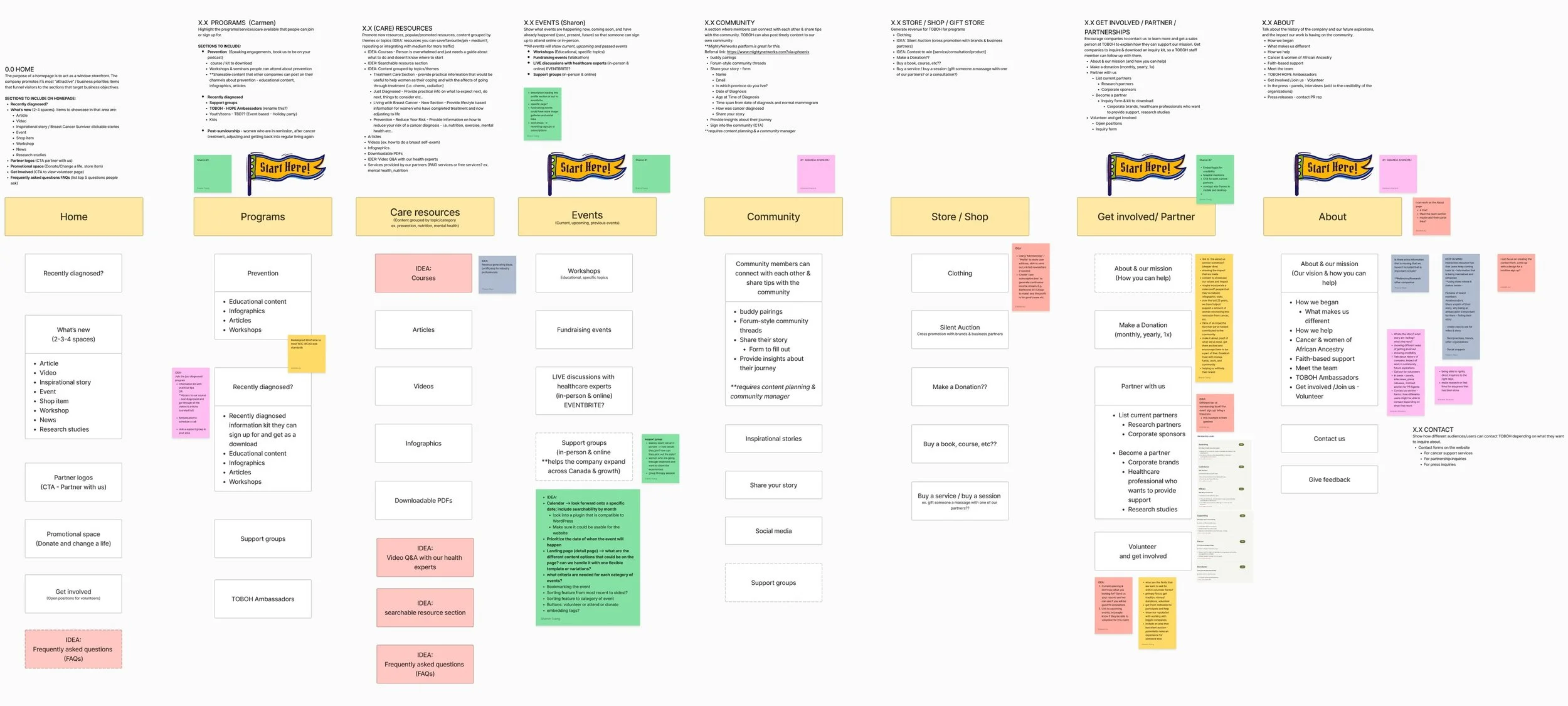
The team built a general hierarchy of information to get a better understanding of what elements we currently have and the functions we were aiming to include for our new launch.
My Senior Designer and Project Manager provided the design team with a bare skeletal structure to get the ball rolling. We had long, fruitful conversations that gave me plenty of ideas to work with, which I earnestly noted down during our chats.
User Flow Diagram: Get Involved Page
Mapping out the bare skeleton of the wireframe screens with layout thumbnails and what each service provides helped clarify what comes next.
User Flow Diagram: Events Page
Mapping out the bare skeleton of the wireframe screens with layout thumbnails and what each service provides helped clarify what comes next.
THE DESIGN PROCESS
Defining the Design and Functionality
The focus was not to make it pretty but to emphasize whether the foundational flow was designed successfully to ensure that the user seamlessly and effortlessly cruises through the website with no problems.
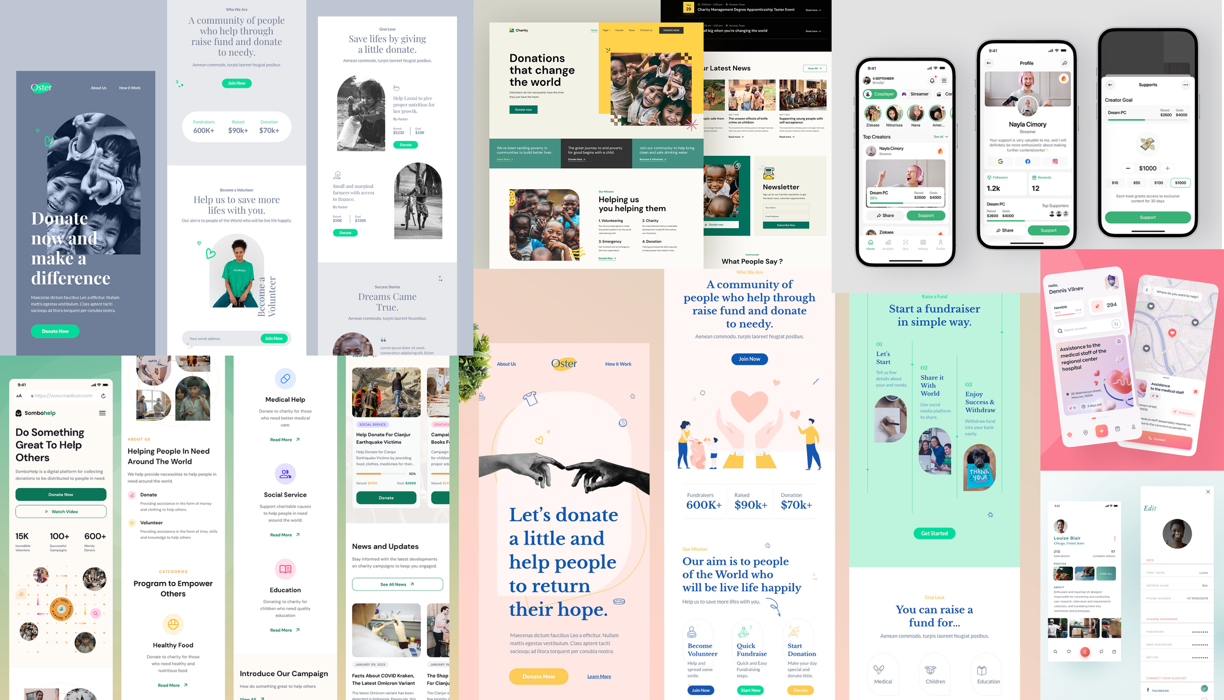
Mood board
As I collected ideas and researched how charity organizations display their contributions and services, I found similar layout patterns in cleanliness, modernity, and simplicity.
Showcasing achievements and accomplishments added credibility to the organization. I felt more secure knowing how the organization was using its contributions to help the cause. I love the establishment of trust and professionalism while maintaining a sense of humanity, which was something that the Olive Branch of Hope didn’t focus on as much as it should have.
Sketching the Design: Events Page
Sketching the Designs
I initially started with a mobile-first design to ensure that our website could be as responsive as possible when users want to access the platform. Thinking about my design in mobile-first allowed me to assess the most important features before detailing the functions on desktop.
Sketching the Design: Get Involved Page
Sketching the Design: Events Page
Revisions & Notes
After evaluating our demographic and feature implementation, we opted for a desktop-first design to accommodate the users who most frequently go onto our site.
For time-saving and efficiency, we took the initiative to use design kits to speed up our mid-fidelity process to present our decisions to the executive team for approval to meet our launch Q1 in 2024.
In the next phase, I’ve documented notes based on feedback received from my co-designers and Project Manager so that I can make improvements based on our refined scope.
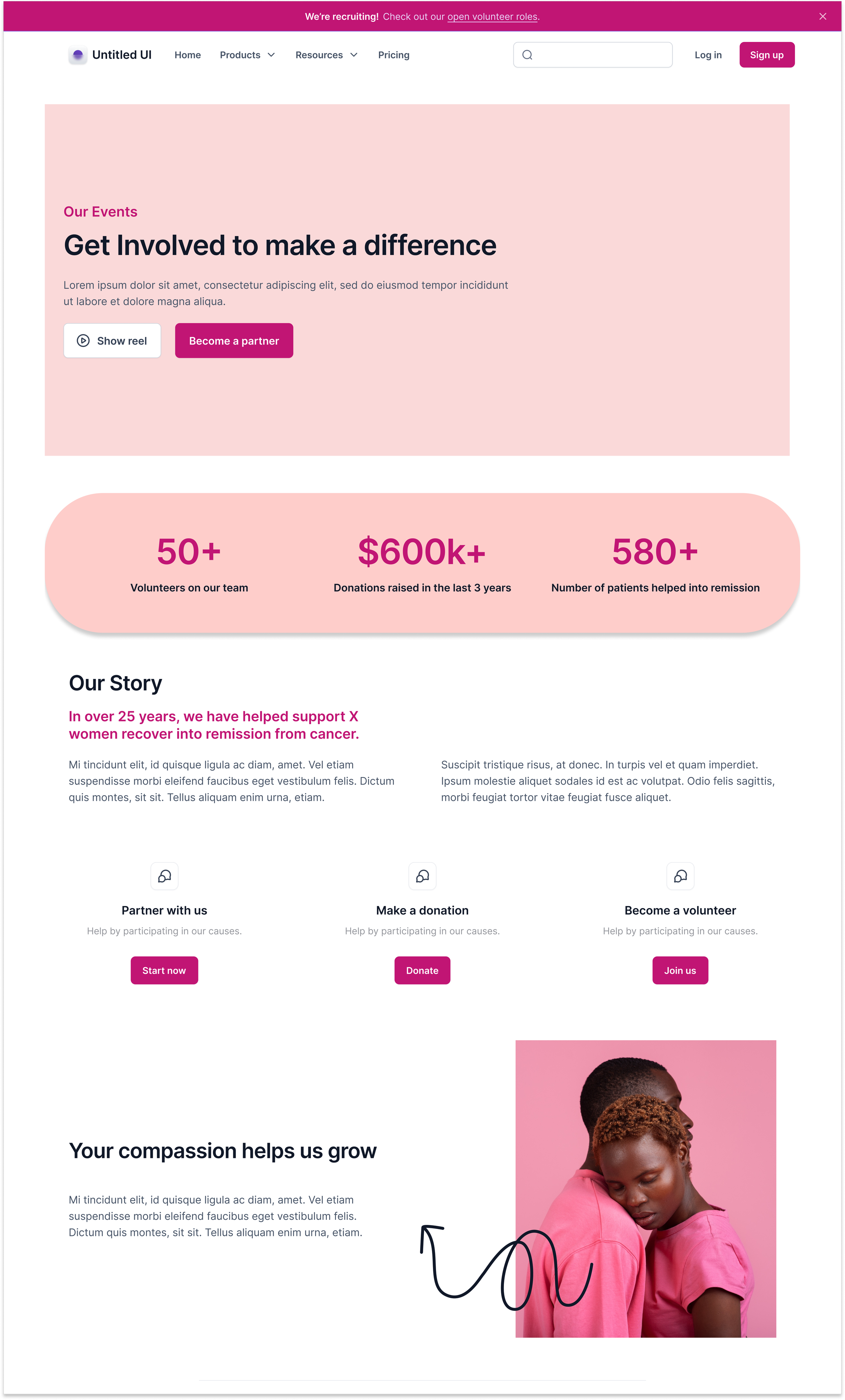
Get Involved - Introduction
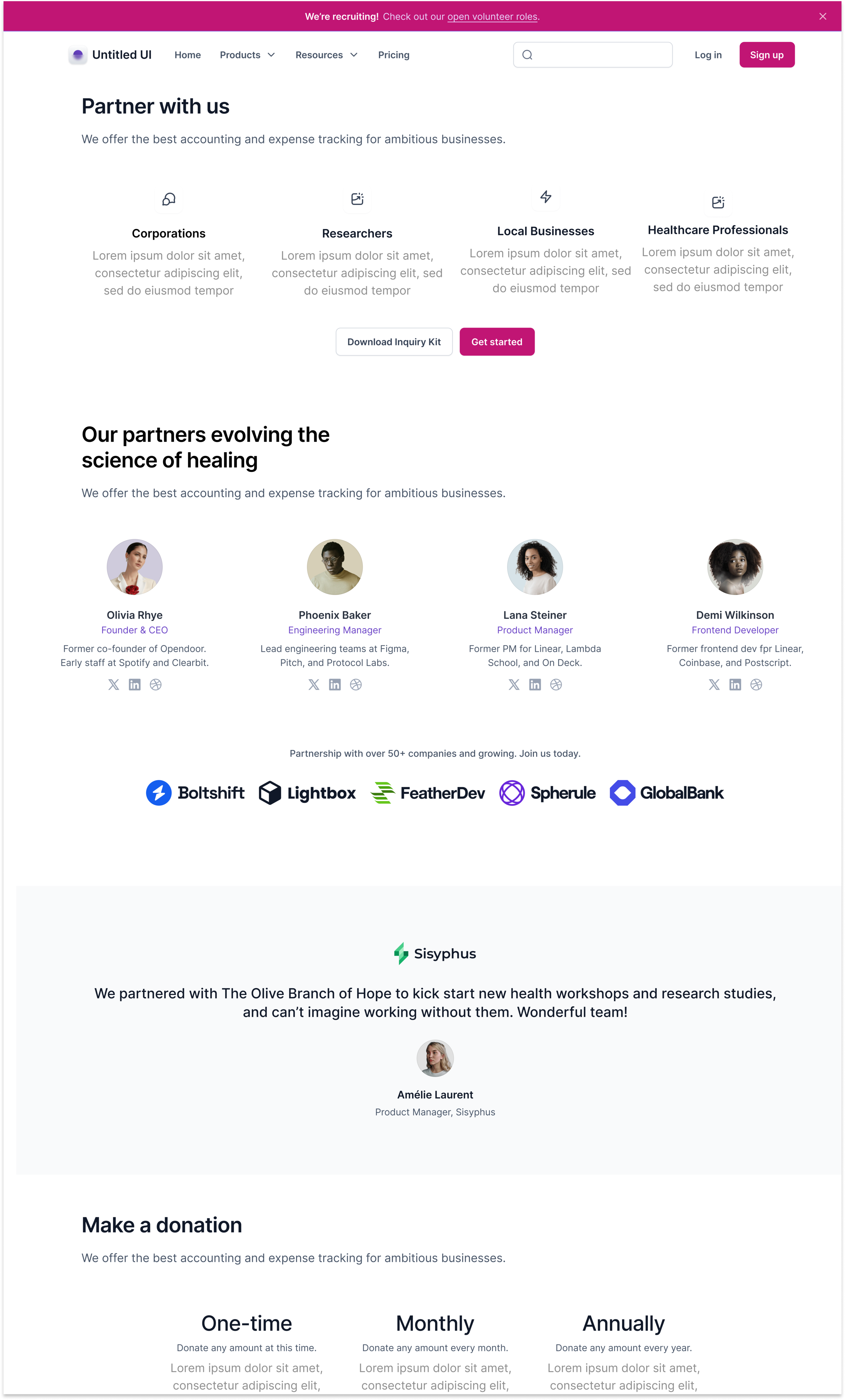
Get Involved - Credentials and Testimonials
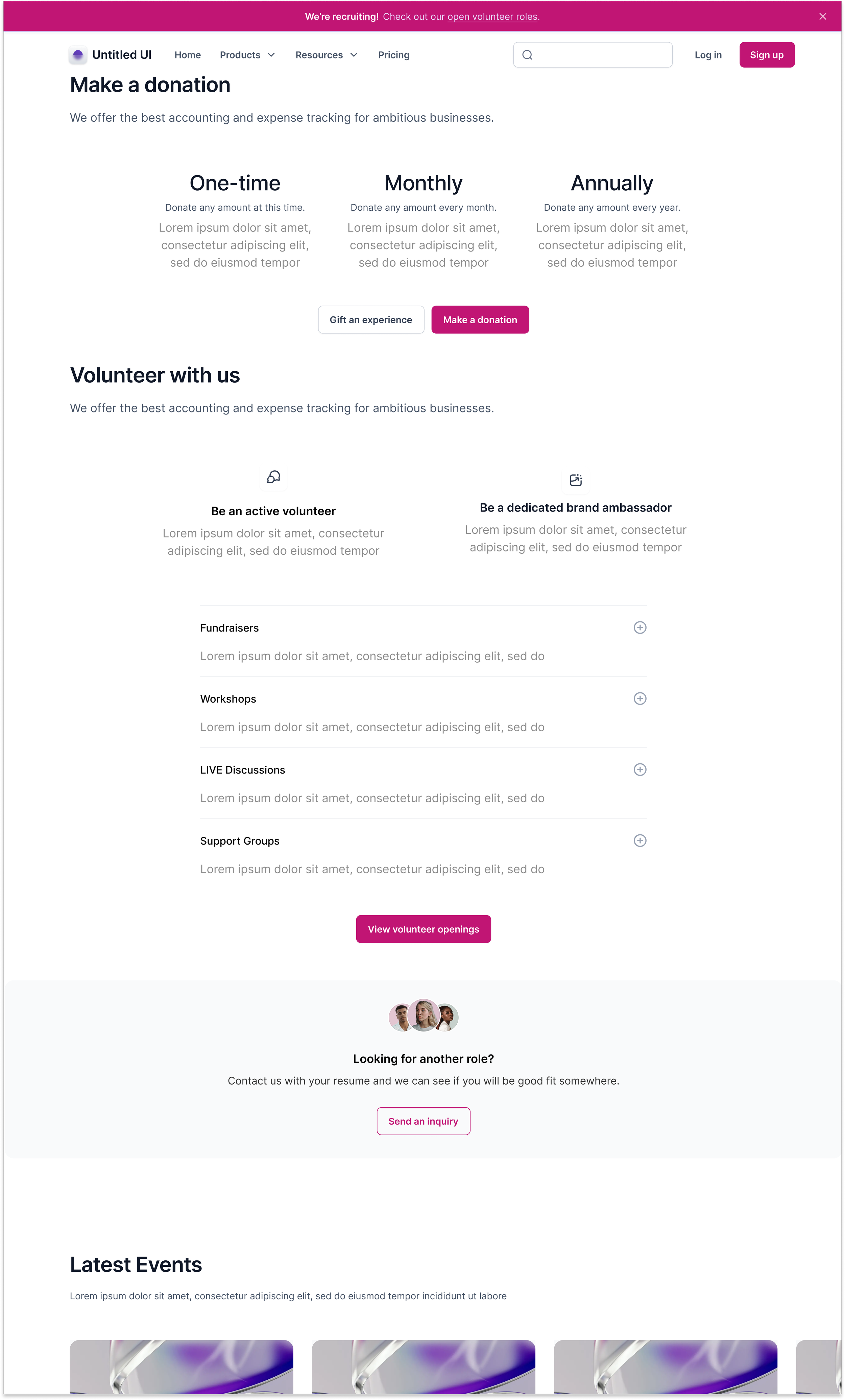
Get Involved - Volunteer with Us

Get Involved - Latest Events
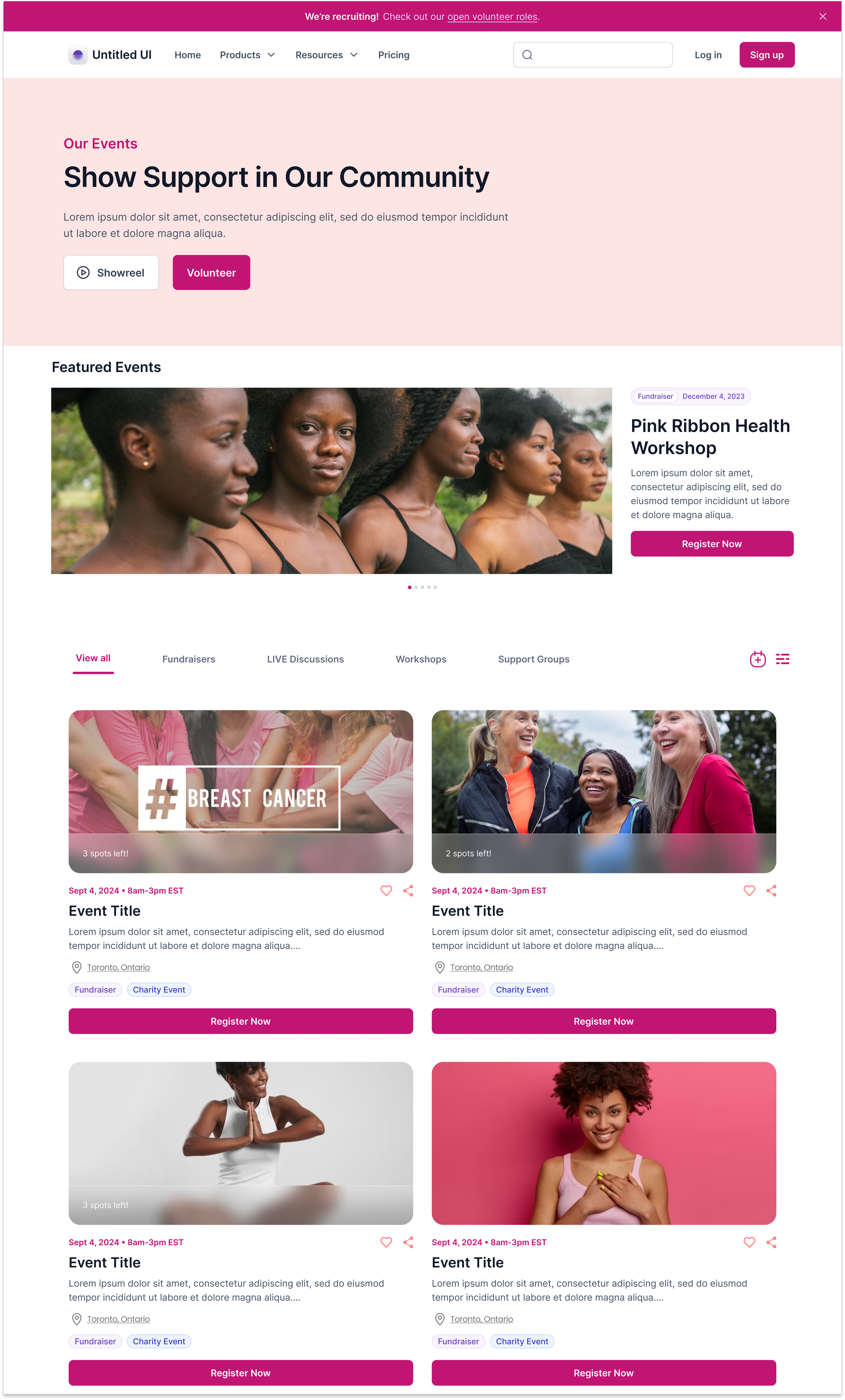
Events - Search and Explore

Events - Latest Events

Events - Details Page

Events - Details Page
THE PROJECT’S IMPACT
The project is currently under review and looking into adding new initiatives, and we hope to be launched and ready by the end of Q1 of 2024. The Olive Branch of Hope’s branding will continue to be improved, and we are determined to build an intuitive, resourceful platform for those who need emotional and health support during their hardships.
Solidifying a Game Plan
The content structure and branding issues went unaddressed for years, leaving bugs and broken elements unfixed. We segmented the project into digestible phases by reorienting a timeline, roadmap, and business goals to help us in our UI and UX process.
Using Reliable Software
It’s essential to create a space that accessibly stores visual components and assets for the organization. We committed to purchasing plans for platforms, including Figma and Click, to ensure the team had trustworthy and stable working spaces for the designs.
Creating a Design with Functional Solutions
The improved user flow in navigating the organization’s services gave users better accessibility and clarity to its resources and initiatives. After implementing the changes, we received positive feedback from our current corporate partners and other health professionals working with the Olive Branch of Hope.
With more apparent levels of informational hierarchies and intuitive navigation, users can now find pieces of information much more quickly. We purposefully redesigned the website’s layout to emphasize more visual design and content, simultaneously minimizing overwhelming text and unnecessary jargon. In addition, bugs have decreased substantially, making website accessibility more stable.
Overall, the user interface exemplifies better success in finding engagement and traction, which we hope will guide the organization to more impactful success for the community.
TAKEAWAYS
The Olive Branch of Hope redesign has helped me reinforce how I execute the UX process, particularly by noting the current problems the organization is facing and asking questions to develop a solution.
Learning Points
Assess every piece of information
Understanding the current state of the product will help give more context to how the user flow can be reshaped and improved. Despite the lack of current trends and data to analyze, we used our tools and resources to adapt our research approach as best as possible.
Taking inspiration from others
Communicating with my teammates helped me see different perspectives and affirmed the direction we were stepping towards.
Facilitating team discussion creates a rich learning environment
Using Post-it notes to determine the most critical areas gave us a more effective process in decision-making in making recommendations.
Presenting a proposal to stakeholders vs. the design team
We learned how to explain and guide the team clearly and straightforwardly thoroughly by using digestible terminology and screenshots to help visualize the sections. Using an easy top-to-bottom order helps train the eyes to follow the content much more quickly.


