Yelp Redesign: UI/UX Case Study
UI/UX Design | Mobile App
Yelp has successfully integrated itself to be a part of our consumer culture with many age groups relying on its online directory as a service resource. Our team referenced Yelp’s mobile application to redesign after assessing its branding direction and style layout. We conducted thorough UX research by delving into Yelp’s target audience and taking their perceptions, feedback, and behavioral patterns to understand what elements to prioritize when redesigning the app’s UI to be more optimal and effective.
TIMELINE
Nov 2020 - Mar 2021
TOOLS
UI DESIGN
— Figma | Photoshop
UX DESIGN
— Miro | Optimal Workshop | Qualtrics Survey
PROBLEM
— Users have a difficult time navigating through Yelp’s convoluted interface.
With multiple markets to accommodate for, Yelp offers an amount of tools that can be overwhelming to many users, making it difficult to find what they're searching for quickly.
SOLUTION
To help improve Yelp’s search experience, we aimed to embed only the most necessary and commonly used functions, then consolidate them into a consistent, simple business layout.
SOLUTION — ACCESS ORGANIZED BUSINESS PROFILES
Find all necessary essentials and information effortlessly
Diligently perform and accomplish tasks
Progress through Yelp’s review system with ease
ADDITIONAL FEATURES — REVIEW & POST IN COHESION
Access different tools and options to aid your feedback
Speed up the process with an embedded photo editing
Efficiently search for menu items with keyword tags
RESEARCH // A PEEK BEFORE THE UPDATES
Yelp undergoes multiple updates a year, so we took the liberty to document the version that we wanted to reference. Above are Yelp’s home page, profile page, and write a review section on January 10, 2021.
RESEARCH // BACKGROUND RESEARCH & COMPETITIVE ANALYSIS
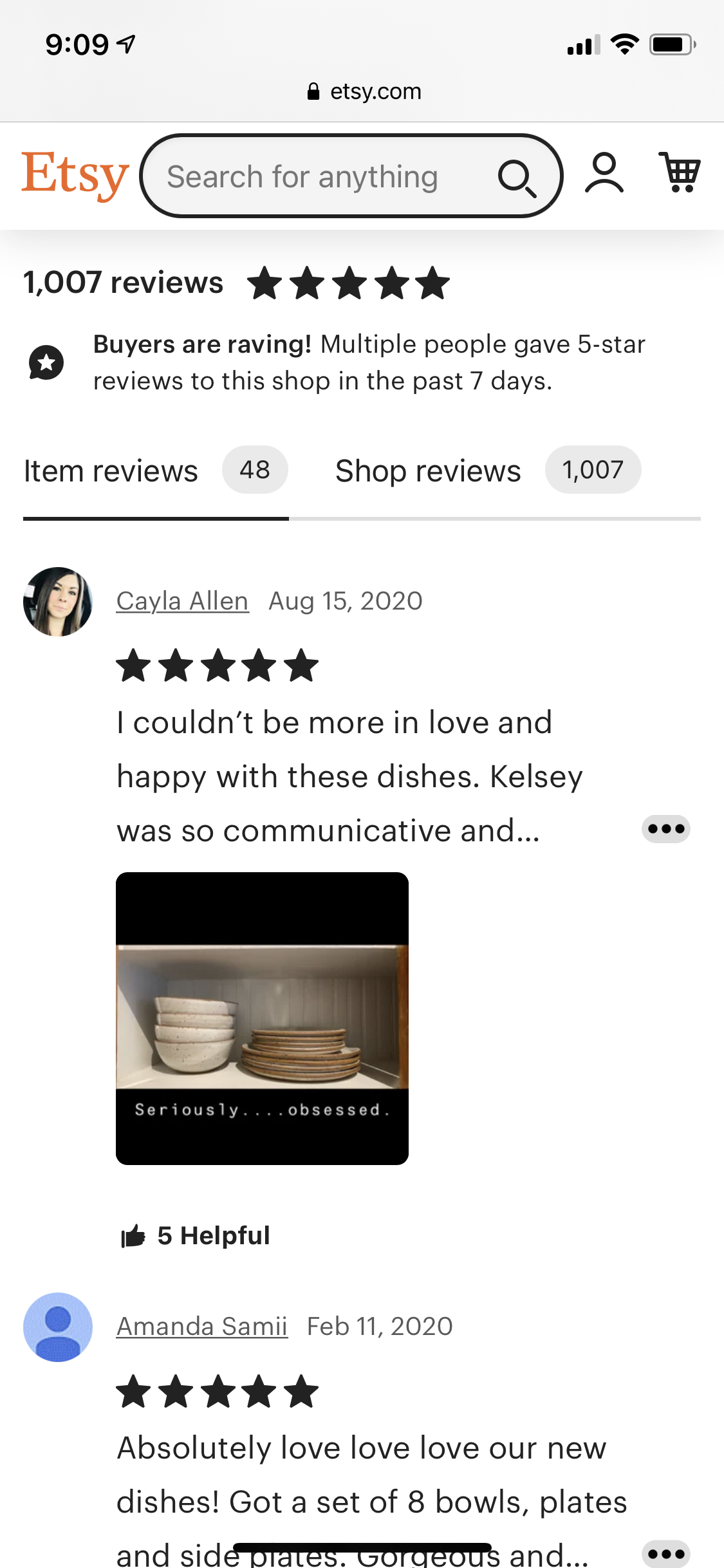
In order to better understand how Yelp operates, we researched into the business benefits, company history, and COVID responses of Yelp, and built a competitive analysis to evaluate together as a group. Specifically, we were interested in studying review systems on commercial platforms, such as Instagram, Etsy, and TripAdvisor to analyze options that maintained successful systematic organization and visual structure.
RESEARCH // SURVEY, CARD SORTING, & INTERVIEWS
We formulated a survey based on a demographic of users who were over 18 and had used Yelp within the past few years to gauge common behavioral patterns. Our questions revolved around the preferences when finding businesses, how they discover Yelp, how often they use Yelp, and other informational details that would help us improve Yelp’s interface. Thanks to our UX team’s research extraction, we gathered the pain points of the app:
Majority of users associate Yelp with the food industry
People care about different functions
UI is cluttered with too much information and redundant features
Reviews seem arbitrary, which impacts small businesses
RESEARCH // DATA ANALYSIS
To narrow down our scope within the main problem of Yelp’s structure, we extracted the feedback we collected and assessed that the Yelp’s mobile application has multiple entry points and pathways, making it difficult to direct our focus to a specific area. Our solution was to gather the most essential features in a standardized layout, then structure the most useful business information in a logical visual hierarchical sense. We prepared the problems and solutions based on our data extraction to strategically plan our interface redesign:
-
Filters are not accurate and complex enough to find specific results.
Solution: Create a tagging system that will help users search for results that are based on their preferences.
-
Users are unable to find specific information about the business with the current functions.
Solution: Add sorting function for photos
-
The layout is outdated, inconsistent, and disorganized with unstructured layouts and redundant buttons/features.
Solution: Minimize unnecessary entry points to guide users into areas of the business page, including reviews, results, business information, menu access, and photo galleries.
-
The UI inconsistency affects Yelp’s desktop platform, as it does not accurately synchronize with rapid layout and function updates on its mobile counterpart.
Solution: Mobile and desktop devices should only offer minimal features that are commonly used by users.
RESEARCH // USER PERSONAS
Creating a persona helped us understand how a typical Yelp user would interact with the app with different sets of motivation triggers. For example, an “Explorer” user type may have specific tendencies to look at Yelp in advance when researching for the pure drive of finding experiences to experiment with.
Using the UX team’s research analysis, I created a persona revolving around common qualities listed below:
Age 18-30
Tech-savvy
Uses Yelp as a resource for food research
With our new research findings, we built the interface and UI capabilities towards the Millennial generation. Once we understood who our basic user type was, and narrowed down their behavioral interactions and drives, we felt more confident to focus on certain features of Yelp in order to provide a more intuitive user-friendly platform.

RESEARCH // USER FLOW DIAGRAM
Each task was broken up into situations to analyze, then transformed into task flows that were eventually organized into different categories based on users’ behavior and performance when using the app.
We focused on introducing two main entry points by combining multiple task flows, ultimately guiding the user to navigate from the Yelp home page and business page to posting a written review and photos.
IDEATE // MOOD BOARD
Our intention was not to rebrand Yelp, but to emphasize important features and a simplistic format that will enhance the layout. We compiled our mood boards by taking inspiration from beautiful interface examples, including Instagram’s tagging system and Twitter’s tweet function, then critiqued our collections to choose elements that favored qualities, like:
Legible
Reliable
Comfortable
Professional
Practical
Minimal
DEFINE // SKETCHING
We assigned each other a set of screens, and used the method, “Crazy 8’s”, to encourage a quicker and effective creative process to avoid redundancy and convoluted selections. Our sketches were a way to visualize multiple possibilities at once, which quickly allowed us to dismiss choices that wouldn’t work, and an easier time to decide what could work the best.
Moving forward, we went through all of our thought processes for every single design flow that we could think of, and democratically voted on screens and flows that successfully conveyed the solutions well.
PROCESS // MAJOR IMPROVEMENTS
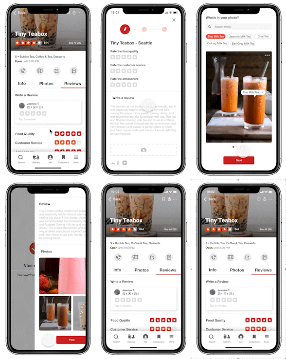
With our preferred layouts, we digitized the screens, so that we could see how our vision could pan out successfully. We introduced the photo tagging function to be a part of the review system, iterating in multiple directions to make the tool impactful, concise, and useful to our audience.
-
The profile is organized with less clutter and function redundancy.
-
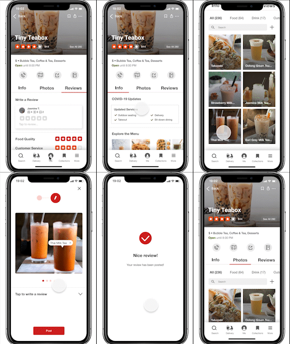
We rearranged the format to present information that users look for more frequently, and removed unnecessary functions that are repetitive. One notable feature was to condense information by dividing the actions into tabs, so that the page was more organized and compact.
-
A new function that allows users to efficiently and easily submit their own gallery photo posts without writing a review.
-
The review system was revised to have a simplified process in writing a review. Users can vividly see a carousel to track the length of completion, easily read sections, and edit their responses.
PROCESS // REVISION 01
The main rating and review system on Yelp was revised to be more organized with less clutter, excessive icons, and verbiage. We added a progress bar and a proper review stage, so that users are aware of how simple the review process may be.
PROCESS // REVISION 02
White space was the key to our enhanced layout. Our new photo tagging and editing system was added to give users more options to review with imagery.

PROCESS // HI-FIDELIY WIREFRAMES
Establishing Yelp’s branding was the cherry on top. We referenced the proper typography and color schemes to bring out the authenticity of the company. While layering the final pieces of branding together, we had a difficult time trying to find the most recently updated color palettes and UI components since Yelp undergoes multiple updates annually.
Despite the confusion in finding the right assets and branding colors, we made sure to bring more modernity to the app by emphasizing negative space, and the visibility of useful tools and photos.
TAKEAWAY // WHAT CAN I IMPROVE ON?
The easiest part in analyzing a well-established brand was nit-picking the features that Yelp should improve on; making the connection on how we will improve the issues was a problem that forced us to re-evaluate our direction multiple times during the process.
-
Although a majority of our team uses Yelp often, we were unaware about almost half of the functions that Yelp provides. The main issue was figuring out what specific tools were used for and how we could repurpose them into our redesign. Personally, I would have had an easier time strategizing the interface layout if I had more time to learn the tools and functions more thoroughly.
-
To make use of our limited time, the team decided to assign each other a flow to focus on, which limited our experimentation stage in wireframe development. In the end, we defaulted to platform visuals that we were familiar with. If I had more time to work on the wireframes, I would have used it to flesh out more variations that uses different UI assets and layouts.
-
Due to our schedule constraints, we were unable to gather external feedback with the prototype we created. I would have felt more secure with ensuring that our flow was user-friendly for people of all ages. Next time, I will make more time to collecting user-testing responses to implement reliable critique.
-
While my team handled their assigned sections responsibly, our schedules didn’t allow us to be online at once to work on specific features and research of the project together. To compensate for it, we tried to work on certain parts of the app on our own, and would individually review them for further feedback. I would have enjoyed having more time set aside
Unraveling Yelp’s branding and interface issues gave me insight on problems that I never noticed as a typical Yelp user. Despite the challenges in sorting through multiple entry points and tools that Yelp had already implemented, I really enjoyed getting the chance to dissect and transform its crowded layout structure into an enhanced version of itself.


