Barenote: Mobile and Website Application
Apple OS | UX/UI Design | Branding | Graphic Design
Barenote is a digital journaling platform that encourages users to personalize their written entries through creative freedom, convenience, and accessibility through a virtual scrapbook space by selecting amongst a range of stylistic choices and using customizable functions.
Our digital journaling case study explores a multitude of visual designs and marketing strategies, including AOS campaigning, branding development, and mobile-first design adaption.
TIMELINE
February 2023 - October 2023
TOOLS
Figma | Google Forms | Illustrator | Photoshop
HYPOTHESIS
Users rely on digital journaling apps, such as Barenotes, to create a personalized space that uniquely caters to their interests and encourages their identity expression and emotions, therefore helping them forge a stronger connection to their journal.
PROBLEM
— Journaling requires commitment and maintenance, and it’s challenging to update entries consistently with varying obligations.
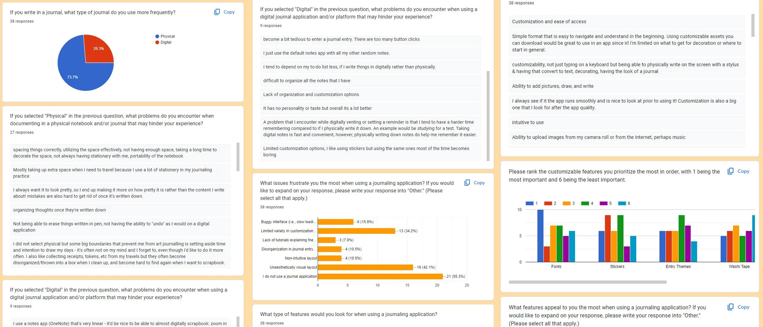
Based on our survey and interview research analysis, we found that journalists tend to feel unmotivated to keep up with their personal documentation due to:
Inaccessibility
Lack of time and energy to upkeep
Difficulty in creative presentation with tools and vision
SOLUTION
Our focus is designing an application that allows journalists to conveniently access their notepads and tools to write and stylize their journals. We needed to create a personalized digital space where users could freely design and write using a space that didn’t feel like a drag to open up.
An idea starts with a bare note.
Inspired by our passion for artistic hobbies and love for design, Barenotes was developed into a brain-crunching project aimed at making creative freedom accessible in a digital space.
01 — WRITE COMFORTABLY
Access essential writing tools anywhere on the go
Document your journal entries conveniently using clean directories to maintain organization
02 — PERSONALIZE YOUR SPACE
Customize your journal with a diverse range of stylistic elements
Experience hands-on digital scrapbooking with your own space
Embed stylized scrapbooking elements and themes to enhance your writing experience
03 — EMPOWER YOUR SELFHOOD
Easily track your mood on the daily using an integrated calendar
Effectively organize your journals and entries at your pace and preference
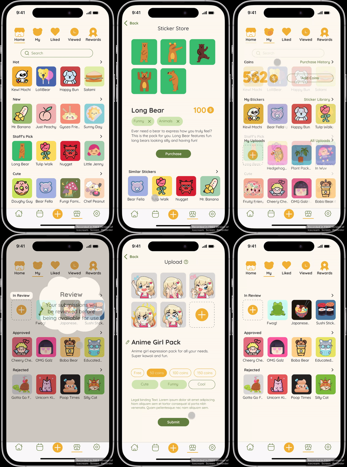
Share your sticker designs with the community
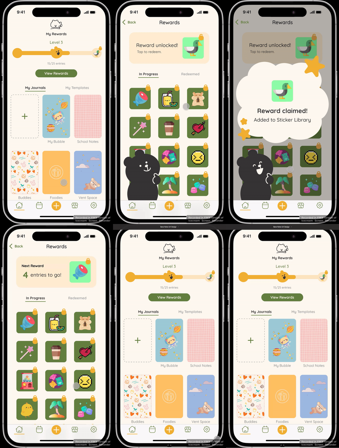
Browse through a collection of sticker rewards and gamification
RESEARCH BREAKDOWN
Competitive Analysis & SWOT Analysis
We analyzed nine applications available for Android and Apple devices to compare the varying features and similarities. While researching, we noticed a handful of digital scrapbooking and journal apps are popularly used in international Asian countries, which reinforces a barrier to growing an audience.
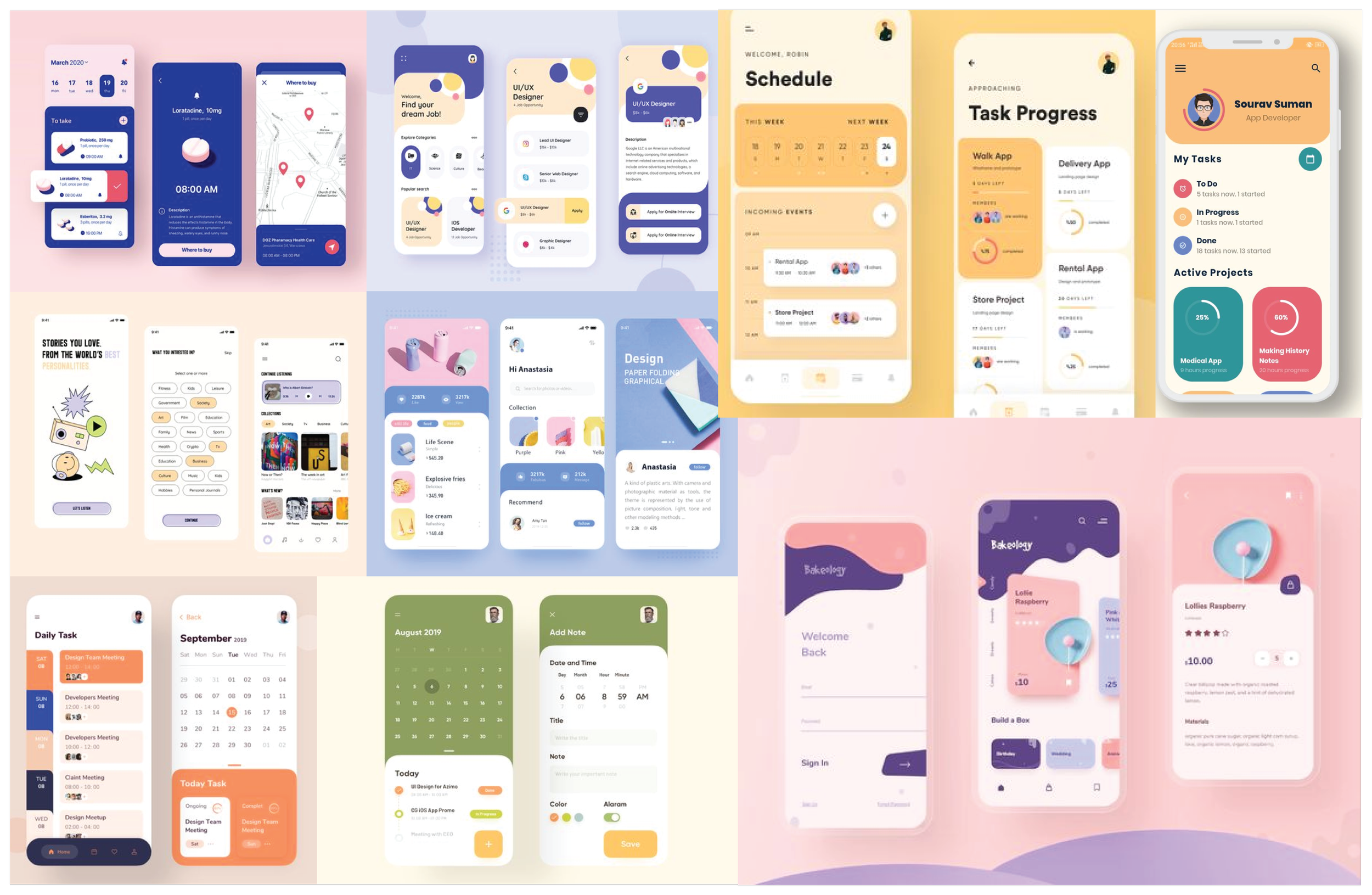
There were plenty of different apps to look through, but we funneled our favorite features and layouts and compiled them onto a board to take note of. We reviewed all the vital points that made a lasting impression on us as users.
Gathering the Pieces: User Information
To thoroughly understand our users and the journaling market, we asked ourselves questions to pinpoint how our goals will target our demographic.
Who is the user?
All users with a focus on teens and young adults who want to explore their identity, relationships, and experiences
What primary goals and tasks will users want/need to accomplish?
Effortlessly record thoughts and experiences on-the-go in an individualized space
Quickly access and track daily emotions
Comfortably share with users within their circle
What will the app do?
Motivate users to express themselves in a creative and fun approach routinely
Where will the app be used?
Anywhere on-the-go
Why does the user need the app?
Empowers users to habitually fall into a therapeutic routine by using a sustainable, resourceful, and creative medium to log their entries
What kind of info will be created, entered, or featured in the app?
Users can create categorized journal entries, themes, stickers, media galleries, and mood notes to express thoughts, ideas, and experiences
What business goals are you trying to achieve with this product launch?
Our team wants to cultivate a healthy and creative way of expression and communication
Interviews with journaling enthusiasts
Our interview questions reflected users’ journaling habits by assessing the environmental and psychological factors that may affect their behavior in maintaining their journals and why they enjoy and/or dislike journaling.
The interview demographic requirements:
Target age groups at least 16 and older
Must be routinely active in journaling or have experience in journaling frequently in the last three years
✕ Paint Points:
Inaccessibility with documents and writing pads
Lack of time to spend on designing the layout and compiling details
A higher possibility of making grammar or styling mistakes discourages commitment
Lack of customization features for an appealing aesthetic
Non-intuitive layouts that are hard to navigate certain features
✓ Gain Points:
Featured customizable options for task prioritization, planning, and stylizing
Accessible documentation tools, including uploading pictures into an archive or within the entry
Easy organization settings, including the ability to track, add, and find entries based on a calendar
Opportunities for Growth
Considering our engineering limitations and product logistics, we took our users’ opinions to reassess what we could prioritize feasibly. Some key features to consider based on our data include:
Uploading stickers, photos, music, clips adds to personalization
Consider having auto-save functionality embedded into the system
Allow users to view their organization through different layout formats, making it more digestible for certain users
Increase space to make room for text fields and editing
Creating a visual data progress bar to track goals and moods can increase motivation in upkeep (i.e., gamification)
Meet Janice Do — The User Persona Profile
We created a user profile that mimics the qualities of a typical person who journals during their spare time based on the survey data we collected from our 1:1 interviews and research. As we found in our research, journalists lack the time to update their events routinely and, therefore, have inconsistent journaling habits.
Noting down the flaws and issues of the hobby gave us more insight into how to structure Barenotes and encourage more users to use their digital journaling app.
User Persona designed by Natalie Ma
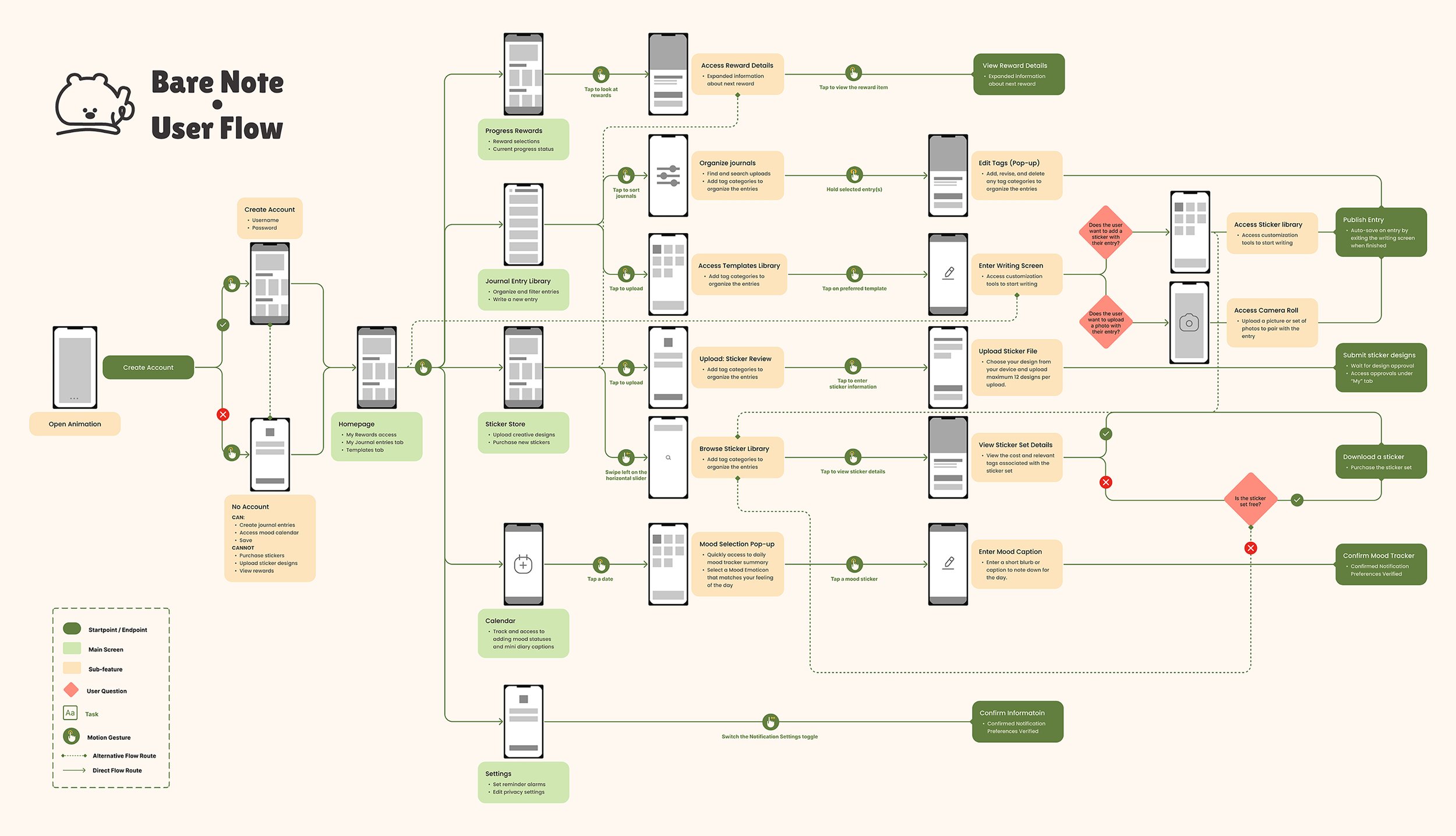
The User Flow Diagram
Establishing a thorough visual flow to map out our user experience helped us understand our features and even helped eliminate functionalities that didn’t seem feasible or necessary to include.
DEFINING OUR BRANDING IDENTITY
Defining our Identity
To establish our branding, we brainstormed on descriptive words and adjectives associated with the genre of our app. With the intention of making our app oriented to scrapbooking, sticker collaging, and free-range customization, we knew that we wanted to create an identity that revolved around organic, natural, and fun elements.
Mood Board
Scrapbooking and journaling are notable interests that encourage expression and creativity. So, we searched for inspirational pieces that emulated eye-catching visuals, including patterns, bold colors, organic lines, and toon-like shapes.
Our team individually collaged mood boards and regrouped to define the style that spoke to all of us. For my process, I chose to make two separate boards to dedicate to the overall branding direction vs. the layout elements of the user interface.
How Barenote’s branding came to be…
To get our heads cranking, we rolled out nouns or adjectives associated with “journaling” and “scrapbooking.”
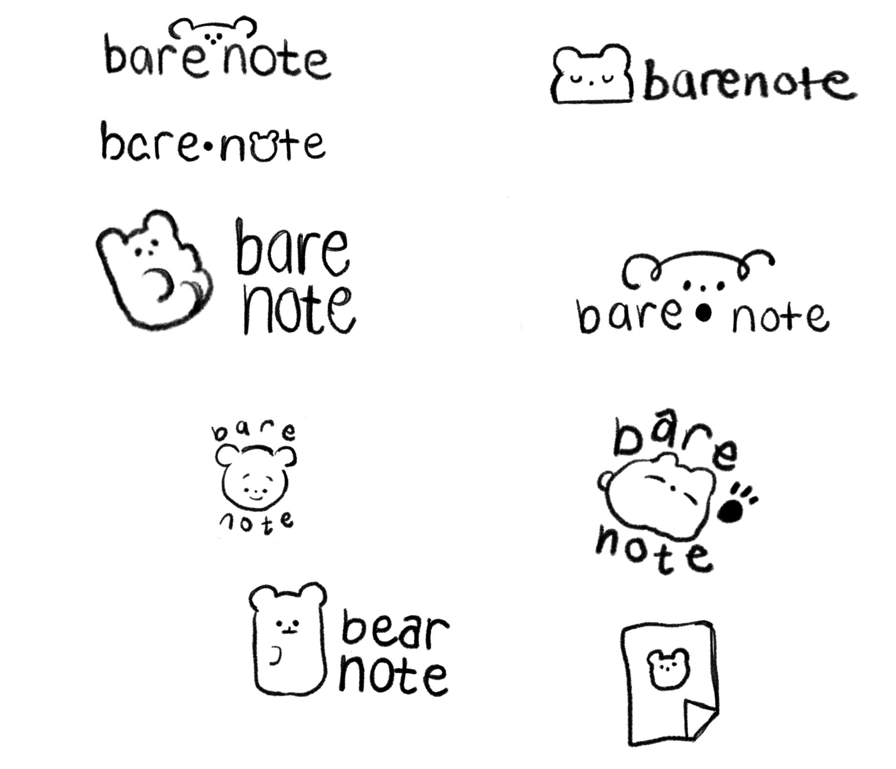
We looked for combinations using wordplay or puns to make the app feel more relevant at first impression. After many candidates were thrown out the window, we decided on “Barenote,” which signifies starting with a fresh blank page when creating ideas. The “bare” word is a wordplay on “bear” that adapted into our cute little mascot character to add to the app immersion.
Logo
We took note of our competitors’ branding’s creative directions and mutually leaned toward using round elements, more visual imagery, and a warm palette.
Our logo sketches embedded curvy shapes, elements of journaling, and our bear mascot. We made additional research explorations on various typography suggestions but agreed on using more handwritten-like or serif font families to emphasize our journaling product. You can see a general overview of how we tied our ideas from our boards into cohesion.
Final logo designed by Natalie Ma
The Branding Guide and UI Kit
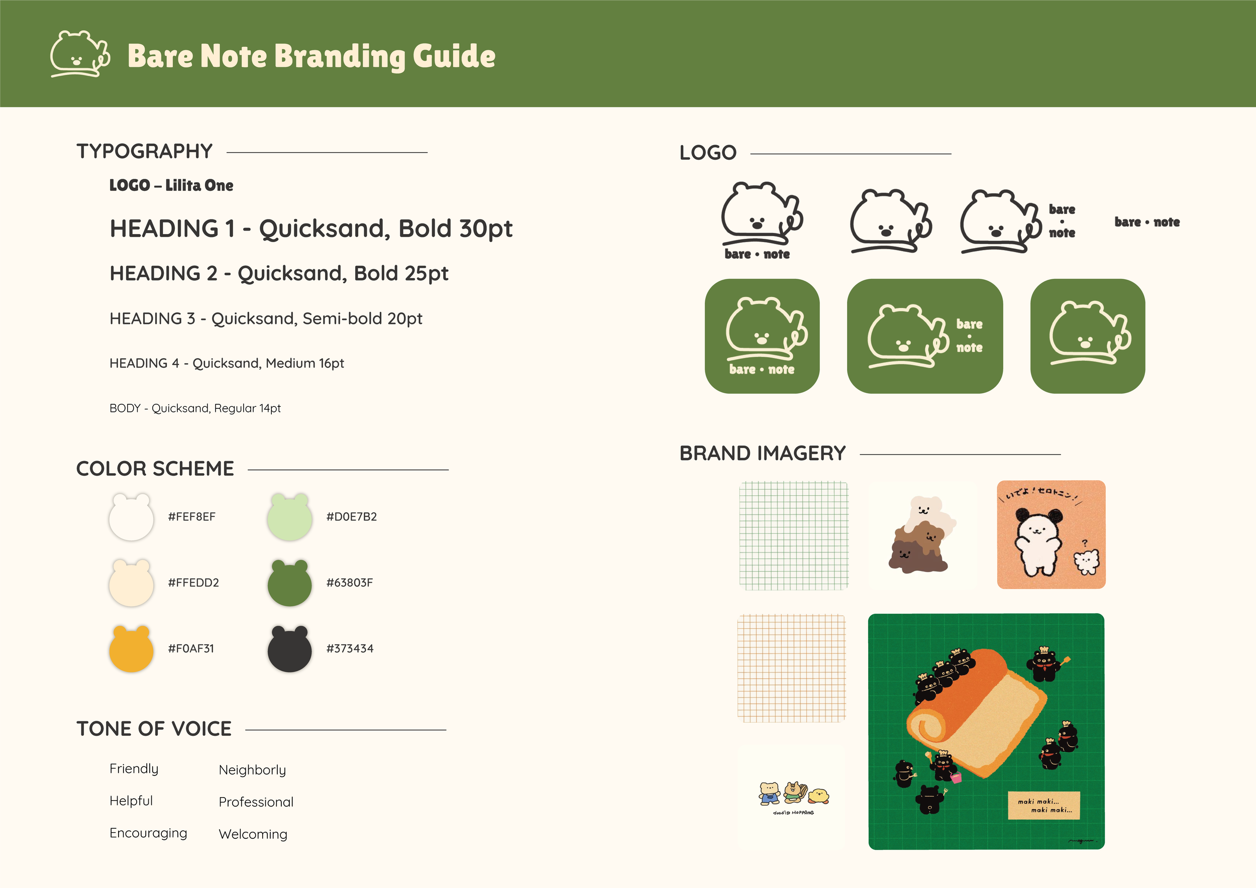
To maintain consistency with our branding, we created a reference guide for our typography spectrum, logo variations, color palette, and visual assets.
Branding Guide designed by Natalie Ma
DESIGN PROCESS
Exploring Ideas
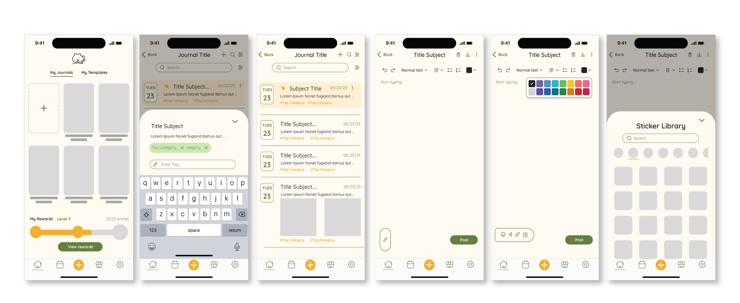
Our team delegated different task flows to iterate for a more optimized workflow. My assigned sketches captured the user flow for accessing the writing canvas, entry archive, tag editing, and journal customization directory.
Determining the Visual Design Elements
Once we mapped out our ideas and translated them into various pathways, we compiled our board with our sketches to magnify what would work best given the established functionalities we wanted to prioritize.
Here, we decided to rank our preferred UI elements by starring the key features that we thought would fit best while keeping simplicity and cleanliness in mind.
Validating the Design with User Testing
There were 13 tasks total for our user test, which we tested on six journal users. We used a prototype to recreate the flow of our app and requested each user to follow the scenarios of our contrived user test to detect any issues during their experience.
The prototype resulted in some minor technical issues, along with plentiful feedback responses for areas of improvement, which helped us understand what we needed to fix. Some issues regarding the app included:
A few features, such as finding the notification settings to set alarms and reminders on the Calendar, were not intuitive
Create multiple entry points for certain functions, including the reward claims or writing an entry.
Add tutorials to help the users understand the purpose of each page. This will help guide the user and eliminate confusion
Change some icons to pair with the functionality more intuitively.
To track our improvements, we created notes on Figma to individually address the issues that the users had faced and collectively made decisions to merge, delete, or add new features to enhance the app even further.
Hi-fidelity Wireframe Revisions
01 — Entry point and tutorial
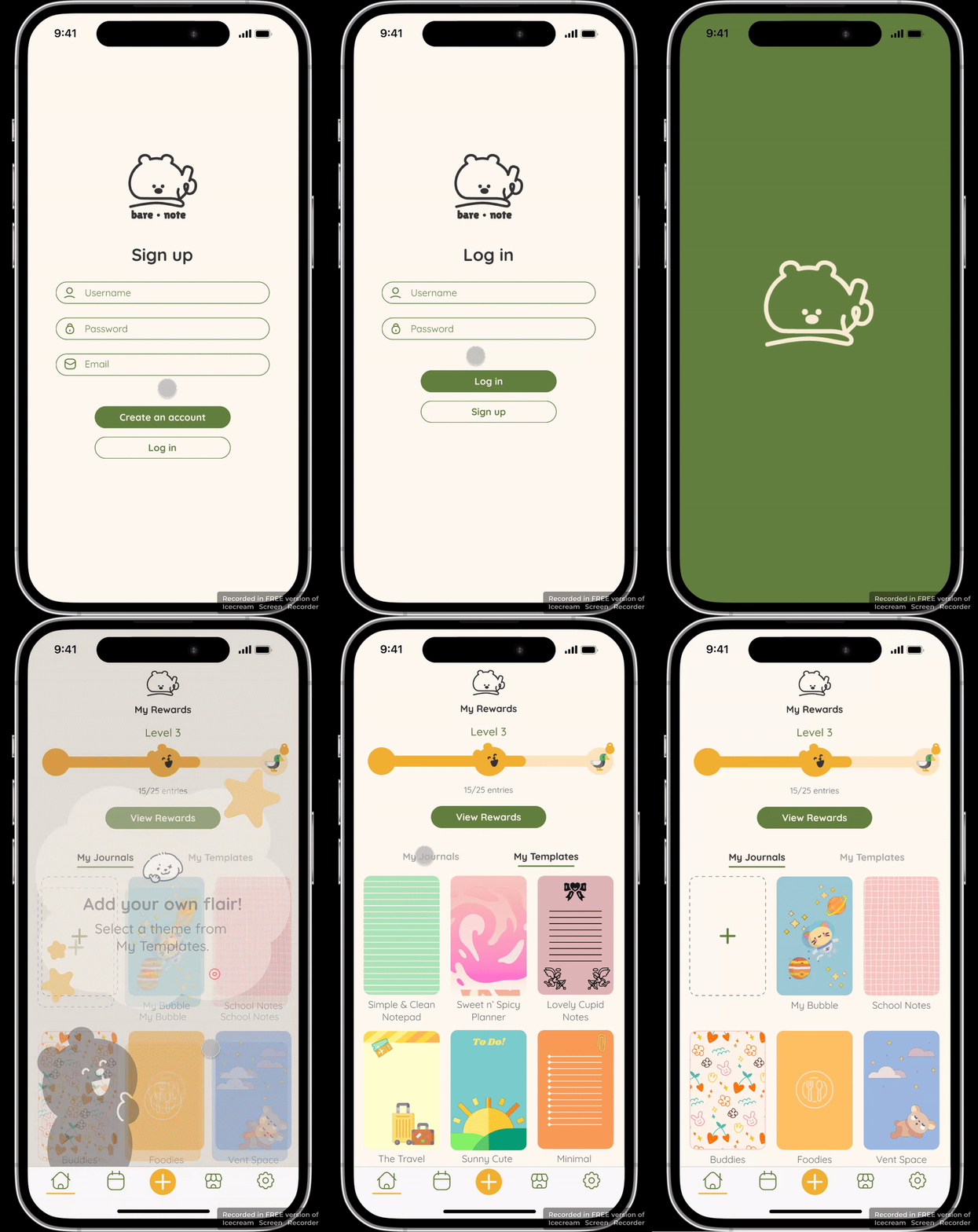
To ensure the prototype would have cohesion from start to finish, we included an animation welcome screen, sign-up page, and login access to pull the entire application together.
Since some of our testers faced some confusion when navigating through our pages, we created additional tutorial screens in the app.
03 — Calendar & Customization features
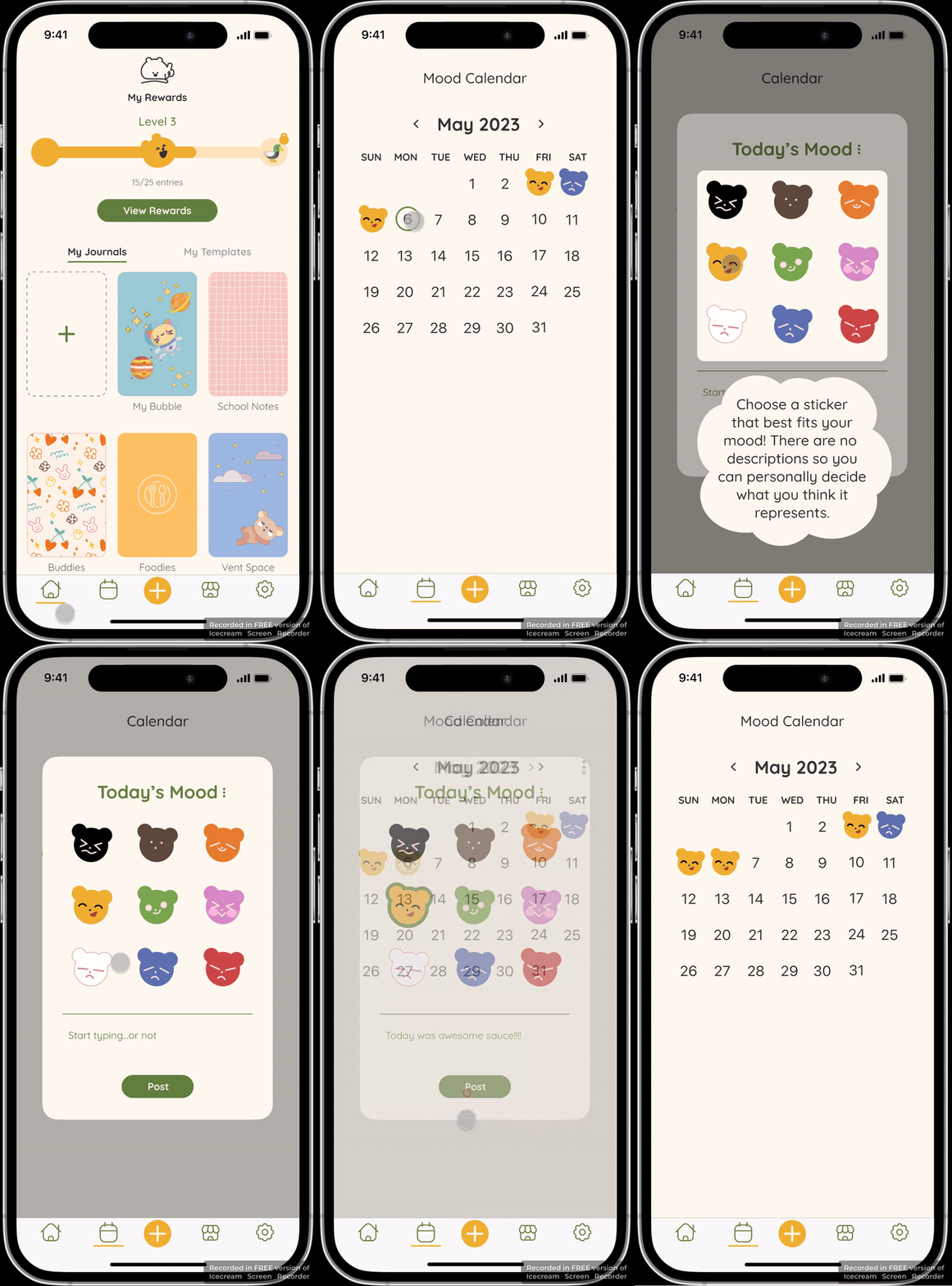
Users were unsure how to use the task management and agenda list portion of the calendar, so we unanimously decided to remove it and have the focus shift entirely to daily mood summary posts.
The writing canvas was simplified by grouping functions and elements that were related to one another at the top of the screen, so that the user was able to find all the necessary features when creating their post.
Changing the direction of the color swatch palette fit the new arrangement better, as it was easier to see.
The theme selector screen was revised more intricately with specific styles, and included an element for highlighting the selection.
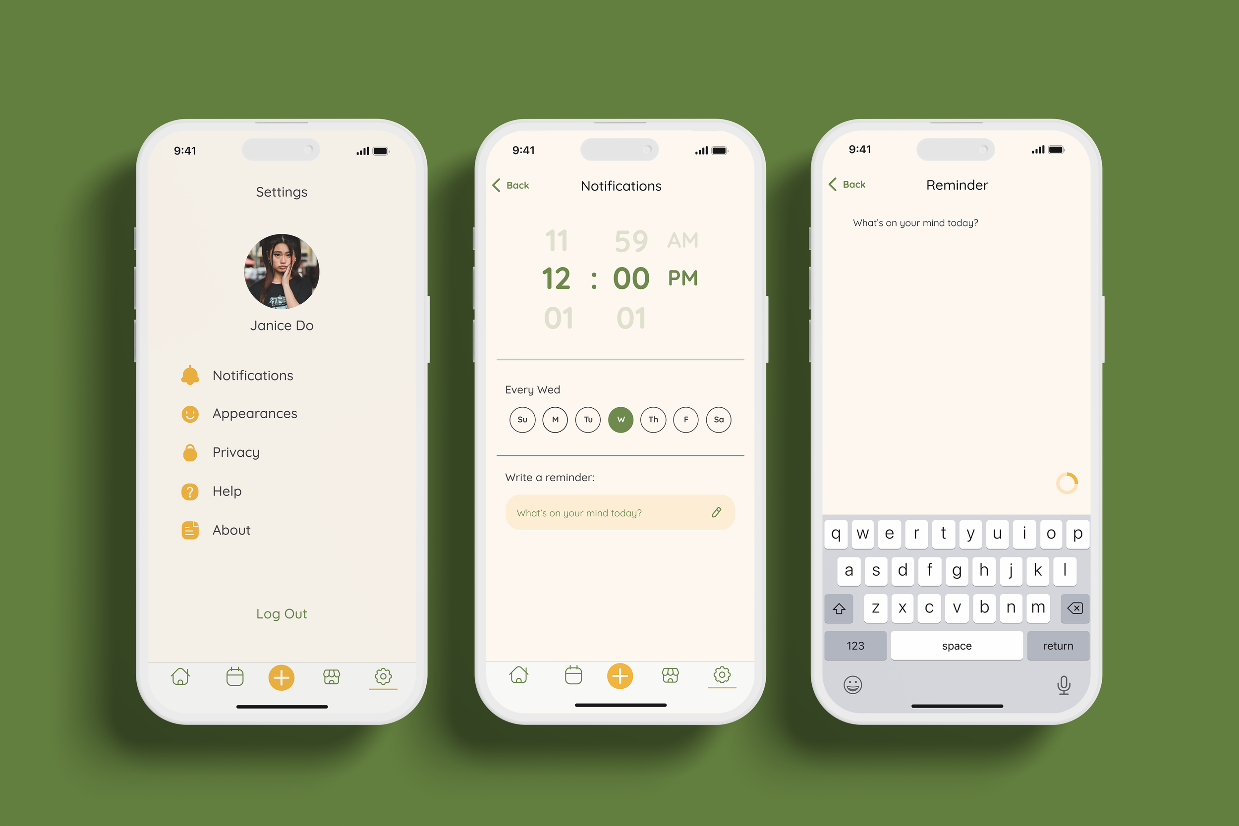
04 — Notifications & Reminders
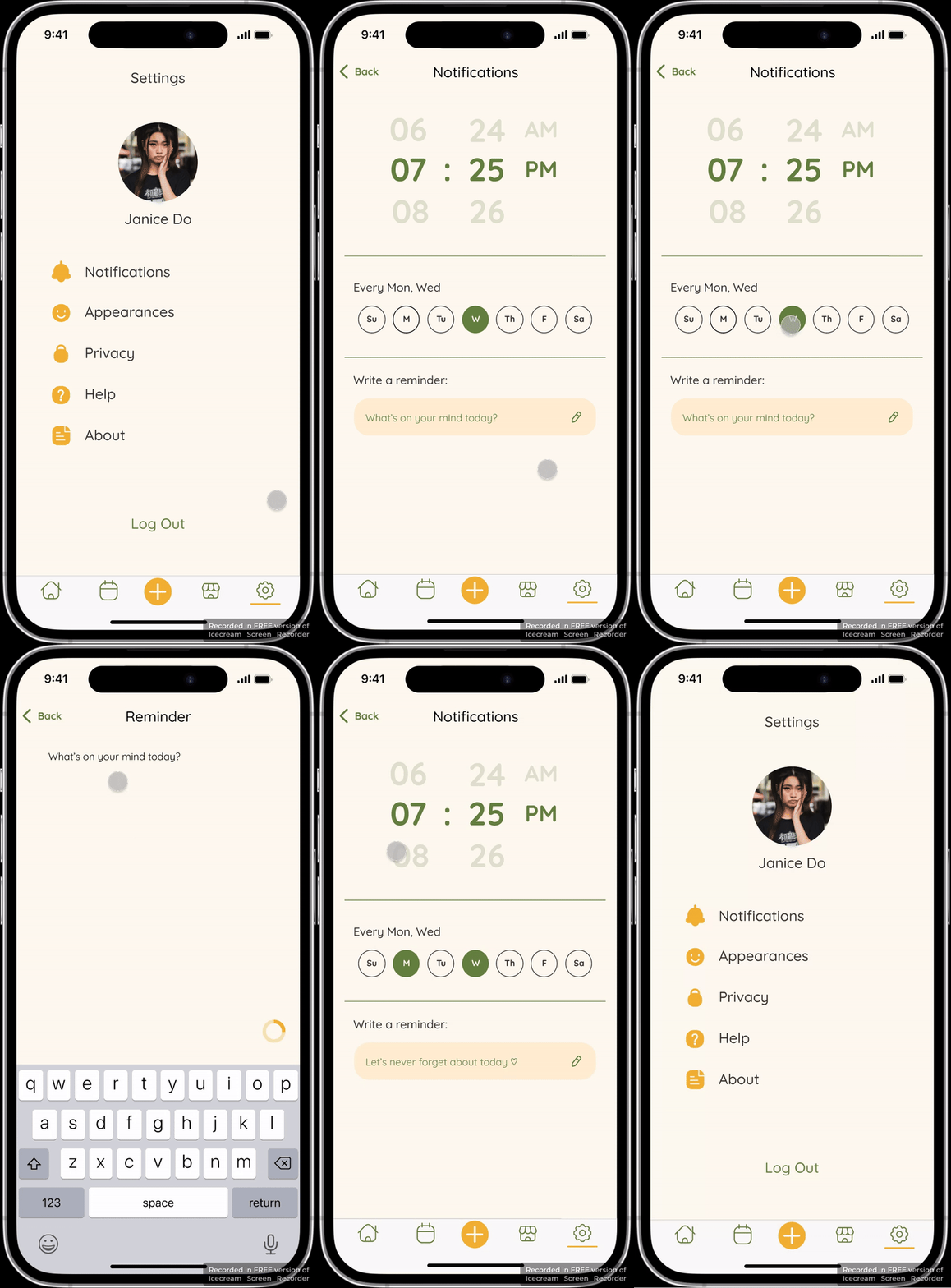
We restructured the alarm reminder settings by consolidating the message and time settings into one page, so that it eliminates tedious gestures.
Instead of a pop up box, users will be directed to a separate screen, so that they’re given more room to write. The button is removed since users are typically expecting for information to auto-save after making changes to their settings.
There are less colors to avoid confusion, and the numbers of the clock are enlarged for a better visual. To add to the visual appeal, we changed the
02 — Home & dashboard
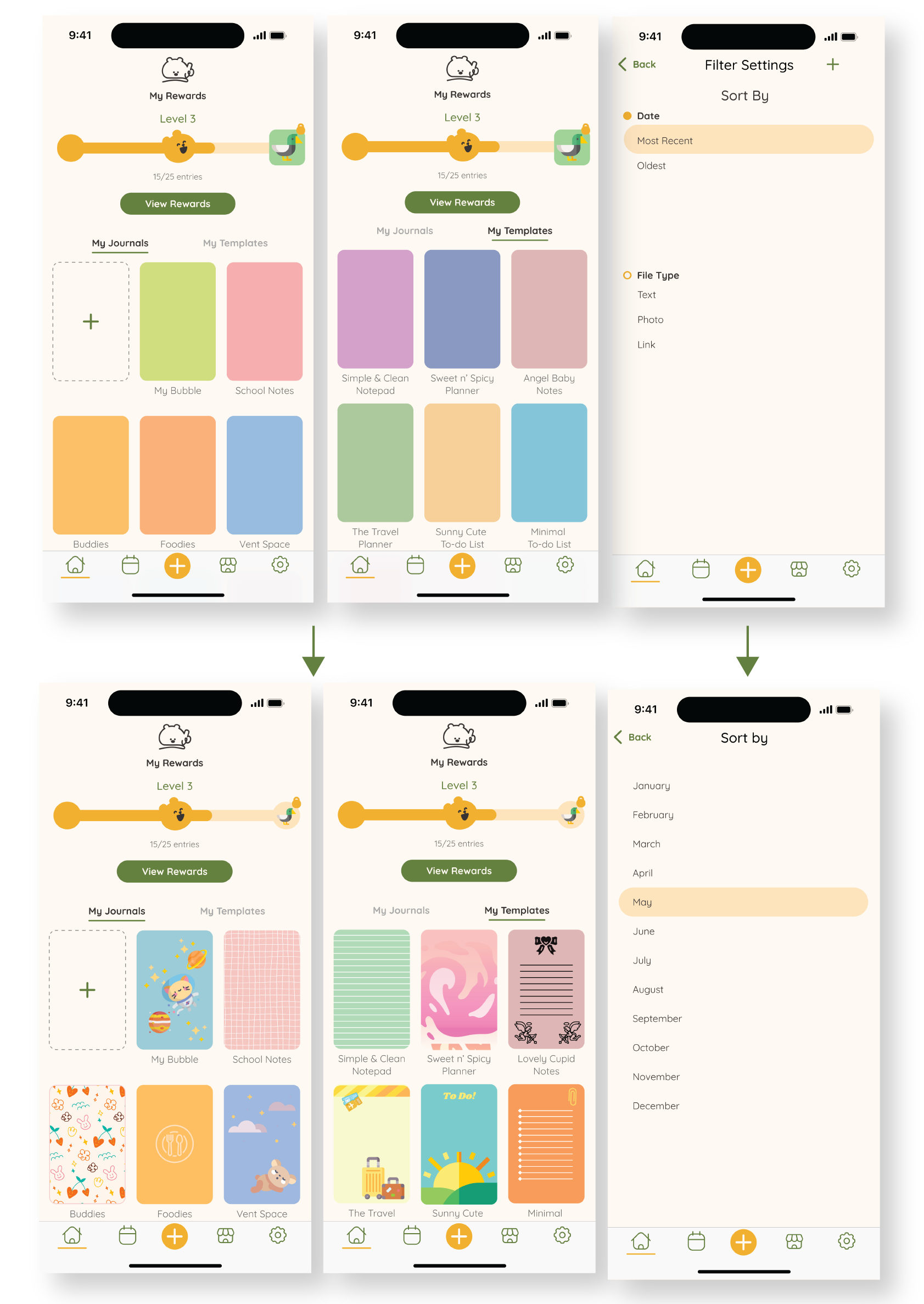
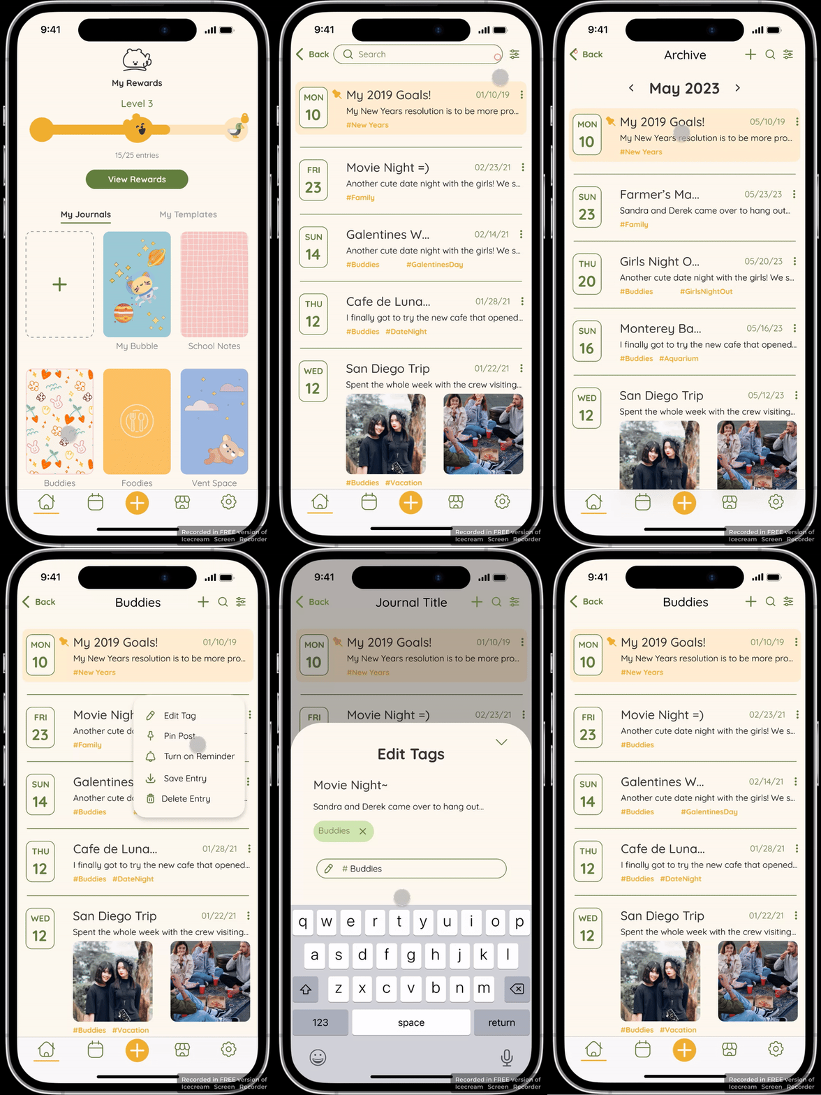
The Home and Dashboard screens used more adjustments with the spacing variations in the dashboard layout to match consistency and make legibility more clear.
We changed the filtering mechanism of the Sort By screen to set it on a monthly search directory; that way, the user won’t be confused with finding specific items.
The Home page was finalized with different creative cover selections in both My Journals and My Templates options to emphasize the customization freedom
Final Design & Campaign
We were thankful for all the responses and positivity received with our dream project. Upon finalizing our designs, added more screens to showcase a more fluid user flow for our prototype and mockup.

Journal Entries Dashboard
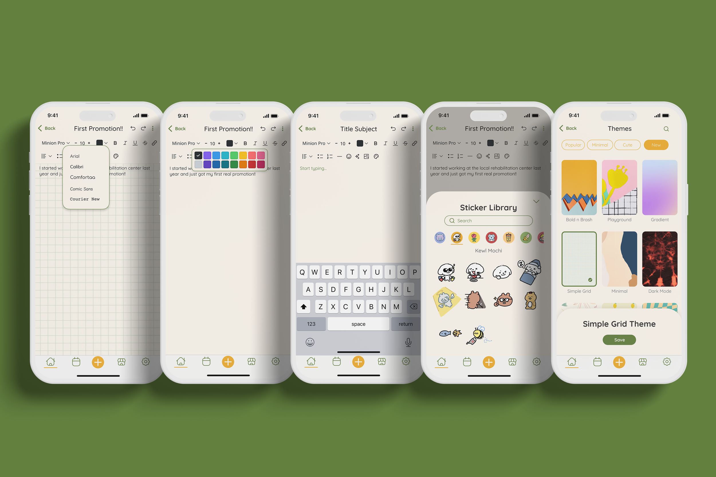
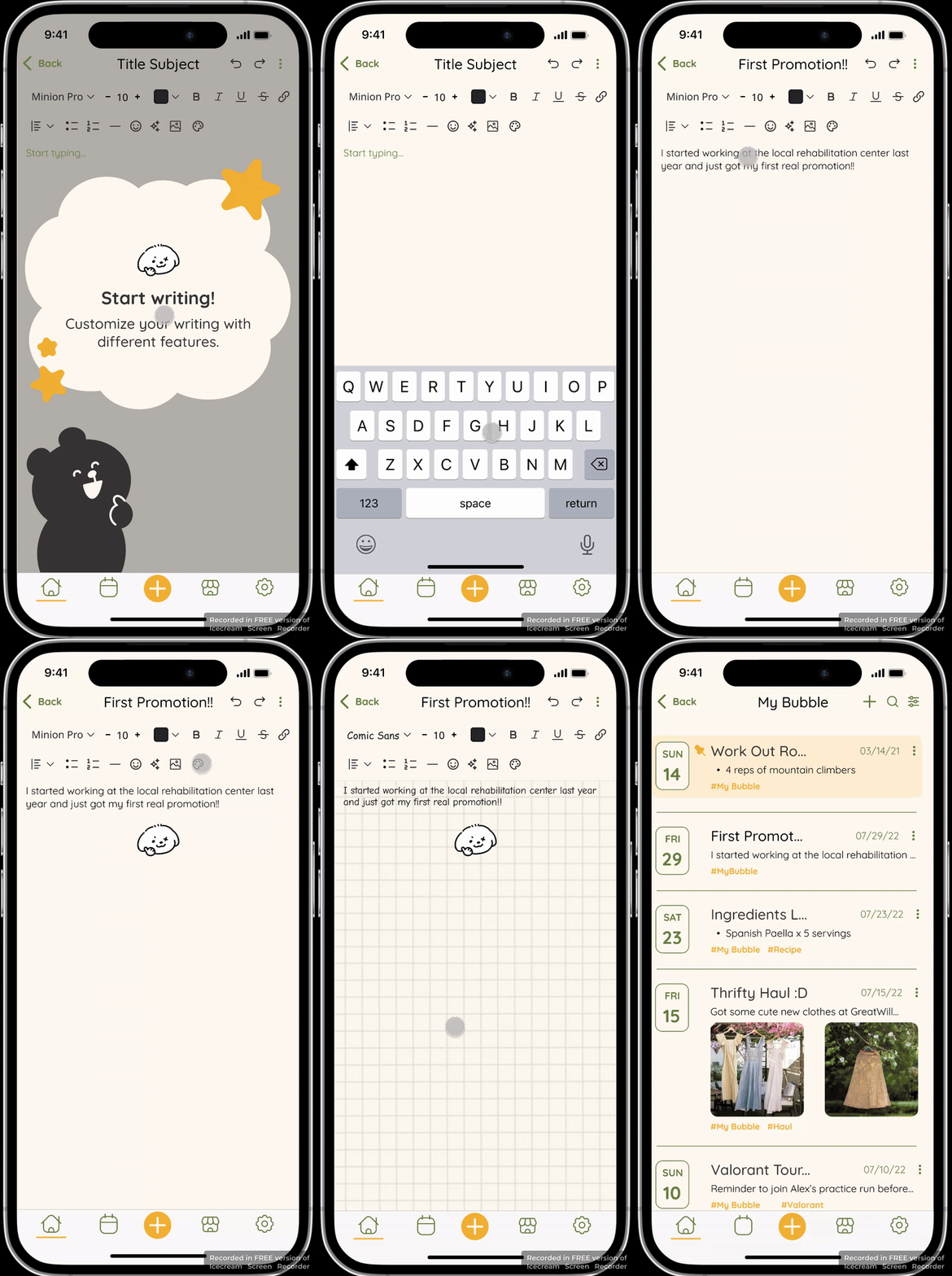
Writing Pad and Customization
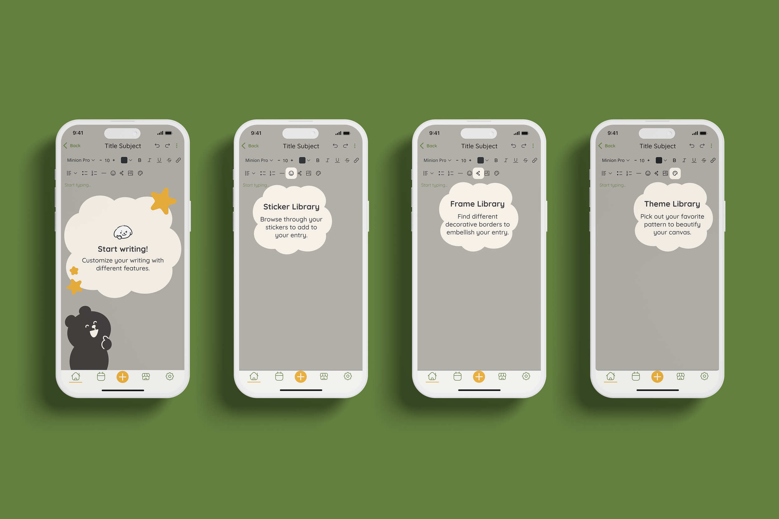
Tutorial

Mood calendar
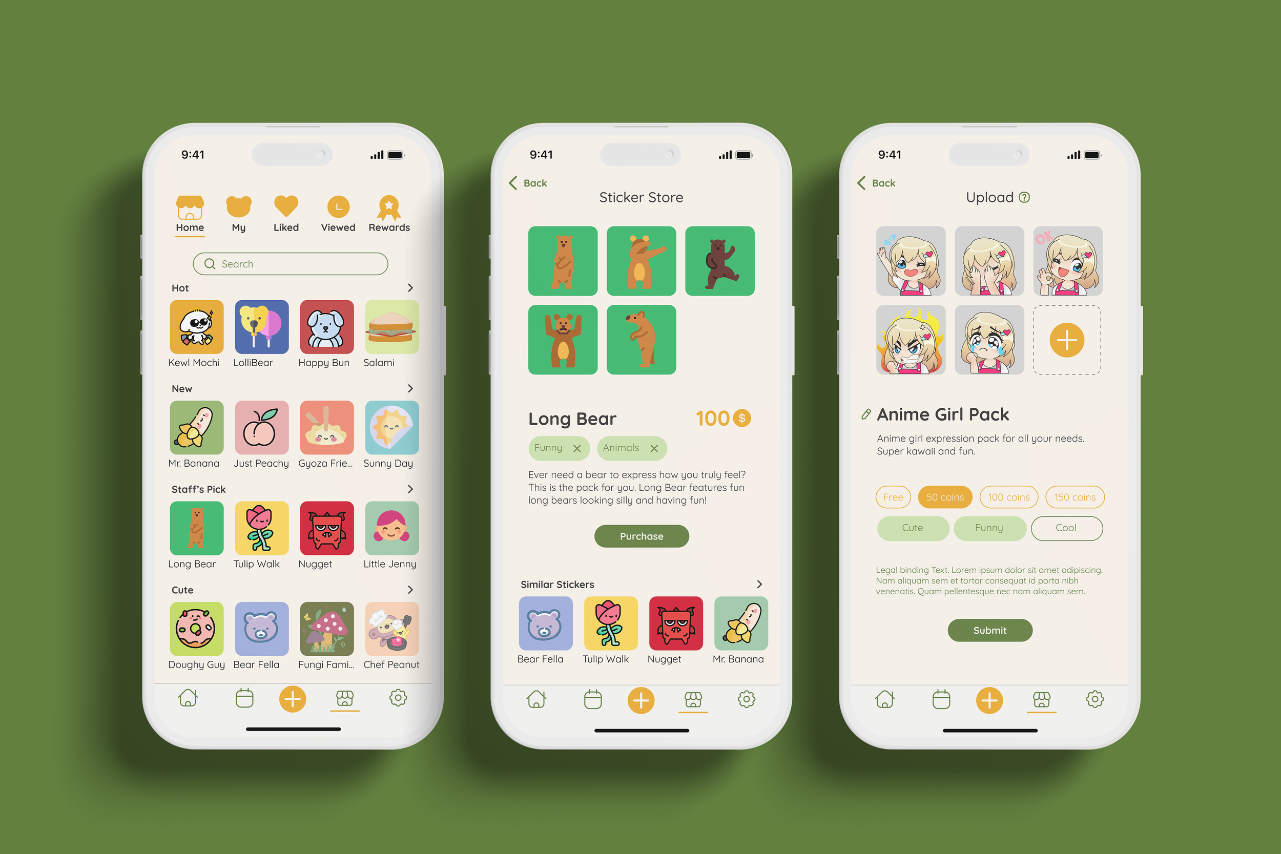
Sticker Store
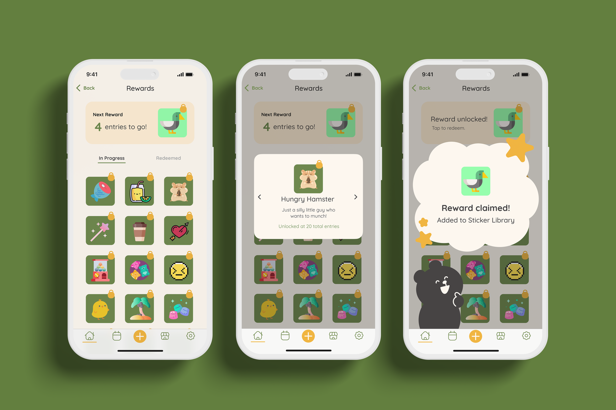
Sticker Rewards

Journal Entries Dashboard: Filter
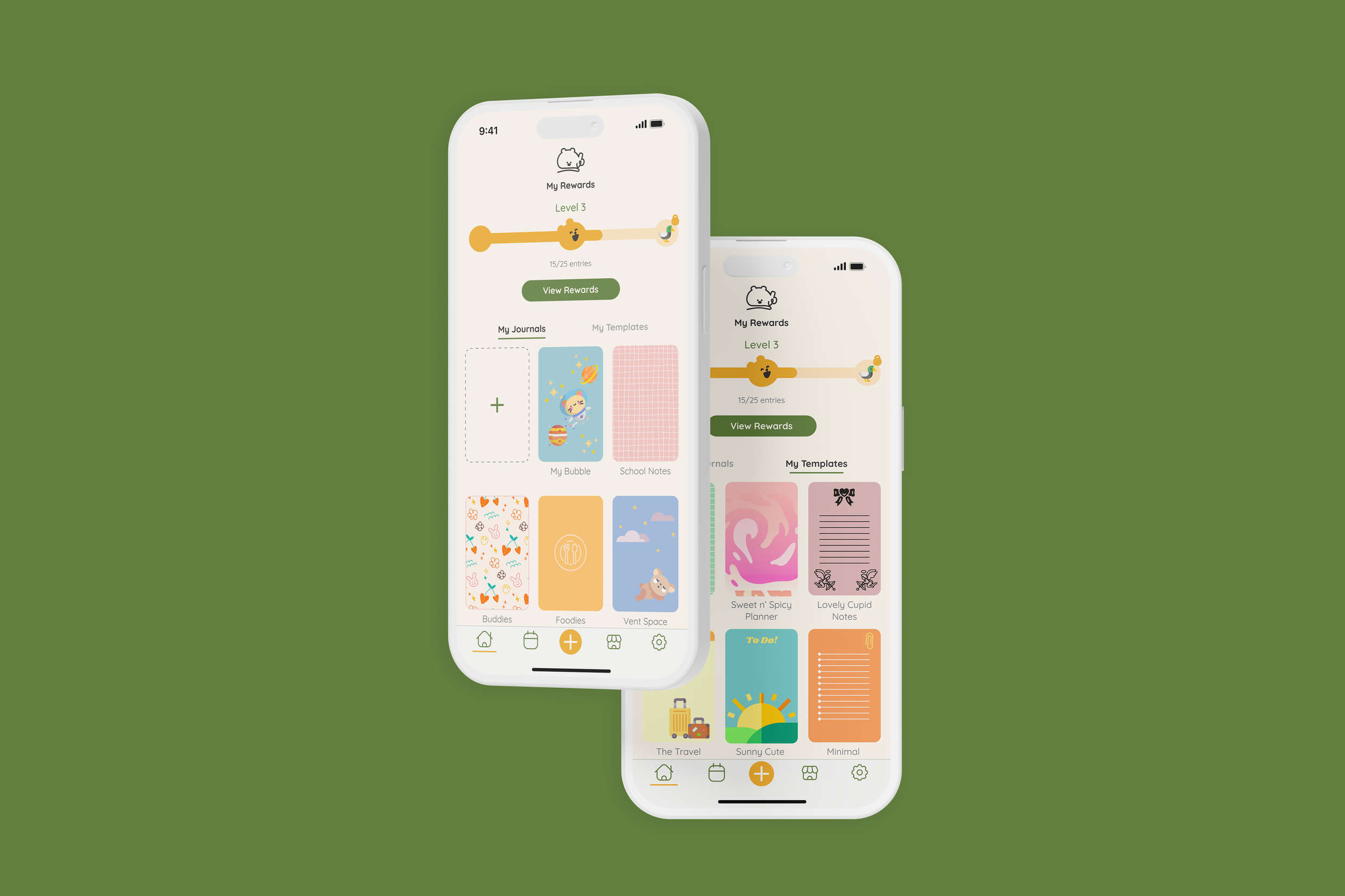
Home: Journals and Templates

Journal Entries Dashboard: Tag Editing
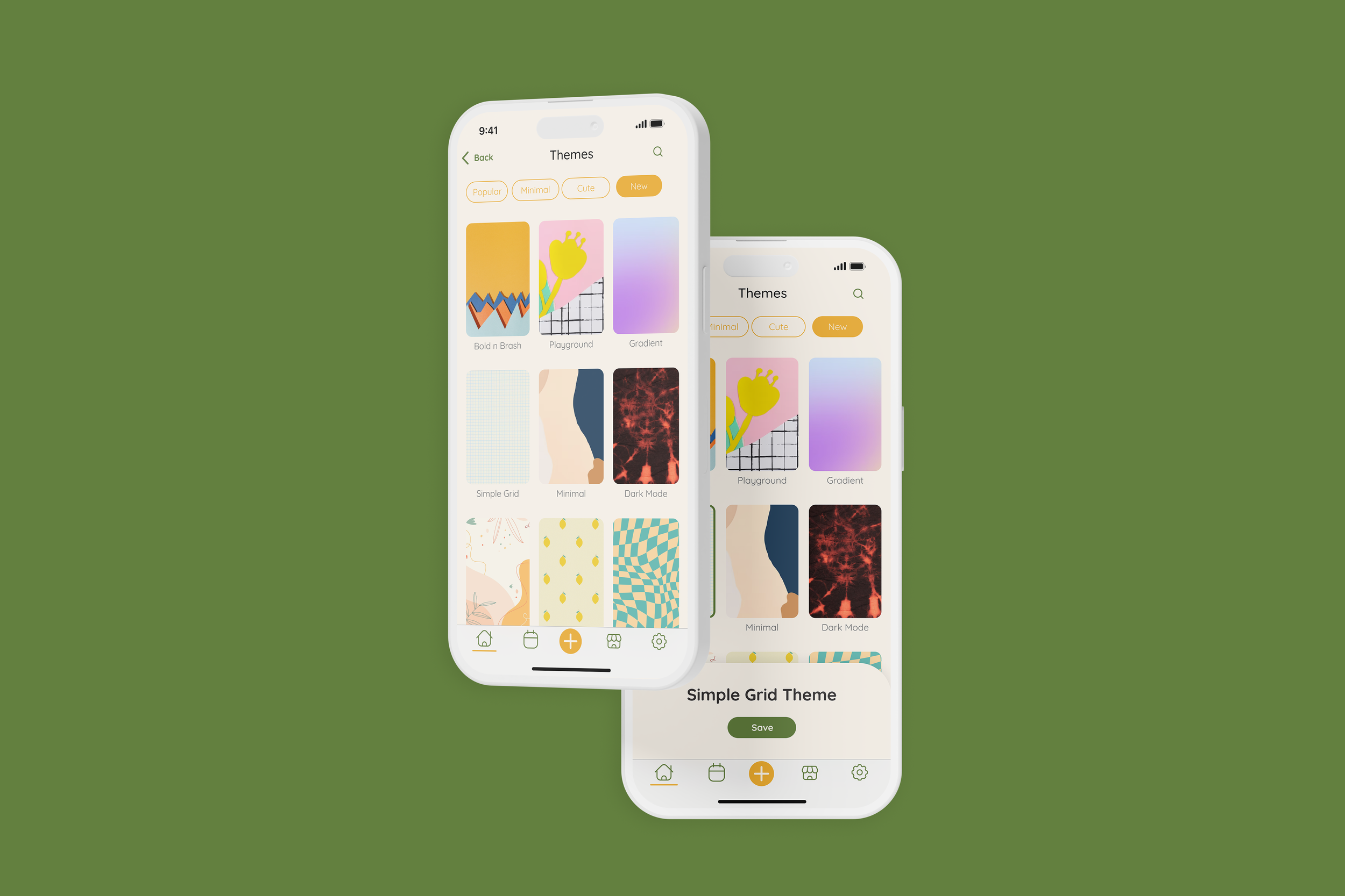
Writing Pad - Theme Selection

Mood Calendar: Mood Selection
Settings - Notification
APP STORE OPTIMIZATION (ASO)
Visualizing the ASO graphics
For consistency, we created a mood board to agree on the style needed to advertise on the app store. Products on the app store tend to look more cohesive, professional, and marketable when strong brand relevance is embedded in the graphic.
Determining the Visual Design Elements Finalizing the ASO
Once we mapped out our ideas and translated them into various pathways, we compiled our board with our sketches to magnify what would work best given the established functionalities we wanted to prioritize.
Here, we decided to rank our preferred UI elements by starring the key features that we thought would fit best while keeping simplicity and cleanliness in mind.
THE PROTOTYPE
To close the project, we developed Barenotes into a prototype to piece together our vision.
THE ASSESSMENT
Setting the timeline and expectation
Starting the project by establishing the commitment level is essential. Defining the amount of workload and gauging the amount of hours we were willing to devote to the weekly assignments gave us a clear understanding of what we could accomplish.
Consistently meeting weekly at a given time motivated our work productivity and gave the team a sense of timeliness.
Using data and analysis
Our feedback from 1:1 interviews and a survey pinpoint the needs, pain points, and task flows to map the user journey and interface of Barenotes. Relying on our users’ insight helped us shape the user flow into a fun, reliable app that addressed and prioritized the elements needed to create a successful and worthwhile journaling experience.
Designing with functionality and appeal
The features we prioritized by the level of need vs. want by the user based on our responses.
Based on our data response, accessibility is one of the biggest frustrations in both digital and physical journaling experiences, so we were mindful to expand our UI elements to include more entry points to create a new entry.
Barenotes’ organic, fun branding design direction was regarded with love, and with the changes implemented after the usability test phase, we worked on improving its legibility with the color palette combination by changing texts in golden yellow into charcoal black, so that it contrasts better against the cream background.
Customization is a highlighted feature of our app, which we chose to incorporate various levels of visual design. To make it easier for the user to navigate, we placed our main canvas’ customizable functions, including the sticker library, journal theme selection, typography options, and color swatch palettes in one area.
The appeal of our design is backed with functionality. Organization is another key portion of Barenotes, so, we defined elements of searchability, editing, and navigation by guiding the user through bubble pop-up tutorials.
TAKEAWAY
Learning Points
While Barenotes was intended to be a side project, establishing a concrete deadline to complete the app could have encouraged more efficiency in workflow, eliminating the possibility of burnout.
During the research phase, the demographic selection was heavily inclined toward young adults ages 20-29, skewing our data and therefore, not providing as substantial of a response to represent the user persona. Having more opportunities to explore ways to expand our demographic range in research could’ve given us more insight into various pain points.
Taking the time to understand the design platform you’re working on and learning specific shortcuts eliminates lag time and increases productivity. If we were to have dedicated time together to absorb tutorials and articles, we would have saved more time with the project length.


