MIXER
UI/UX Design | Web App | Mobile & Desktop
Mixer is an ongoing, developing web application designed to be a convenient space for users to efficiently explore different alcoholic beverage recipes through integrated customizable filters and search functions, ultimately helping users discover refreshing drinks fit for their taste buds and preferences.
TIMELINE
Jan 2022 - Present
TOOLS
Figma | FigJam | Illustrator | Photoshop | Google Suite
Problem
— With thousands of options to choose from, users find it challenging to find an alcoholic drink recipe that fits their taste.
Types of alcoholic drink preferences vary from person to person, making it seemingly difficult to discover suitable alcoholic beverage recipes that complement what they enjoy drinking. Based on our research and data analysis, users experienced frequent pain points, including:
Complex ingredient measurements
Lack of ingredients on hand
Particular taste and alcohol content preferences
Solution
Mixer provides alcoholic drink enthusiasts with a simple and efficient search system for delicious drink recipes, including a custom-built algorithmic system, in which users are able to experiment with different ingredients, customize with multiple beverage filter settings, and easily share drink recipes amongst their friends.
— Cheers to new recipes with great company.
With functions that allow users to create, review, and share recipes, Mixer can encourage users to expand on a new online directory specially made for alcoholic beverages.
RESEARCH BACKGROUND
Competitive Analysis
We brainstormed responses to general demographic questions to better understand the market before delving into other companies’ branding strategies, history, and UI interface directions.
-
21+ adults who need an accessible alcoholic drink recipe app.
-
Conveniently search for alcoholic drink recipes compatible with the users’ preferred ingredients and preferences.
-
On-the-go when shopping or meal prepping at home
-
Using the app in a domestic environment via mobile or desktop
-
Working adults who enjoy experimenting with new alcoholic beverages. Users can use this beverage recipe app to ensure convenience, easy-access, and healthier and budget-friendly options.
-
Filtering preferences and customizations to narrow down their navigation process.
Survey and Analysis
The industry we were tapping into is entirely new and unique to our team, as none of us have proper experience with consistently drinking alcoholic beverages. To get a better idea of the behavioral patterns that alcoholic drink consumers tend to showcase habitually, we conducted a survey that received 41 different user responses based on questions relating to purchase preferences, drink palette customizations, frequency of alcoholic drink consumption, and methods of finding their drink recipes.
Although half of our responders enjoy crafting their drink, they experience issues, including:
Finding specific ingredients
Using accurate measurements
Solutions:
Keep the interface simple, straightforward, and organized
Present valuable details and filter options for users to apply during their search
Provide guidance when organizing summarized details, instructions, and reviews
User Persona
Based on our research findings, we created three user personas from diverse fictional backgrounds to visually map out how a typical alcoholic beverage consumer approaches their drink recipe navigation and experimentation process. All three personas have a different motivational drive to experiment drink recipes in their own home and commonly share the following qualities:
Generation Y and Z
Use technological devices often for recipes
Have an interest in mixology to an extent

User Persona 01 | Yasmina Ahmadi
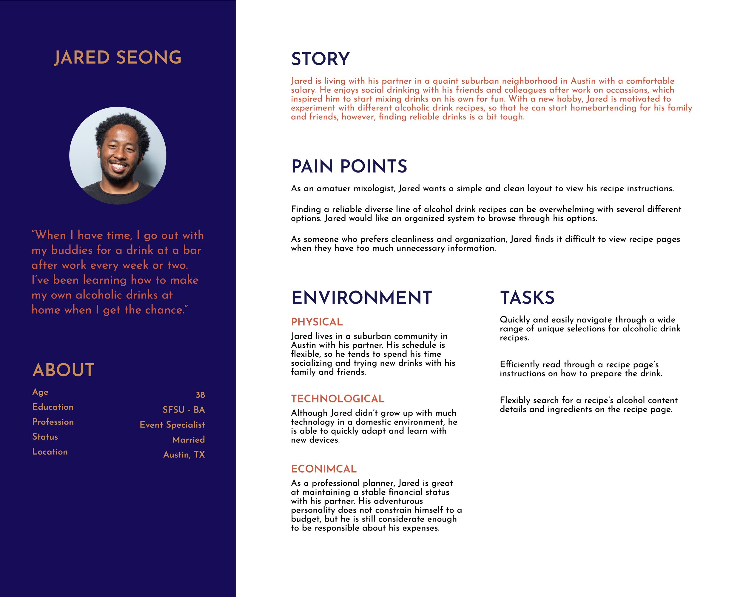
User Persona 02 | Jared Seong

User Persona 03 | May Bennett
User Flow Chart
Mixer’s user flow directs the user into a few pathways that allow them to access four functions:
Posting Recipes
Recipe Instructions
Alcoholic drink facts and details
Reviews of the recipe
We mapped out a user flow diagram to organize a specific flow in how a user can progress toward each screen, feature, and action. The diagram essentially laid out our skeleton and helped us prioritize certain features on the layout.
The Mood Board
As we headed toward our wireframe stage, we needed to establish proper branding so that our app stayed authentic and professional.
Mixer was envisioned to be professional, minimal, and straightforward. We noticed that many recipe apps, mainly related to drink directories, are usually overloaded with multiple categories and labels, so we decided to avoid layouts that used too much jargon and buttons. The main goal was to showcase an app with bold, fun graphics and a clean interface, as shown in our inspiration collection above.
IDEATE // BRANDING
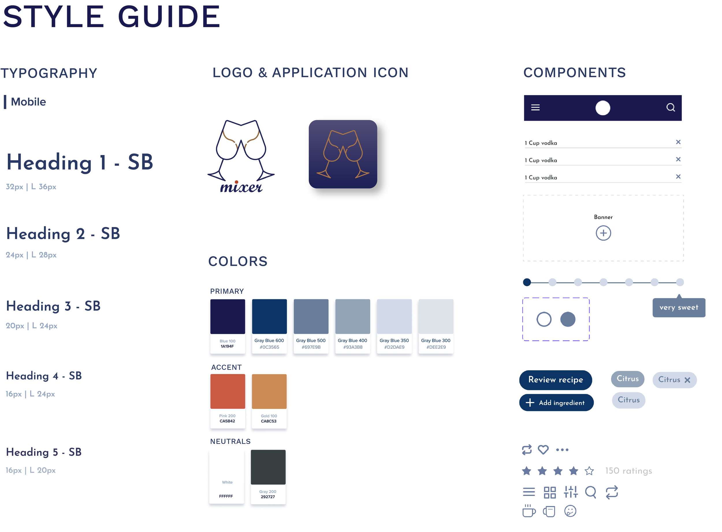
The branding direction was set to be night-themed with a retro twist. We were inspired by drinking culture traditions, specifically how drinking occasions are associated with nightly celebrations and the bold festivity in vintage lithographic visuals.
Although our branding is influenced by retrofuturism, we wanted to maintain professionalism and clarity with minimalism. To balance Mixer’s modernity and fun, retro aesthetic, we used round, simple iconography and a San Serif typeface.
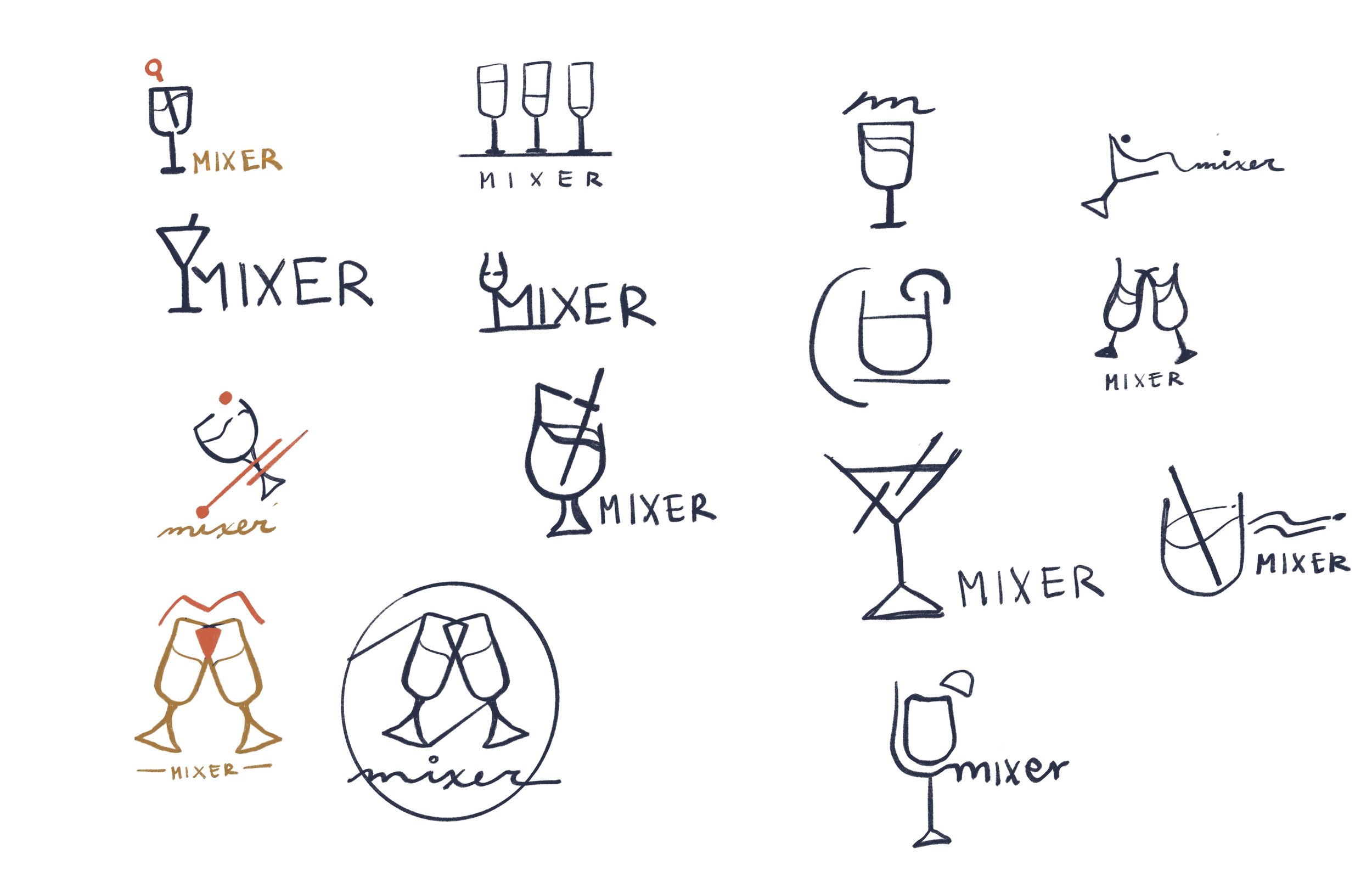
IDEATE // LOGO
Mixer’s logo was inspired by the idea of sharing drinks with great company. While collecting feedback from our research, we discovered that most of our participants enjoy recommendations based on experiences. My logo iterations drink experimentation and the celebrative gesture of drinking with loved ones.
Sketching out Ideas
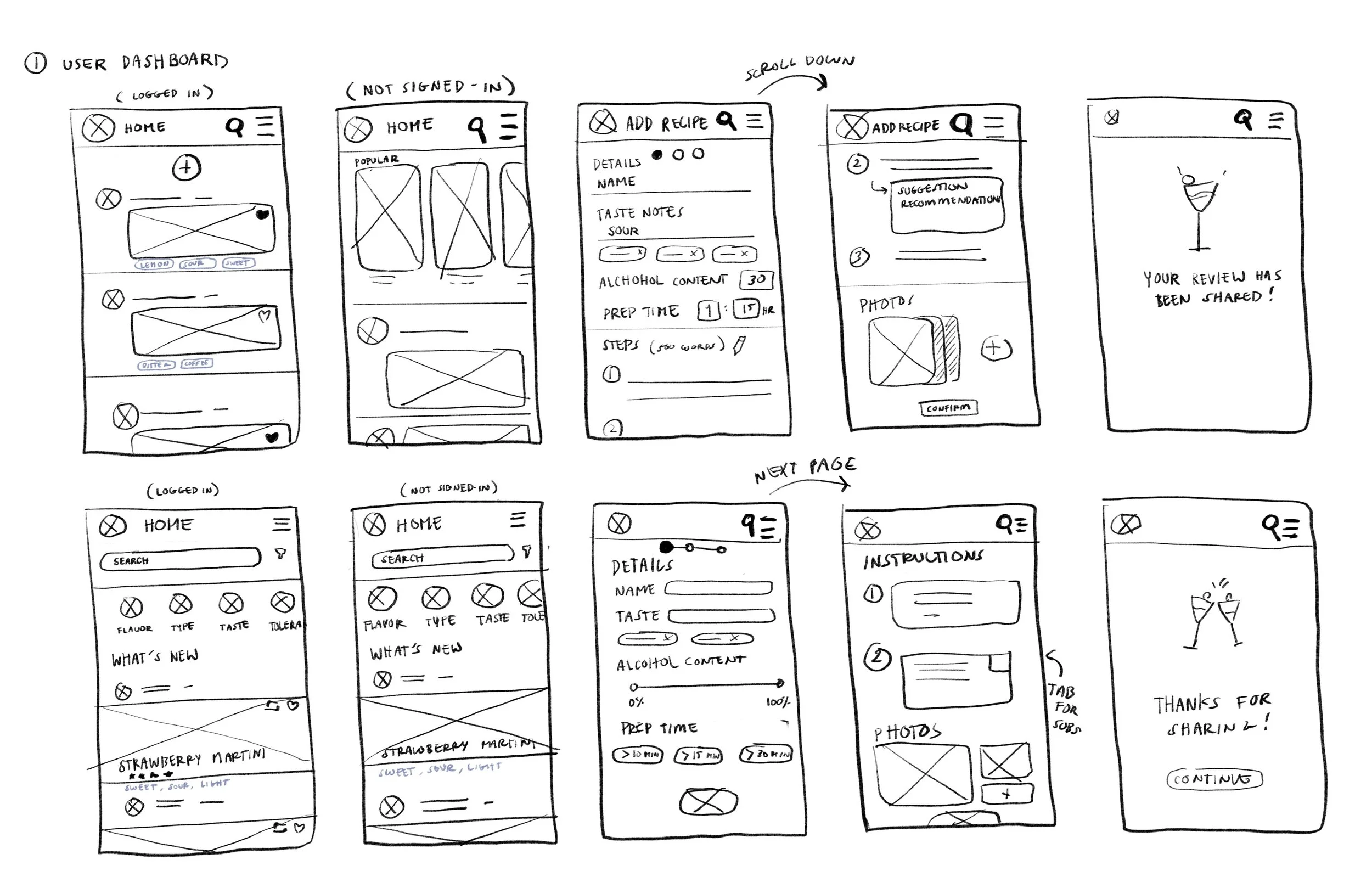
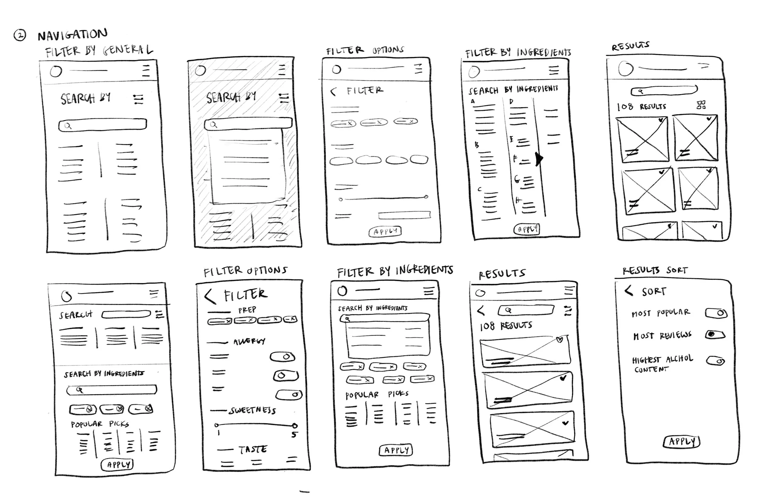
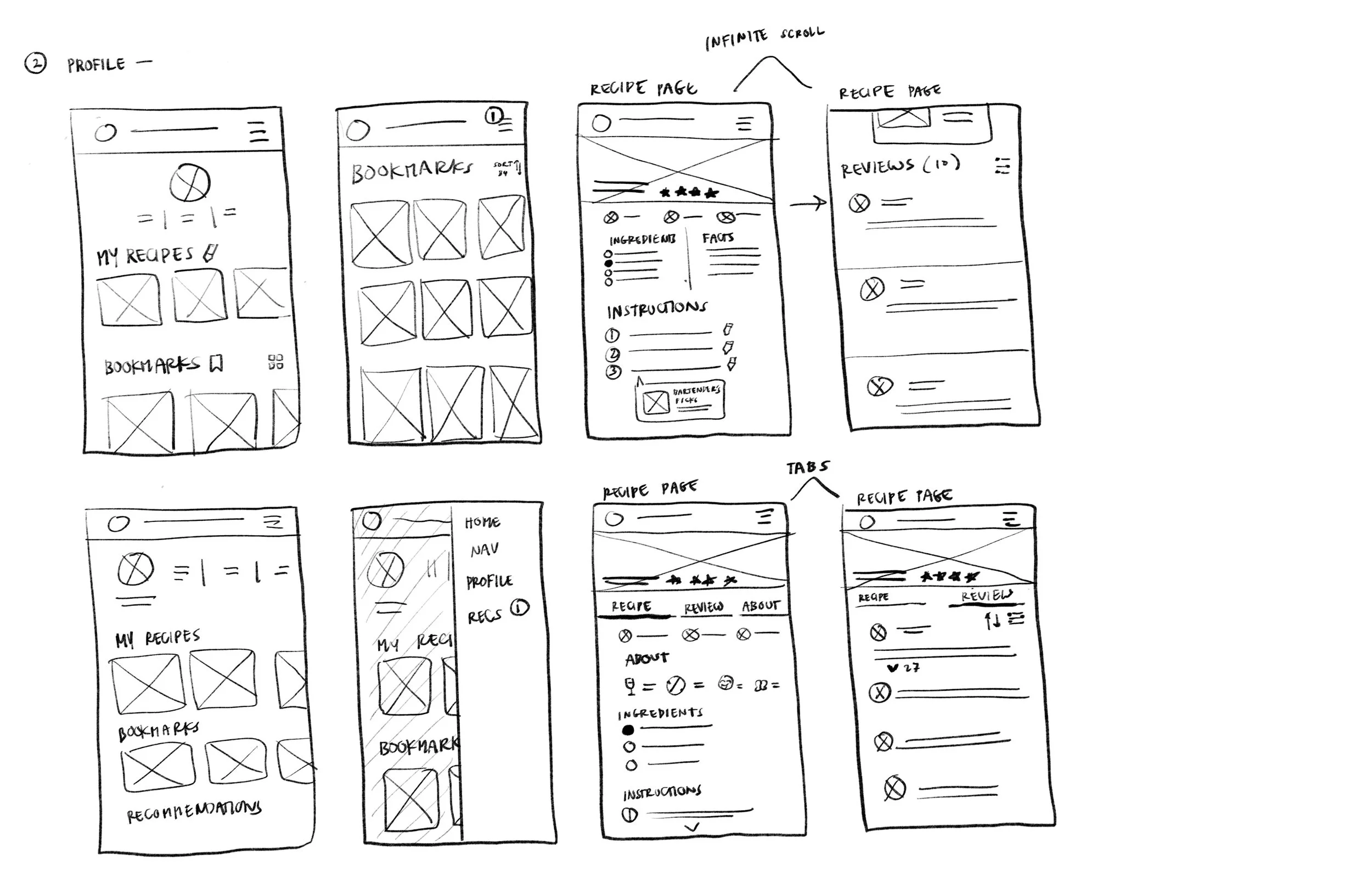
We aim to develop Mixer into a responsive application for mobile and desktop devices. To help the development team maintain an optimized workflow, we decided to focus on developing our mobile wireframe sketches since revising future coding changes easily transitioned from the mobile layout rather than a desktop structure.
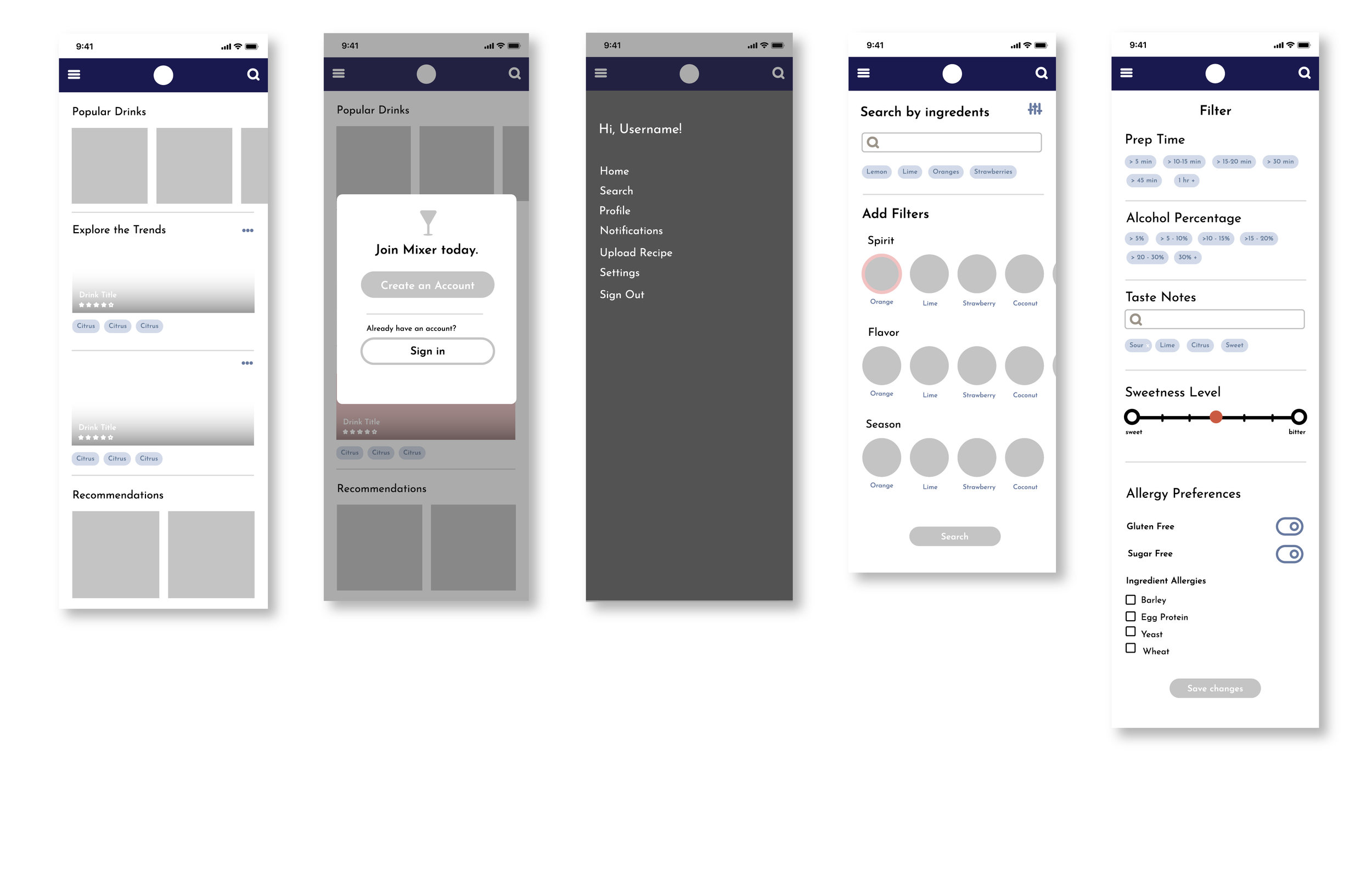
Low-Fidelity Wireframes
We compared iterations, compiled the main features that worked well with our user flow and visual direction, and then digitized the sketches into low-fidelity wireframes to make sure that the system made sense from the perspective of our users.
Whiteboard Diagram
Organization is key to a comprehensible user flow, so we composed a hierarchy of notes to assess functions and features that must be prioritized. The development team advised feedback to ensure whether our design decisions could develop into functional elements. From here, we removed and reworked specific functions that were either too impractical or fell short of our objective
-
Our text sizes were in various sizes— some sections of headings being too small too read. We changed the standards, so that the details are legible and clear.
-
The blue hue was altered to be darker to ensure that the contrast was well adjusted while users read the white text on specific sections.
-
Based on what the users might want to use the application for, we prioritized specific functions to implement as our tab order and navigation shortcuts. A few functions were removed when deemed as more of a user desire rather as a necessity.
Mid-fidelity Wireframes
We embedded the helpful feedback from our development team and began cleaning up our wireframe flow and component assets. During this phase, our screens were becoming much more cohesive and organized with the following changes below:
-
Dashboard populates recommendations and shared posts of recipes from the user’s curated network. We reworked the UI design to have the recipe details be legible with a gradient against the photo.
-
To ensure a smooth development process, we included all the necessary filter options, so that it would be in sync with the recipe instructions page.
-
The search page was revised, so that the filters will be changed into checkboxes and broken into categories to accommodate a simpler development process.
-
The recipe page format clearly displays the necessary information using icons, and mimics the “Upload Recipe” page for UI consistency.
-
The user’s profile is focused on building a fun engagement hub spot for users to view and share different recipes amongst each other.
PROCESS // MID-FIDELITY PROTOTYPE
For new users, we want to test out the learnability of this web app by observing how intuitively they can fill out the appropriate details when creating a recipe, searching for a recipe, navigating through a recipe page, and sharing recipes with existing user profiles.


